


Although to a certain extent, at least Microsoft’s Edge browser can be considered “very close” to Google (does it count?). However, when it comes to card-based interfaces, at least in the desktop version, Microsoft seems to be one step ahead.At this time, it seems like the phrase “that’s what competition is like, just like running and swimming, doesn’t it mean that he will do whatever you do”?Continue reading The desktop version of Google Search pays homage to Bing’s card interface, did you notice? Report text.
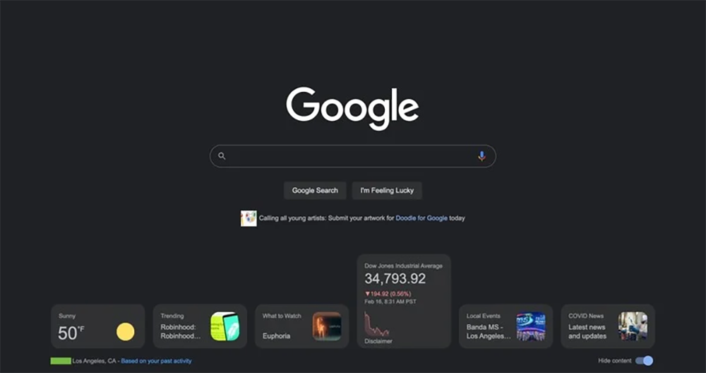
▲Image source: 9to5Google
Did you notice that the desktop version of Google Search pays homage to Bing’s card interface?
“Google” has become synonymous with “Internet search” in modern times. one time ”. Although the popular dark mode theme has been added in recent years, their desktop version interface is indeed quite plain compared to the mobile version of the app – it really just consists of a search box and a “lucky” button. Now it seems that Google, which was once very Mobile First, has finally decided to make the desktop version of the search homepage richer in information.
Although you can’t help but feel that it really looks like a tribute to Bing (you can compare it with the picture below).
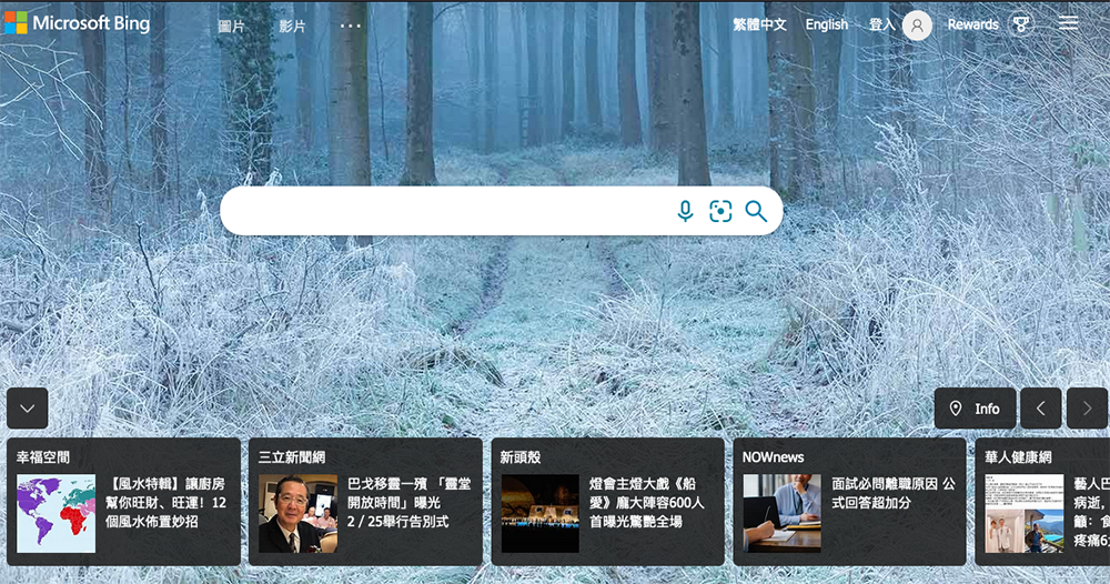
Although there is no fancy background switching function, the desktop version of Google Search seems to be bringing a horizontal card interface similar to Bing. According to the findings of foreign media 9to5Google, this search page, which has been used as a tool for final reports for many years, seems to be about to usher in a new interface with richer information.
Google Search has reportedly introduced new information cards. Although it seems to pay tribute to Bing’s interface. But compared to the presentation method that provides more scrolling information. The Google search page prefers to change the vertical information card on the Google app homepage to a horizontal display, and place it at the bottom of the interface that has mainly added a large trademark word to the search box for many years – it seems that this should also be designed to correspond to the PWA adaptive web interface? After all, once the window width is narrowed, just switch to the way the Google app is displayed in the mobile app?
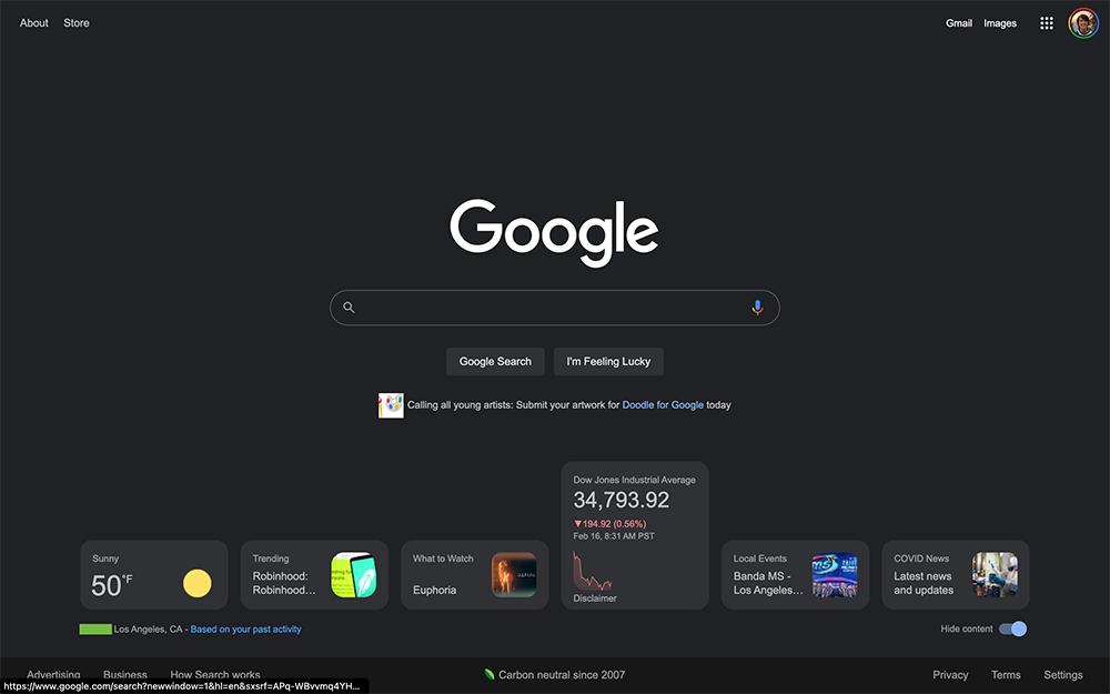
Judging from the screenshots of foreign media that have received the test function so far, the desktop version of Google Search provides weather, trends, recommended viewings (What to Watch), stock markets (Stocks/markets), local events (Local Events), and currently, the epidemic news (COVID News) should be inseparable from all mankind.
Compared with the mobile version, clicking on the card will jump to the page. Basically, every card in the desktop version currently being tested will become taller after clicking to display more information – the weather will show the weather for the next day; the trend will show the number of searches; the stock market will show a chart.
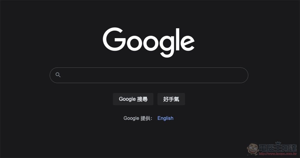
So seriously speaking, compared to the existing Bing search page, the new interface of Google search still has more focus on the interface and information type. Interestingly, Google reportedly revealed in 2018 that it would not bring the mobile app experience to the desktop. I can only say that maybe this test board has another name now, right?
Further reading:
Source: KOCPC Chinese