


When making presentations, writing reports, or composing articles, you’ll definitely want to create some charts to enrich the content, or use images to explain things more clearly. But not everyone knows how to make them or how to present them. Recently, I came across this incredible tool called “Napkin AI” — just give it text, and it generates AI charts, and they’re really polished ones at that.
Even people with absolutely no artistic talent can create beautiful charts—you really should try it.
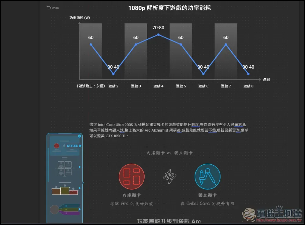
“Napkin AI” generates beautiful AI charts from text content
Napkin AI is an AI tool designed specifically for chart generation. It was just launched recently and is still in Beta, so all features are completely free to use. However, it’s unclear when they’ll introduce a paid version in the future, so if you need it, make sure to use it while you can.
First, let’s look at the result. This is the chart I generated from the text above, and it took less than 30 seconds:
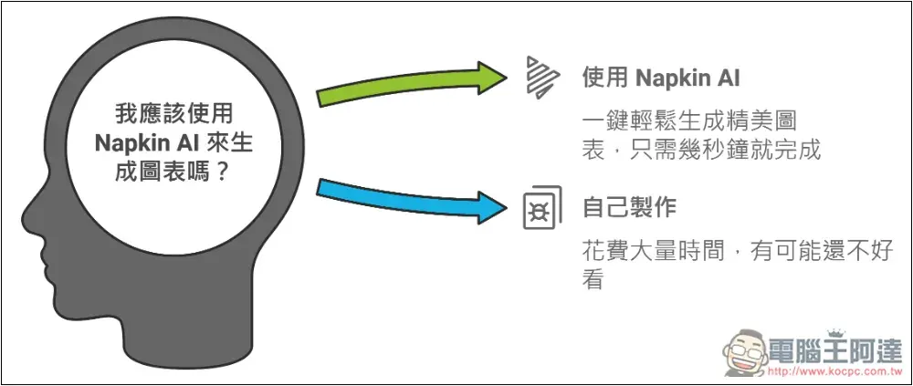
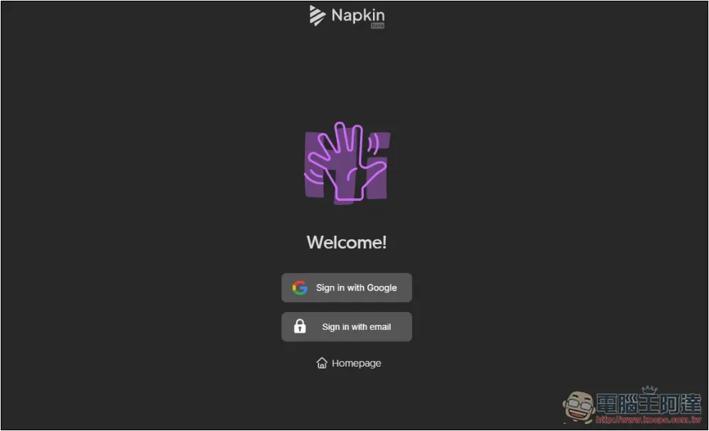
Napkin AI is currently free to use. After entering the website via the link above, first register an account. It supports quick registration with a Google account, or you can use email—whichever you prefer:
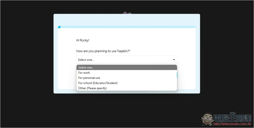
After registering, before you start using it, it will ask you two questions. The first is what you plan to use it for — for example, I chose personal use:
In what aspects is it used? This can be multi-selected; I choose blog and news, and social media platforms:

Then you can start using it. Click Create my first Napkin:
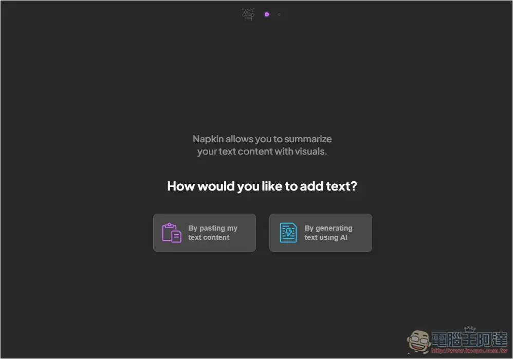
Choose how you want to generate it: you can use your own content, or have AI generate the text. I’ll use the former—paste my content and then generate a matching AI chart.
When this screen appears, paste the content you want to generate an AI chart with.
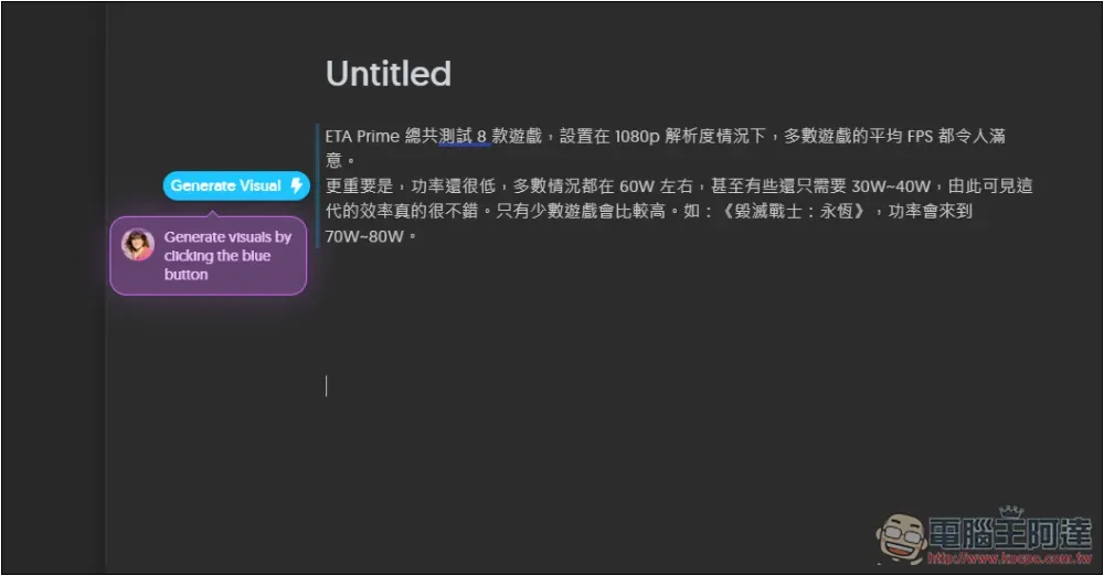
I’m looking for another piece I wrote.A major improvement over the previous generation! Real-world testing shows that the Intel Core Ultra 200S processor’s integrated graphics gaming performance is comparable to the GTX 1050 Ti.”Article content. I’ll just grab a random passage; this one is mainly about test data.
After pasting, you’ll enter the editor. The blue line on the left indicates the content the AI will capture for generation. If it doesn’t capture everything, shorten the blank line by one line; if it captures extra, add one more blank line. Then click Generate Visual:
After waiting a few seconds, the chart will be generated, and on the left side there will be multiple charts for you to choose from:
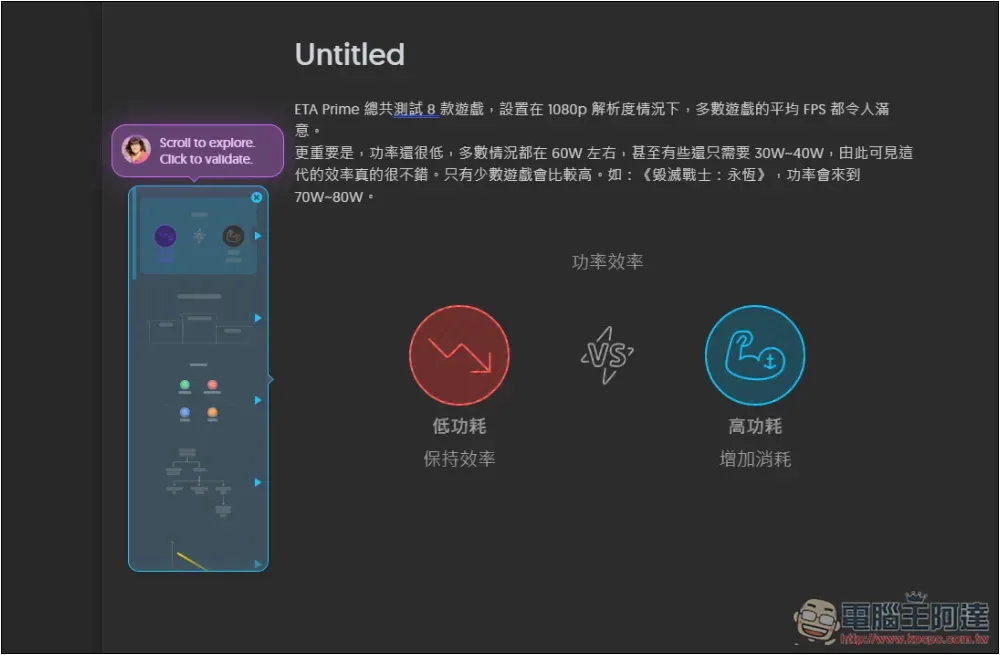
The text in the chart can all be edited, so just start by choosing a chart type that you think fits this text, like how I chose this line chart:
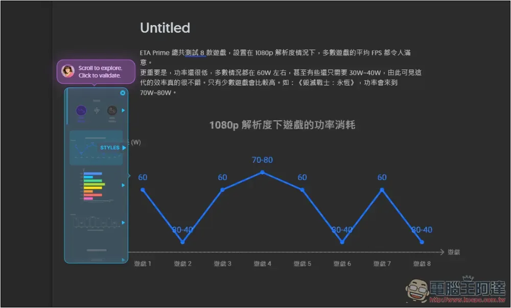
The next page will have more styles for us to choose:
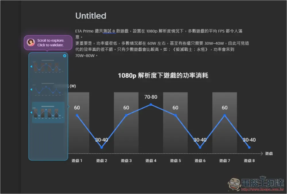
Once you’ve made your selection, you can begin editing the text in the chart:
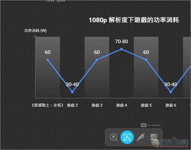
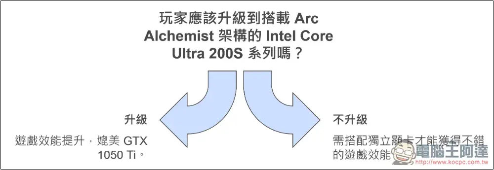
Plain text descriptions are fine too—they can still generate charts that match the content. My point here is mainly that Intel Core Ultra 200S’s integrated graphics gaming performance has improved significantly, and I found this arrow that fits pretty well for showing the difference between upgrading and not upgrading.
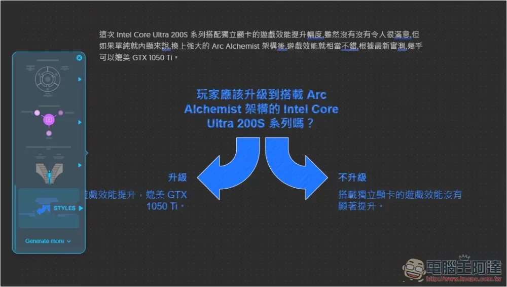
Modify the text content to what I think is suitable.
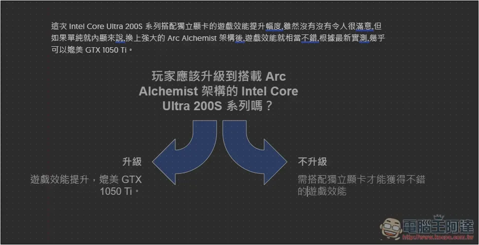
After everything is modified, use the mouse to select all the chart content, and a toolbar will appear above:
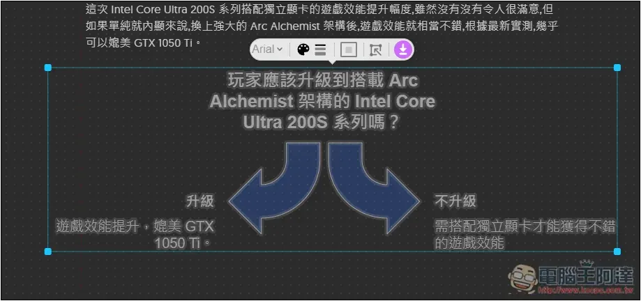
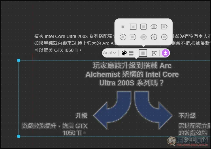
This toolbar lets you add borders, change colors, fonts, and more. If you’re satisfied, just click the download icon next to it:
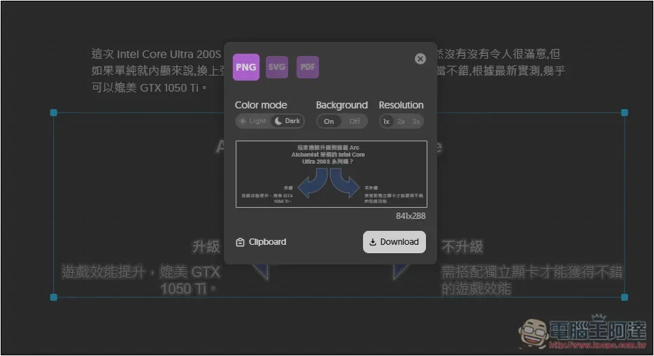
It provides three formats—PNG, SVG, and PDF—and you can also set the color mode (light, dark), background, and resolution. Once configured, just press Download:
A super exquisite chart is done! It takes just a few seconds:
Additionally, if you want the AI to fill in chart text more precisely, you can summarize the content first—either by yourself or by giving it to an AI like ChatGPT—and then put the content into Napkin, so the AI-generated chart will be more accurate.
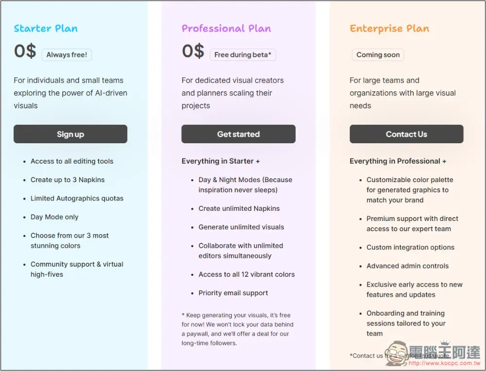
The pricing page also mentions that the PRO version is completely free for now since it’s still in Beta, but it will definitely be charged for in the future. After that, the free version will have certain limitations, such as being able to create a maximum of three:
Source: KOCPC Chinese