


This article is submitted by the reader “Beard Technology Academy”. The content is very exciting and practical. It allows ordinary beginners to learn CSS concepts step by step from shallow to deep. If you are learning website layout and architecture, this article will be a very important introductory teaching course. Friends who are interested can alsocome hereSee original text.
This is a comprehensive introductory course on CSS teaching suitable for novices (updated in 2021).
In this article, you will learn:
- Basic concepts of CSS
- CSS Selector
- CSS Statement Text
- CSS Statement Practical
- CSS Box Model
- CSS Position
- Other CSS
- Responsive CSS
From a novice perspective, we will divide it into 8 chapters, from the shallower to the deeper, to teach you all the CSS programming knowledge you need to know.
Are you ready? Let’s get started!
Chapter 1CSS basic concepts
CSS can make HTML more beautiful.
In other words, CSS is responsible for controlling the appearance of web pages, including static and dynamic elements, as well as the appearance of mobile phones.
CSS is like a design and typesetting tool. As long as you master it well, you can design various exquisite web pages through CSS.
Let me take you from the simplest to the deeper to learn CSS!
Let us first take a look at the basic concepts of CSS.
CSS basic concepts
After we understand HTML, the next step is to learn CSS. (If you don’t understand HTML, you can take a look first:HTML Teaching Course-Introduction) The purpose of learning CSS is to make the appearance of a website more beautiful.
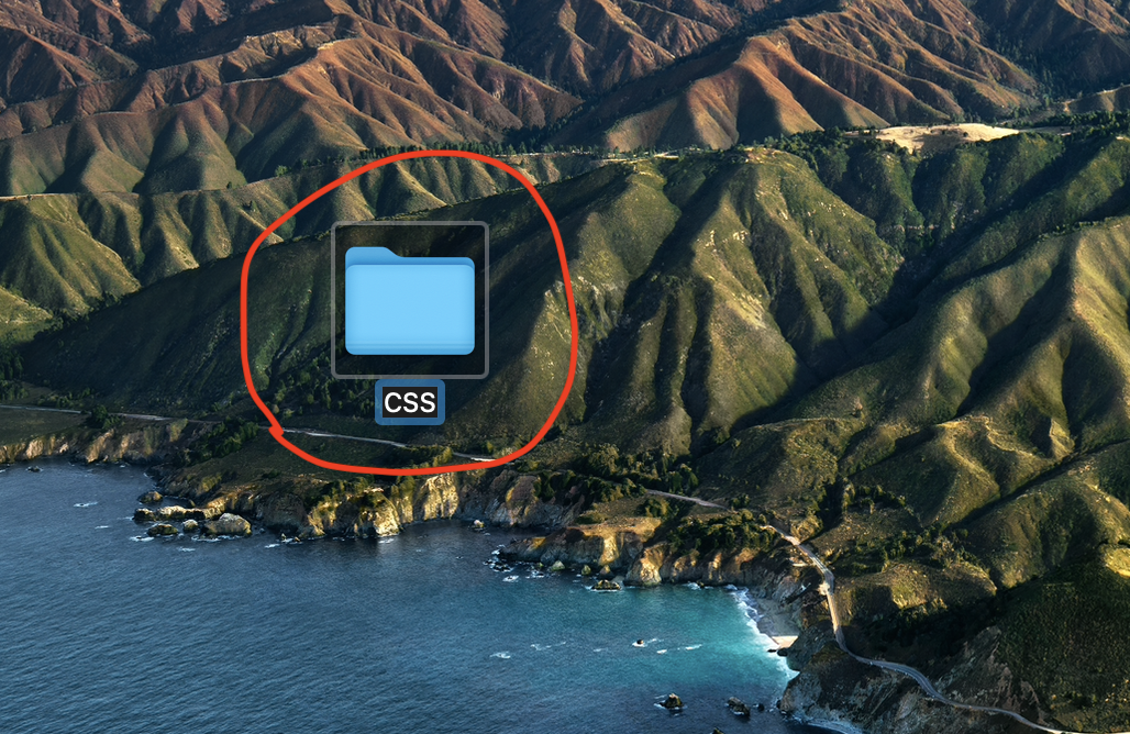
First, let’s open Visual studio code. I want you to try it on your Code Editor and type it with me to learn. Let’s open a new file together. This file can be placed on your desktop, and then add a “CSS” folder.
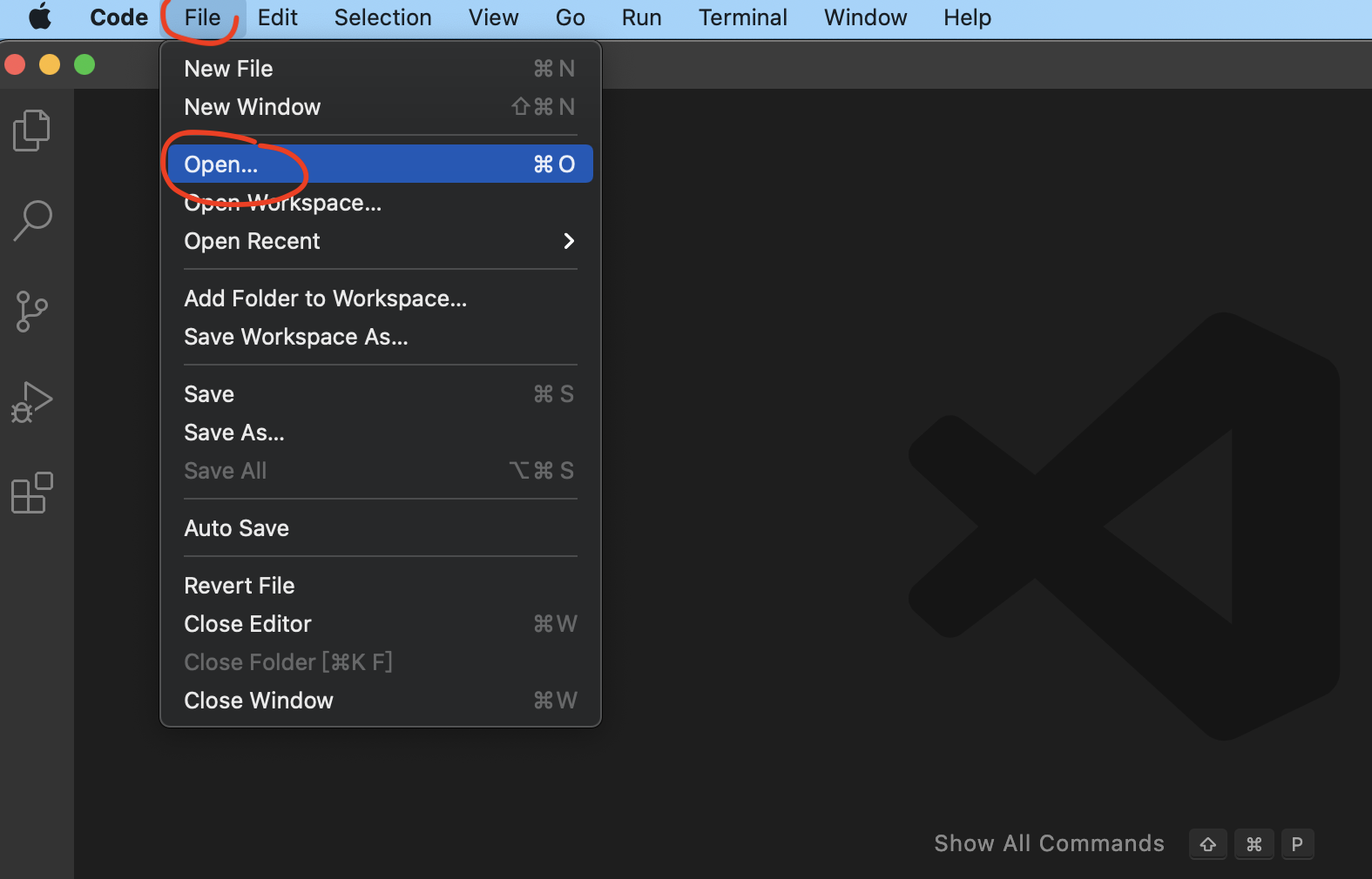
After that, we open Visual studio code and press File -> Open to open the “CSS” folder.
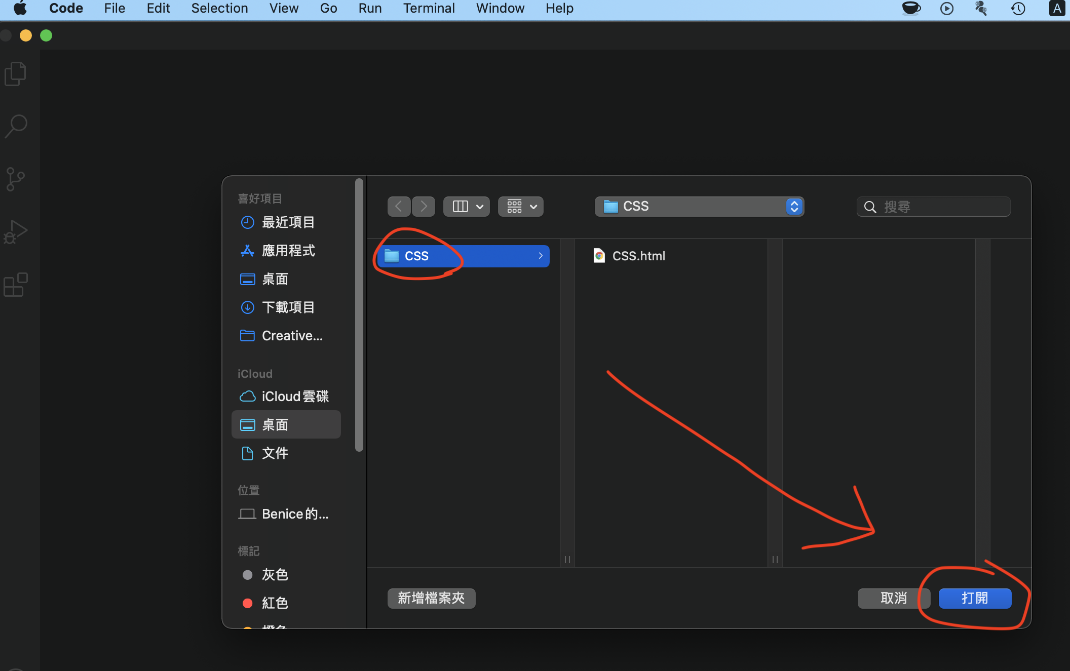
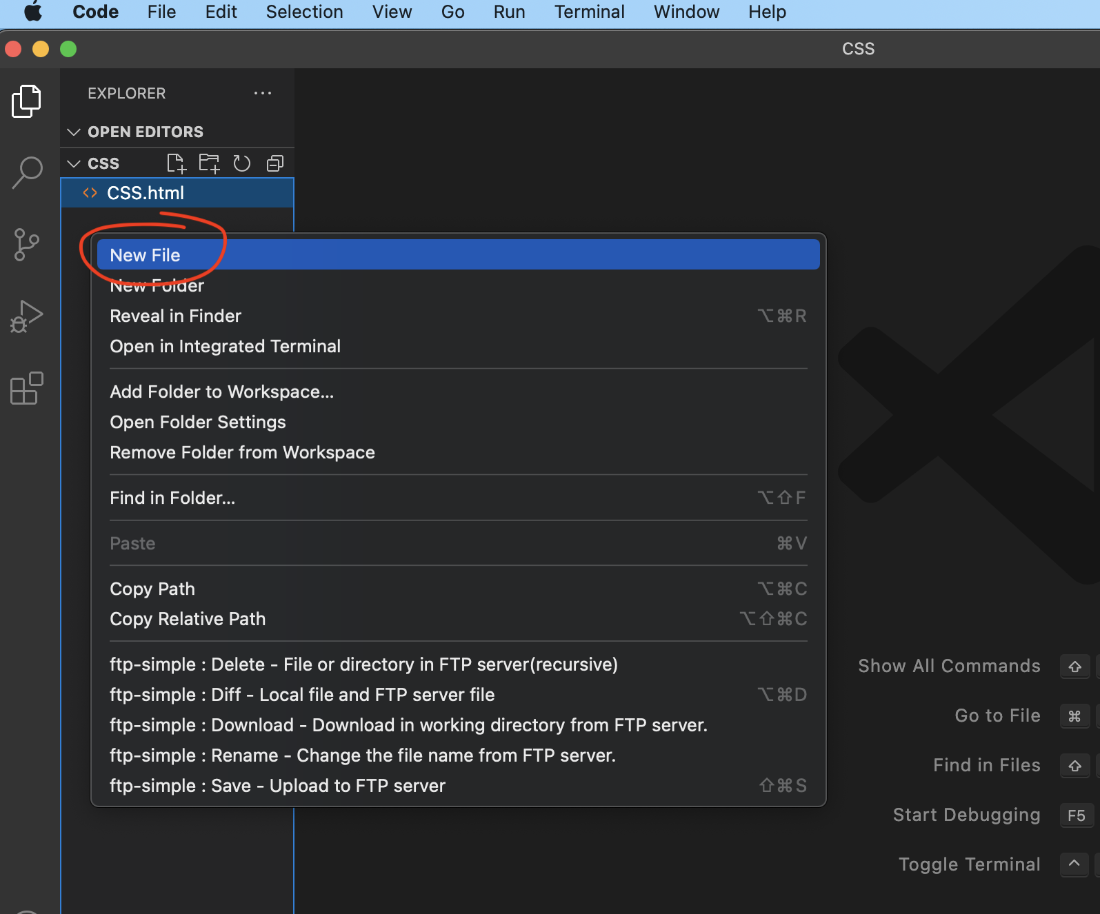
Then right-click on the blank space on the right side of the CSS to create a new file called “index.html”.
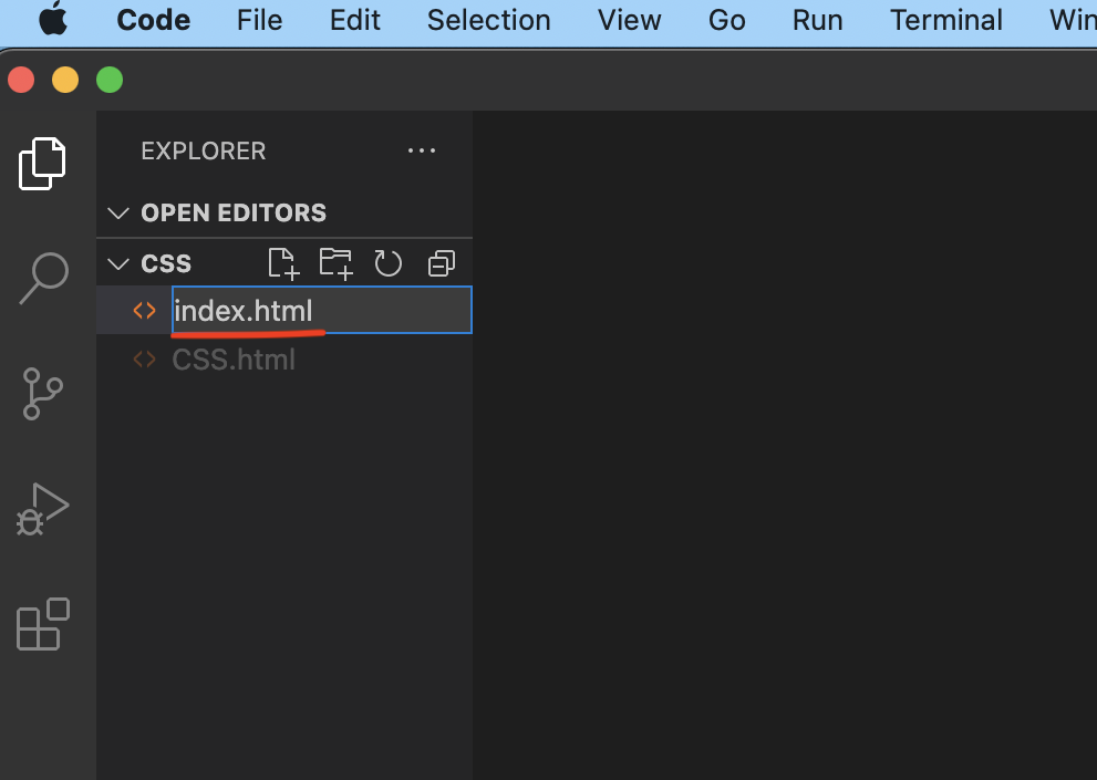
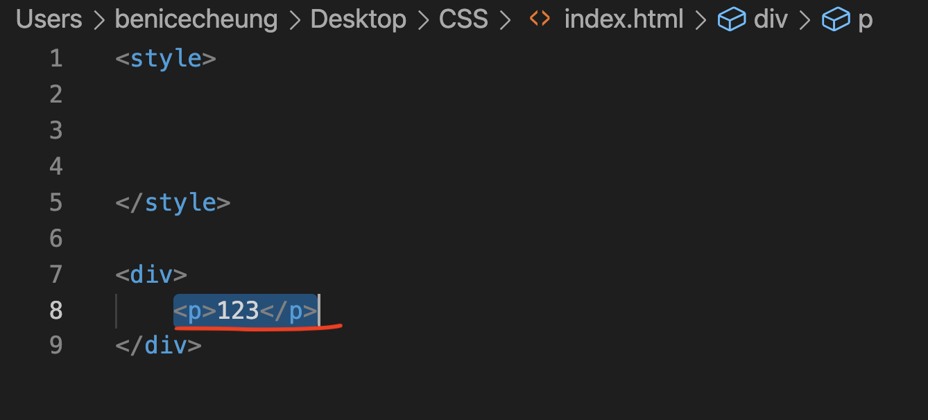
Then try to see if the function is normal, for example, enter
123
to see.
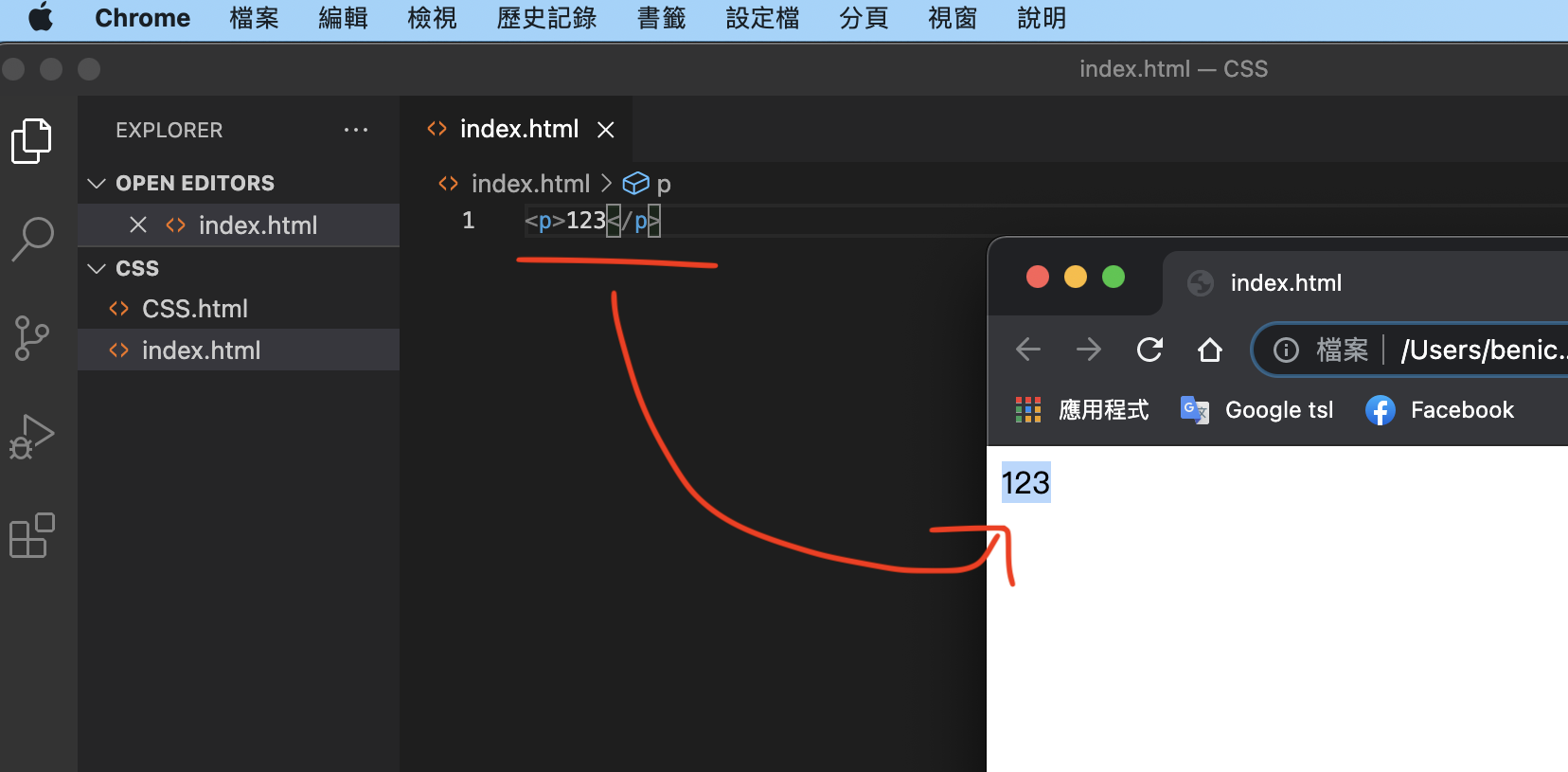
After saving, you can try to use Chrome to open this File file to take a look.
If you see “123” in Chrome, it means you have successfully set up this file.
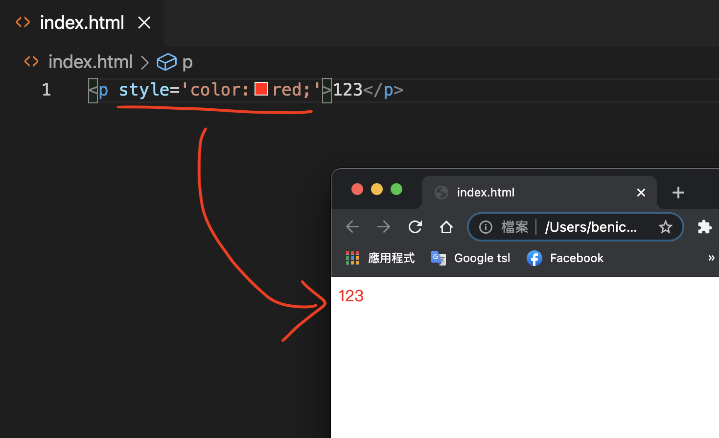
The first thing to do when learning CSS is to place p, separate it with a space, and then enter:
style=’color:red;’
See the Pen by Chan Ying Yeung (@chan-ying-yeung) on CodePen.
You will find that after entering this content, the text “123” will turn into red.
It turns out that the first thing we learn about CSS is that we can add CSS to each HTML element through attributes. Each appearance change can be done with a different CSS statement. For example, some CSS statements can change the font size, some CSS statements can change the color, some CSS statements can change the transparency, etc.
Separate CSS and HTML
However, when actually writing CSS, we usually separate CSS and HTML. Let’s take a look at the benefits of separating CSS and HTML. Just like the following example, suppose you have many p Tags now.
If each p Tag has different CSS, your program will be very confusing (as shown below).
<p style=’color:red;’>123</p>
<p style=’color:red;’>123</p>
<p style=’color:red;’>123</p>
<p style=’color:red;’>123</p>
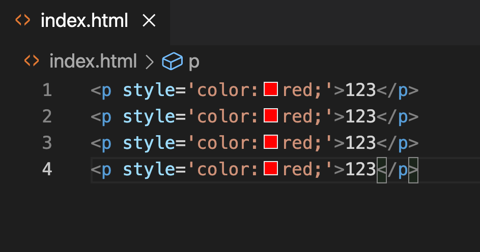
So, there is a very important concept about CSS,
Just input HTML and CSS separately.
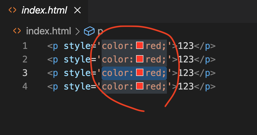
It means to extract all the styles in the middle of the picture.
So, now everyone input with me, we will create something called style Tag at the top of the file.
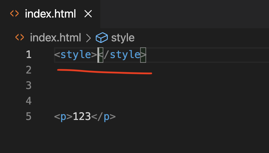
The style tag only needs to be created once, and what is entered in the style tag is no longer the content of HTML, but the syntax of CSS.
Let’s try typing in the style tag:
As shown in the picture p{}, and then press enter. (picture below)
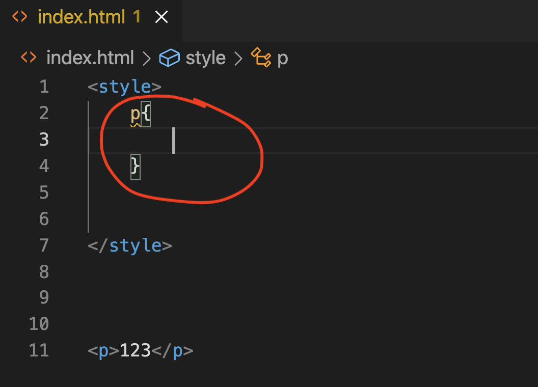
Enter color:red in p{},
p{color:red;}
After saving, you can try to use Chrome to open this File file to take a look.
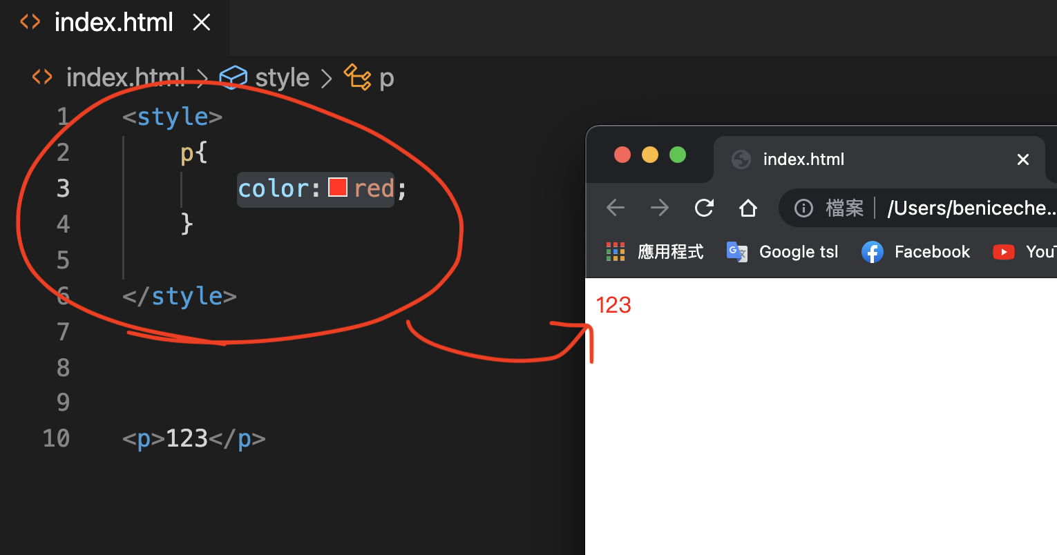
See the Pen by Chan Ying Yeung (@chan-ying-yeung) on CodePen.
What does this p{} represent?
It turns out that p{} is CSS Selector.
CSS Selector can let the file know which HTML Element needs to be pointed to in the following content.
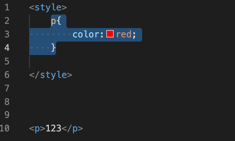
In this link in the figure above, p{} refers to all p Tags below.
And what does color:red; mean?
In fact, “color:red;” is a CSS statement, indicating that the color of the text is red.
“color” is the Property of the CSS statement, and “red” is the Value of the statement.
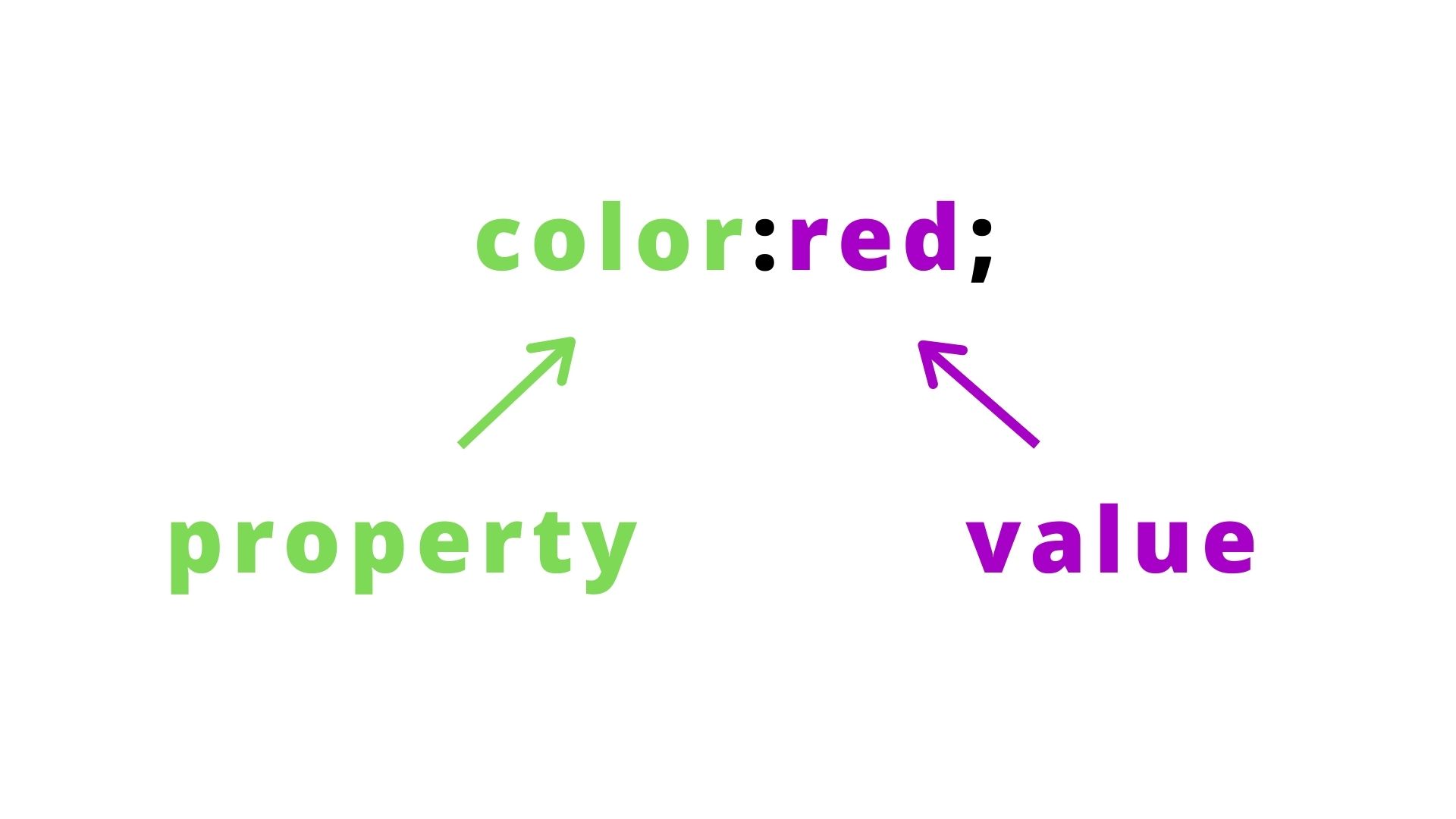
CSS Statement is written as property:value;
Each CSS statement will have a semicolon, so enter it one sentence at a time.
That’s it, we have successfully classified HTML as HTML and CSS as CSS.
In fact, there are two difficulties in learning CSS.
The first difficult part is how to learn to write CSS selector.
The second difficult part is how to learn to write CSS statements.
What you need to pay attention to with CSS selectors is how to “correctly” write CSS selectors.
Because sometimes in your content, there will not be only one p Tag, but there will be many other elements.
So how can you clearly identify the tag you want to style?
In the next chapter, I will learn with you the 4 most commonly used CSS selectors.
Chapter 2CSS Selector
CSS Selector is the most complex concept in CSS. Because it is a conceptual thing, you must fully understand it before you can use it.
For beginners, there are 4 types of CSS Selectors, which are:
- Element Type Selector
- Id Selector
- Class Selector
- Descendant Selector
Are you ready? Let’s get started!
Element Type Selector
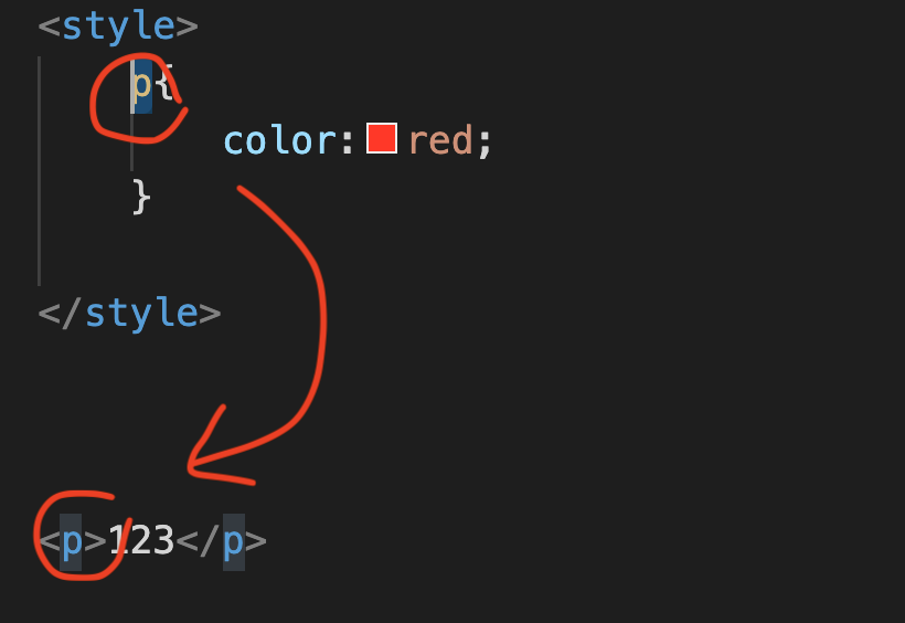
As mentioned above, how can you clearly identify the tag you want to style?
In fact, there are four methods. The first one is Element Type Selector.
This input method is the simplest. For example, the text in the picture above is p Tag. You only need to enter “p{}” above to use the CSS Selector.
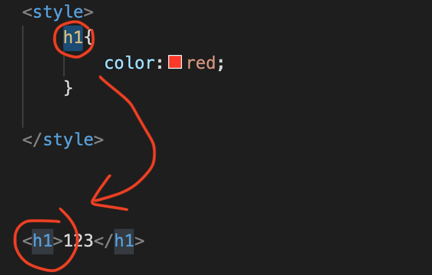
Next, if the text in the above image is an h1 Tag, then just enter h1{} as the CSS Selector.
Therefore, what should be noted about the Element Type Selector is that when the CSS Selector refers to the place, it will refer to everything in the content below.
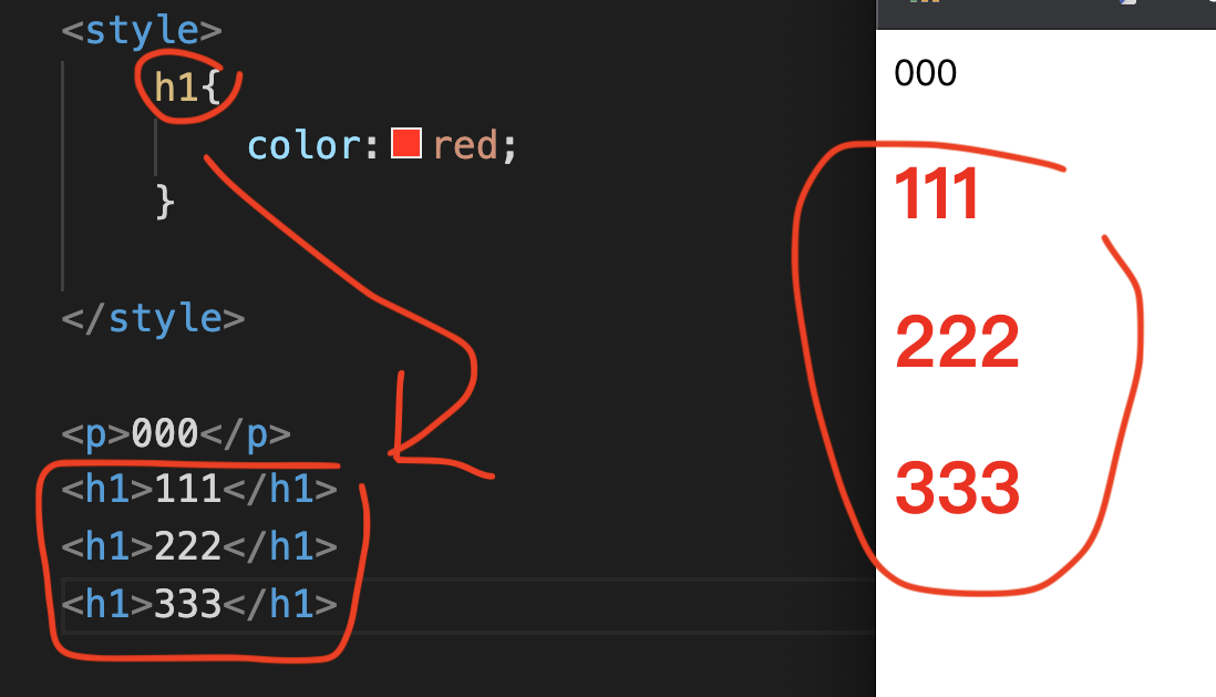
Just like in the picture above, when there are three h1s below, the h1 in the CSS pointer will include the three h1s in the picture above.
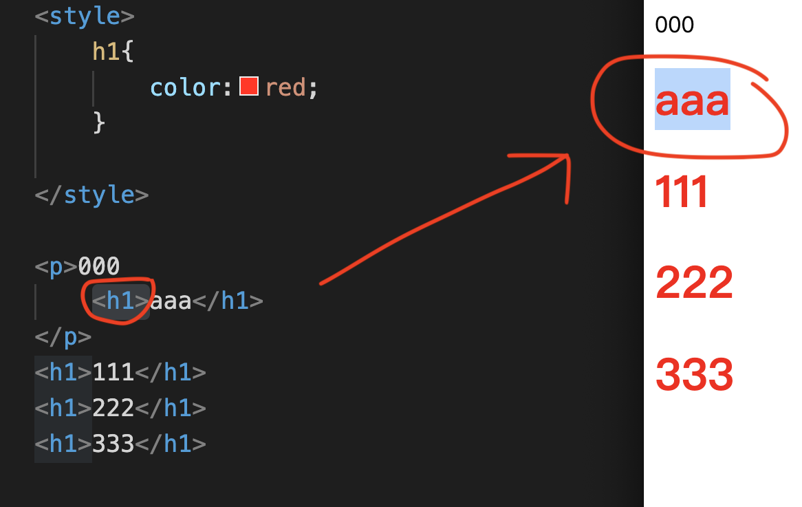
If h1 is in p Tag, it will also be affected.
The Element Type Selector affects all HTML elements, regardless of whether these HTML elements are wrapped by other things.
In this example, all h1 in p are affected.
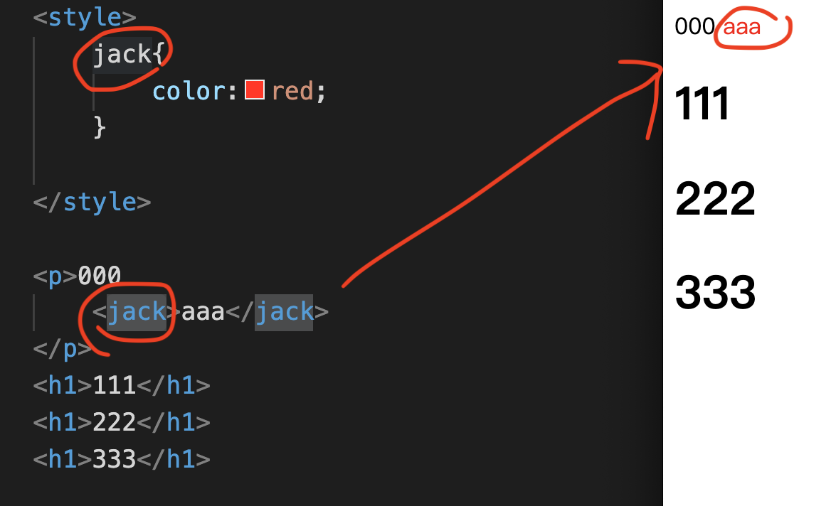
Suppose you create a non-existent Tag, such as: jack Tag. Similarly, CSS will clearly indicate the location of the jack Tag.
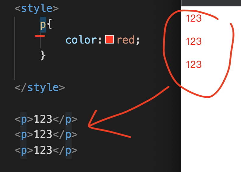
What if sometimes everyone just wants to point to one of the p Tags?
For example, if it is the p Tag in the middle, then using the above CSS Selector will not work.
Because you also know that once the Element Type Selector points, it will point to all p Tags (as shown in the picture above).
Id Selector
Because Tag Selector will affect all tags. If you only need to specify a tag, you can use the id or class selector.
It turns out that the above two functions: id and class, are actually attributes. Both are methods similar to changing names. These attributes are placed in HTML.
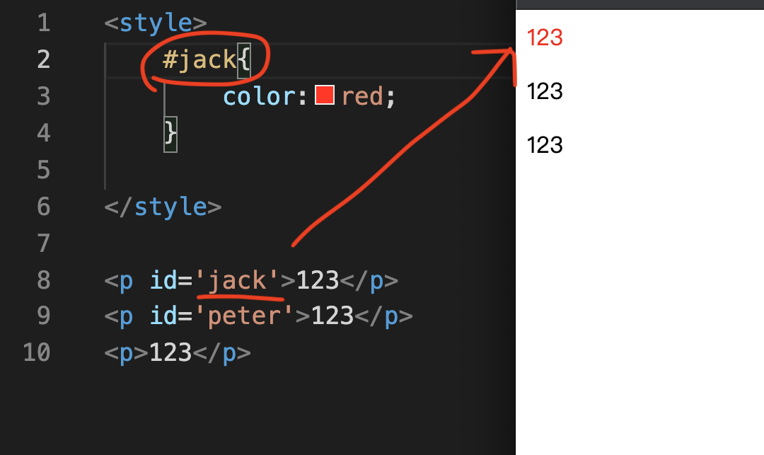
Now, we try to add two ids to the two p Tags:
For the first p Tag, enter id=’jack’,
For the second p Tag, enter id=’peter’.
Then in the CSS style Tag, change it to #jack.
It should be noted here that we cannot directly enter “jack”.
Because inputting “jack” means pointing to the jack Tag below, this is the wrong input method.
correctly points to the name of the id,
You enter “#” to point to its id, so you enter “#jack”.
After saving, you can try to use Chrome to open this File file to take a look.
Did you successfully turn the first p Tag into red text?
Another characteristic of Id is that it is independent and uniquely set.
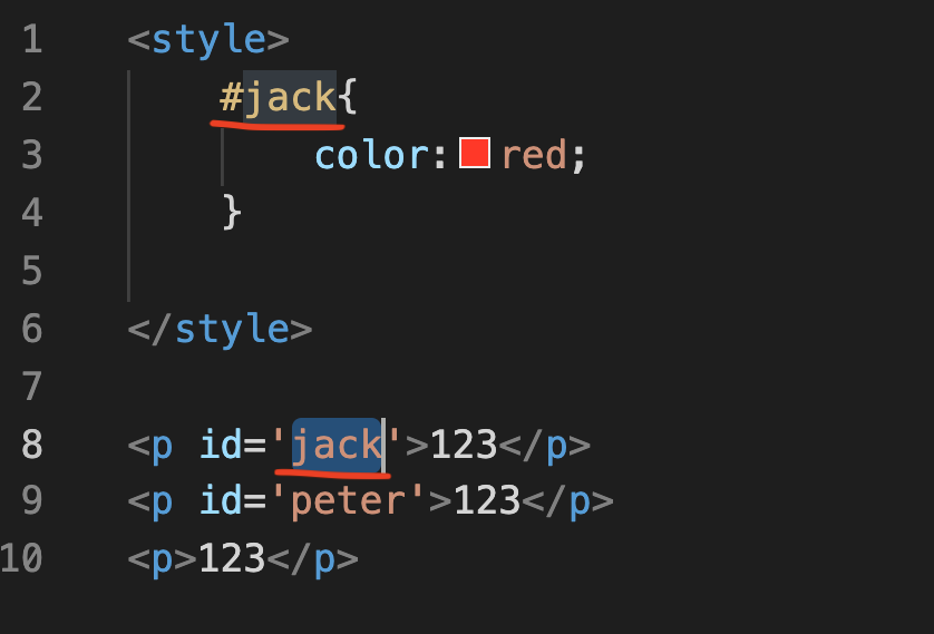
For example, in the picture above, the id in the HTML p Tag is jack.
Then in this file, there will not be another element’s id, which can be called “jack”.
Class Selector
After understanding the id Selector, we have to come to the third method, called Class Selector.
The methods of class and id are also very similar. They are all derived from attributes, but I will explain the differences one by one below.
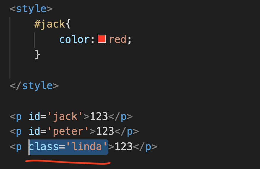
Let’s try to enter class=’linda’ in the third p Tag,
<p class=’linda’>123</p>
Then in the CSS style Tag, change it to “.linda”.
See the Pen by Chan Ying Yeung (@chan-ying-yeung) on CodePen.
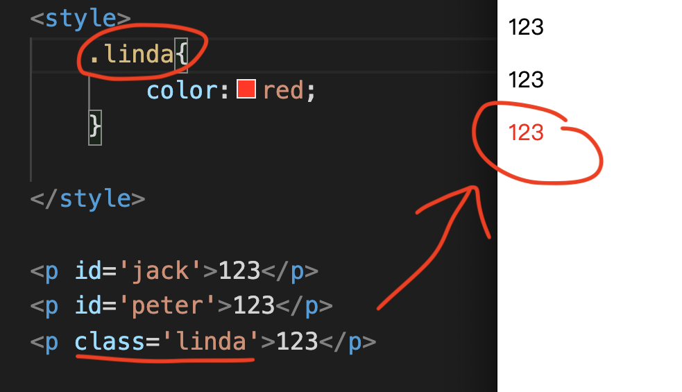
After saving, you can try to use Chrome to open this File file to take a look.
Did you successfully turn the third p Tag into red text?
Here you will find,
“#” points to the id,
“.” points to class.
You may ask,
Why are id and class so similar, and why are there two types of CSS Selectors?
In fact, the first feature is that class and id are different. ID is unique, while class can be used repeatedly.
See the Pen by Chan Ying Yeung (@chan-ying-yeung) on CodePen.
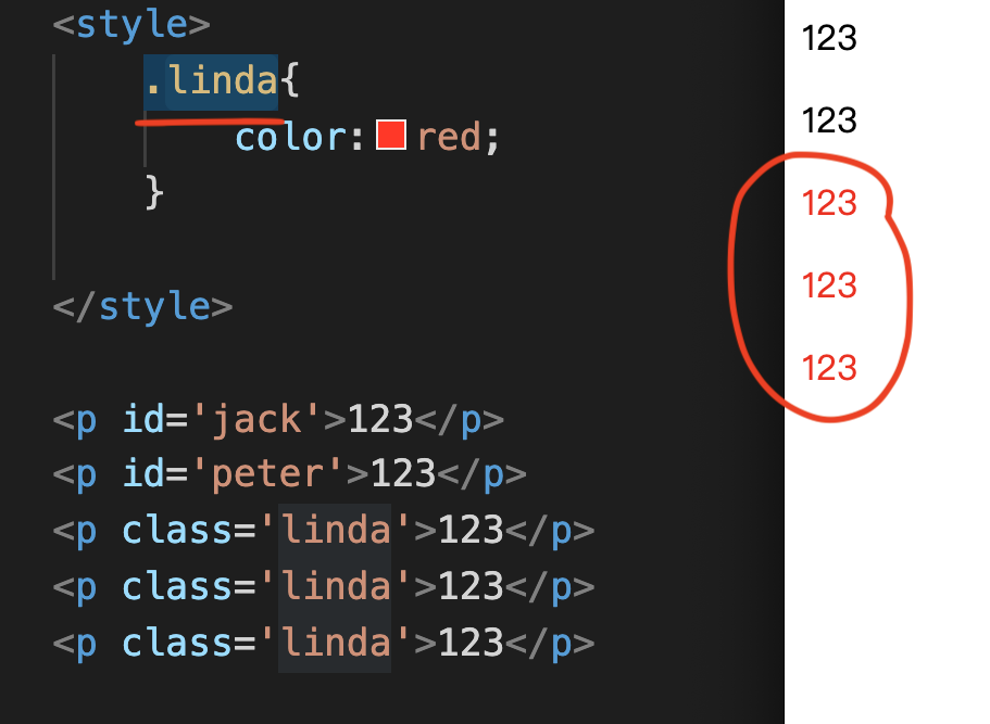
For example, in the picture above, there are three p Tags, all of which have class linda, so the CSS Selector will affect all linda at the same time.
Class Selector is not unique. You have a p tag whose class is linda, and the classes of other tags can also be linda.
The second feature of Class Selector is that the same HTML element can have many different classes.
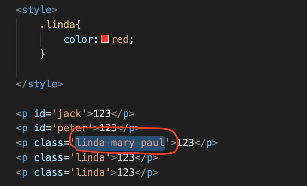
As shown in the picture above, you can see that after entering linda, you can enter mary, and you can also enter paul.
Just put a space between each name.
See the Pen by Chan Ying Yeung (@chan-ying-yeung) on CodePen.
What should be noted here is that this class is not called “linda mary paul”, but can be called “linda”, “mary”, or “paul”.
If I want to point to it, I just need to enter one of the classes,
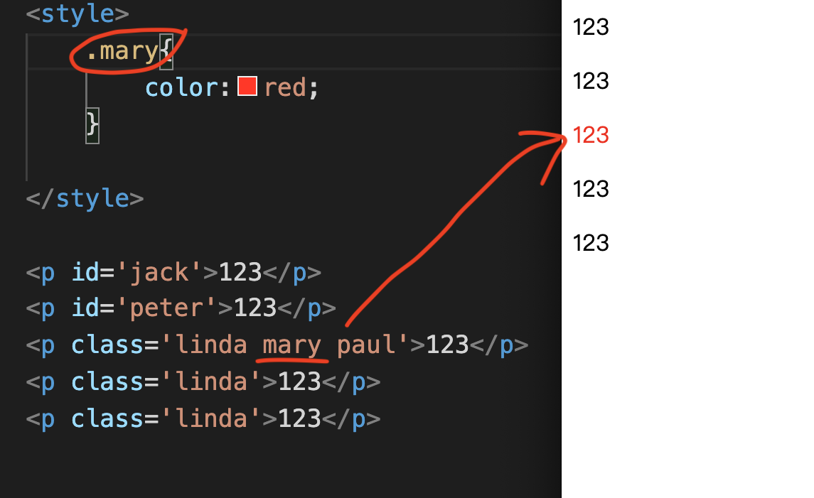
Just like “.mary” in the picture above, it will also successfully point to the p Tag in it.
Finally, there is another feature, that is, id and class can coexist at the same time.
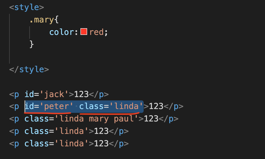
If you want to point to the p Tag in the picture above, you only need to point and enter #peter, or enter .linda, and you can point to the same HTML Element.
The above is the basic concept of id selector and class selector.
Descendant Selector
In fact, the id selector and class selector do not solve all the selector problems, so at this time, we have to come to the last selector, which is also the most complex selector.
The name is descendant selector.
Why is it the most complicated selector?
Let’s take a look!
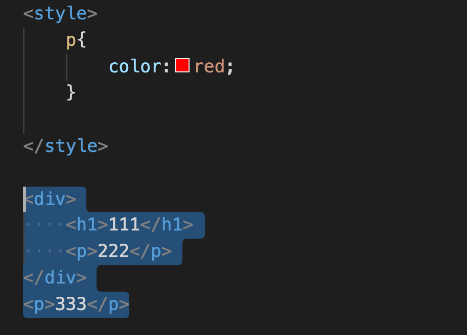
Let’s enter the div Tag together, and then enter the h1 Tag and p Tag in the inner layer.
And enter another p Tag outside the div.
This div will have a class called paul.
See the Pen by Chan Ying Yeung (@chan-ying-yeung) on CodePen.
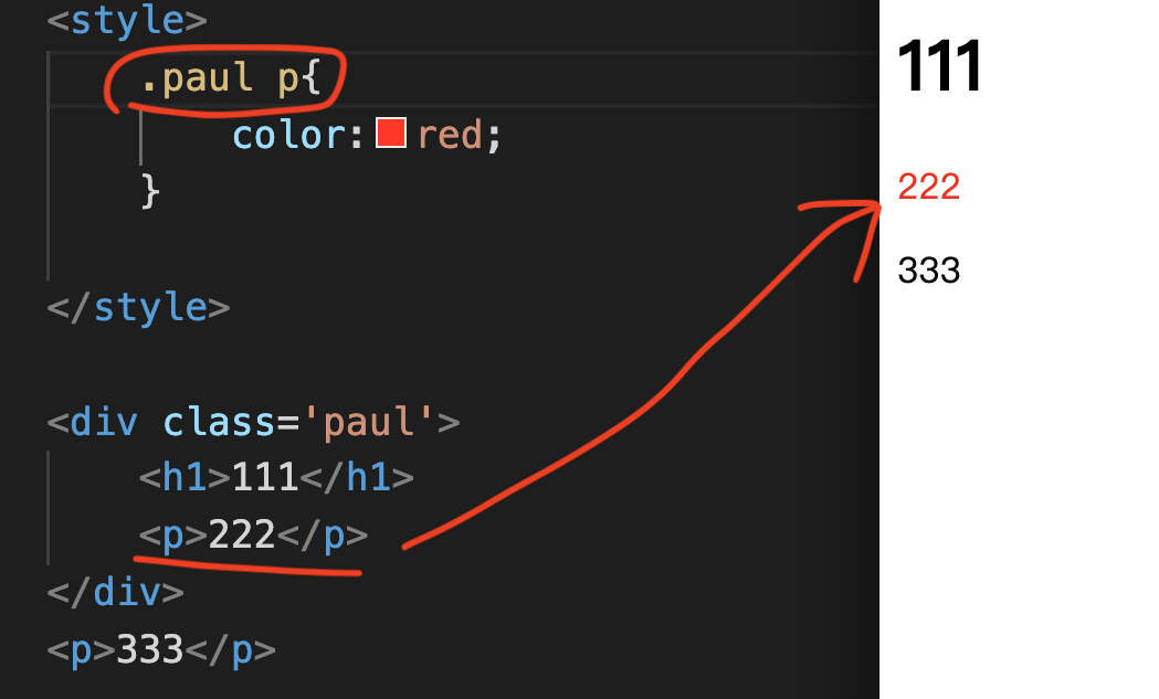
At this time, you will find that the original selector .paul p will point to the p Tag in the div, not the p tag outside the div.
Descendant selector is Princess. For example, .paul p, represents:
To point to all p tags, these p tags need to be wrapped by class paul.
As shown in the picture above, although there will be two p Tags, class=’paul p’ clearly indicates that there must be a p Tag in class paul.
So you will see “222” turn into red text, but “333” will not turn into red text.
Why do I explain that this selector is very complicated?
The reason is that this selector can be extended infinitely.
See the Pen by Chan Ying Yeung (@chan-ying-yeung) on CodePen.
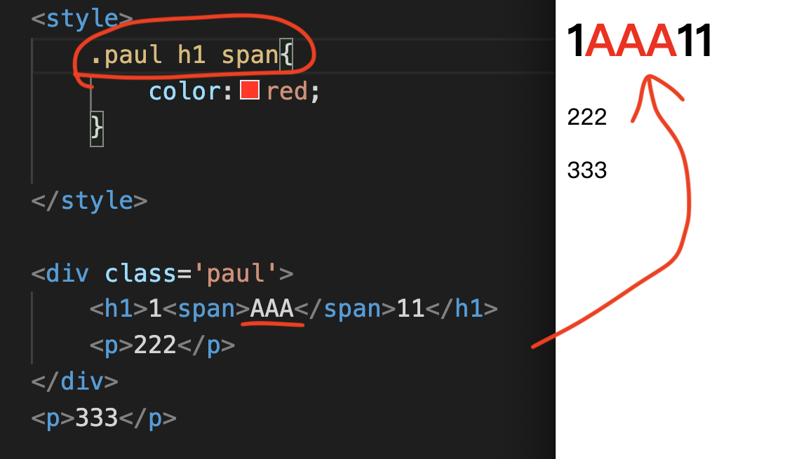
How complicated could it be?
I tried to add a span tag here in h1 and enter “AAA” in the text.
Then the CSS Selector was changed to .paul h1 span,
.paul h1 span{color:red;}
You will see the text “AAA” changed to red text.
This refers to all spans, and these spans must be wrapped by h1.
And h1 should be wrapped in paul.
Finally, one thing to note is that this fingering method is not limited to the number of layers.
What does unlimited number of layers mean?
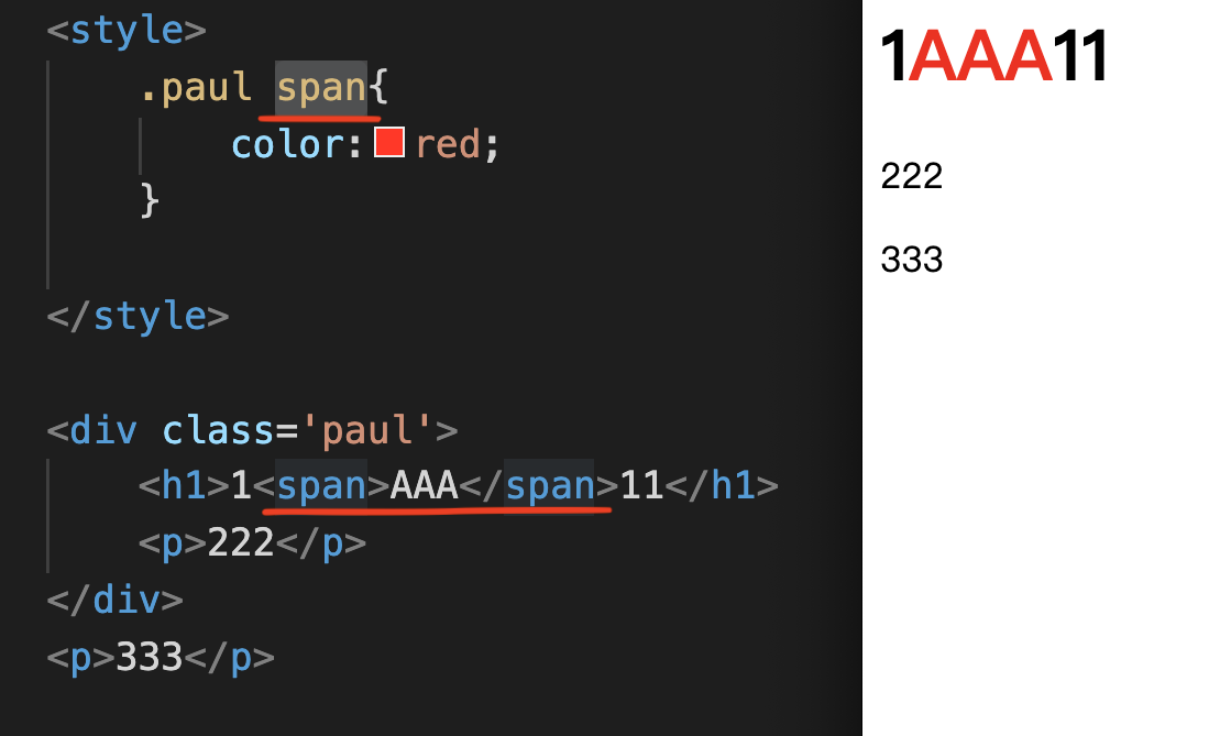
For example, in the picture above, enter .paul span as the Selector.
Similarly, the AAA of the span in the middle text will be successfully pointed to and turned into red text.
Although there is h1 in the middle layer, it doesn’t matter.
Because as long as the span is wrapped by Paul, it will be successfully pointed.
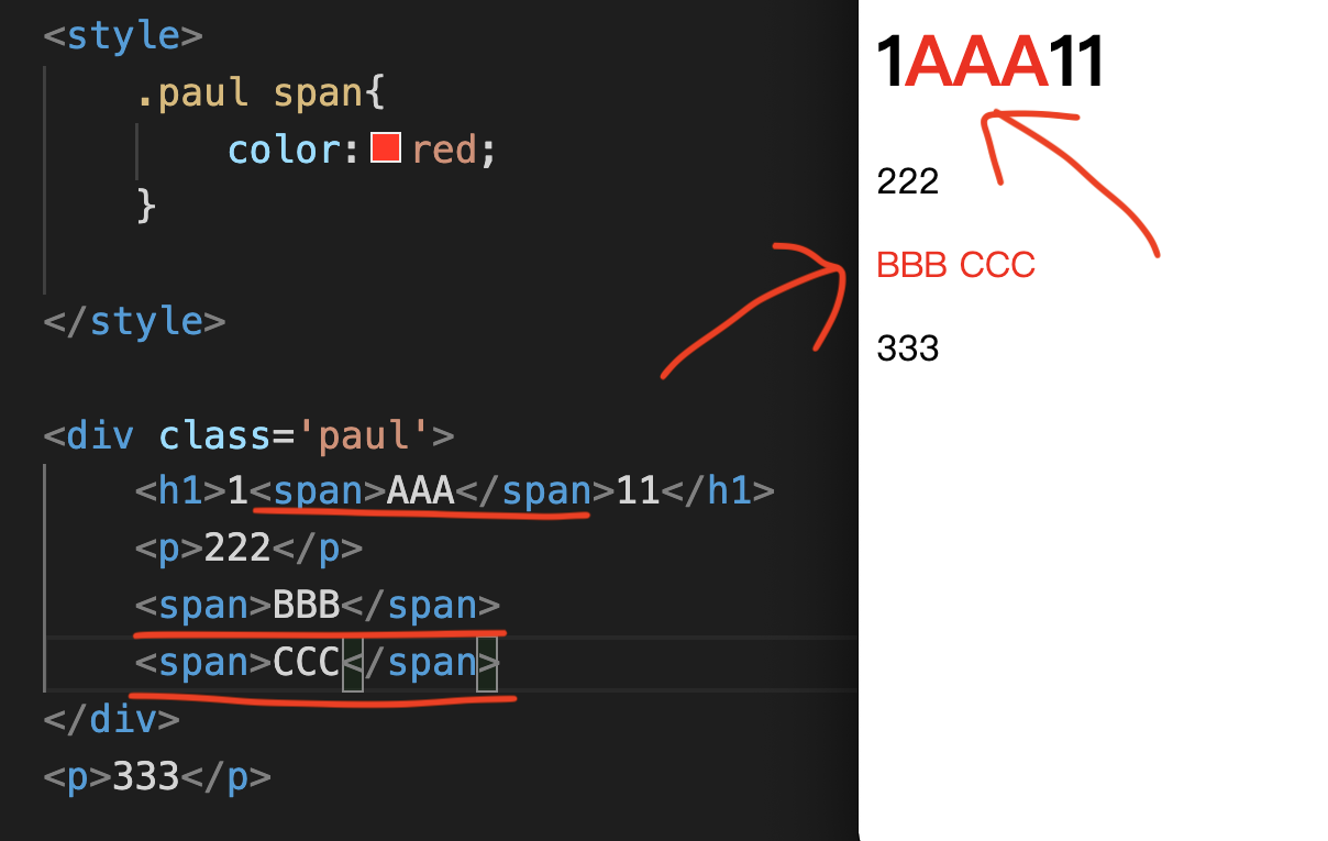
Another example, as long as span is wrapped by paul, then all spans will be pointed, as shown in the picture above.
The above is the most complex descendant selector.
Let’s practice well, everyone!
Chapter 3 CSS Text
CSS statement is relatively simple compared to CSS selector.
Because, if you have a CSS statement that you don’t know, you can actually search it on Google and find how to write it.
For example, you can check out this teaching website: w3schools.com/css
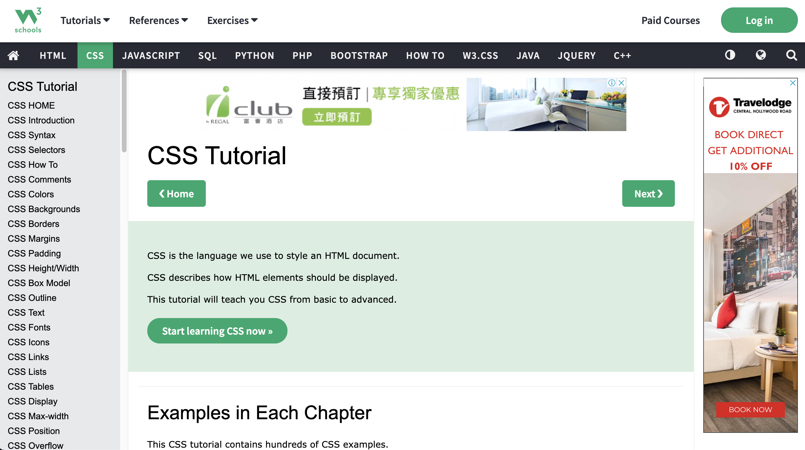
This is a very detailed CSS English website. You can just use it as a CSS dictionary.
Since there are so many CSS statements, we have to learn them by category.
The first category is CSS text!
There will be a lot of CSS styles in the text chapter. I will teach you step by step below.
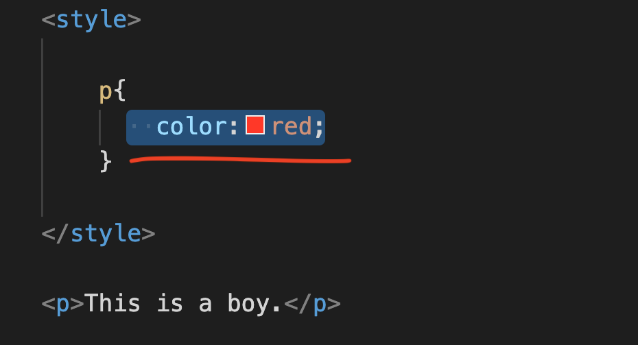
First, enter the p Tag and style Tag in the picture above. The format must be consistent with my input method above. After opening the style Tag, press the corresponding position in the picture to separate a space, enter p{}, and enter “color:red;” in {}.
p{color:red;}
The content of p Tag can be entered as “This is a boy.”
<p>This is a boy.</p>
See the Pen by Chan Ying Yeung (@chan-ying-yeung) on CodePen.
The color entered in the picture above is always the ordinary red solid color.
In fact, in addition to solid red, red also comes in many different shades.
So, how can we express it?
Let’s first search Google for “Color Picker”.
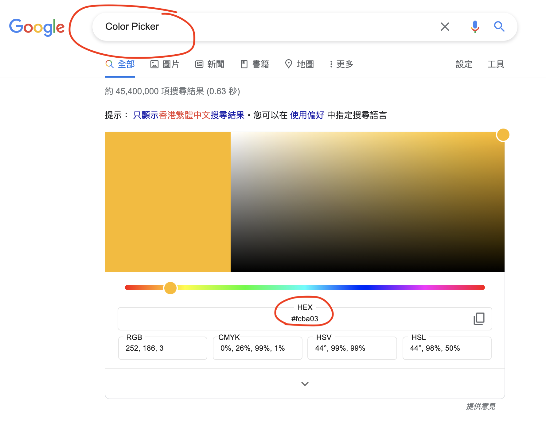
You will see that each color is represented by a code.
The most commonly used one here is HEX code.
You will see # and the 6-digit English number “#XXXXXX” which is the HEX code.
For example, “#fcba03” in the picture above, let’s enter it together:
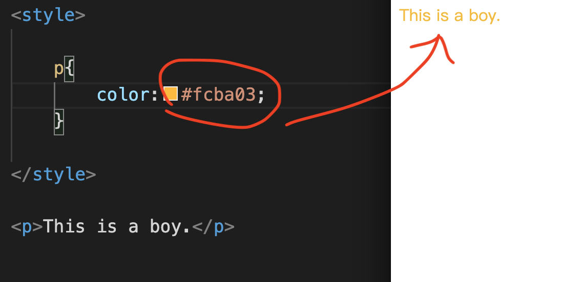
We change red to #fcba03,
So enter “color:#fcba03;”.
p{color:#fcba03;}
See the Pen by Chan Ying Yeung (@chan-ying-yeung) on CodePen.
After saving, you can try to use Chrome to open this File file to take a look.
Did you successfully change the red color to this yellow color?
In addition to HEX code, another one can be RBG,
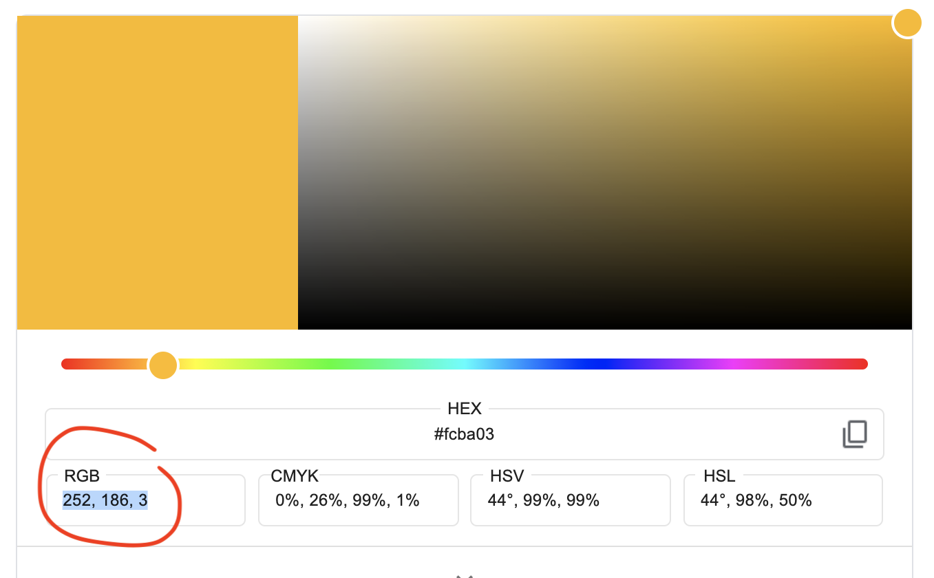
You will see that RGB has 3 numbers, such as 252,186,3 in the picture.
The input method is “color:rgb(252,186,3);”
p{color:rgb(252,186,3);}
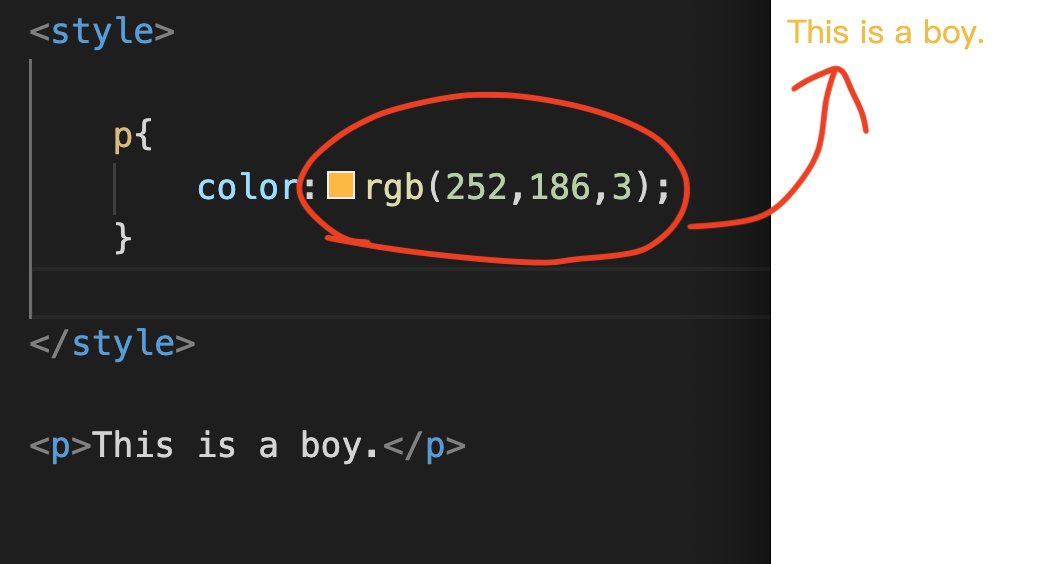
See the Pen by Chan Ying Yeung (@chan-ying-yeung) on CodePen.
There is another commonly used method, which is rgba. This rgba has one more number.
This number is between 0 and 1, which is transparency.
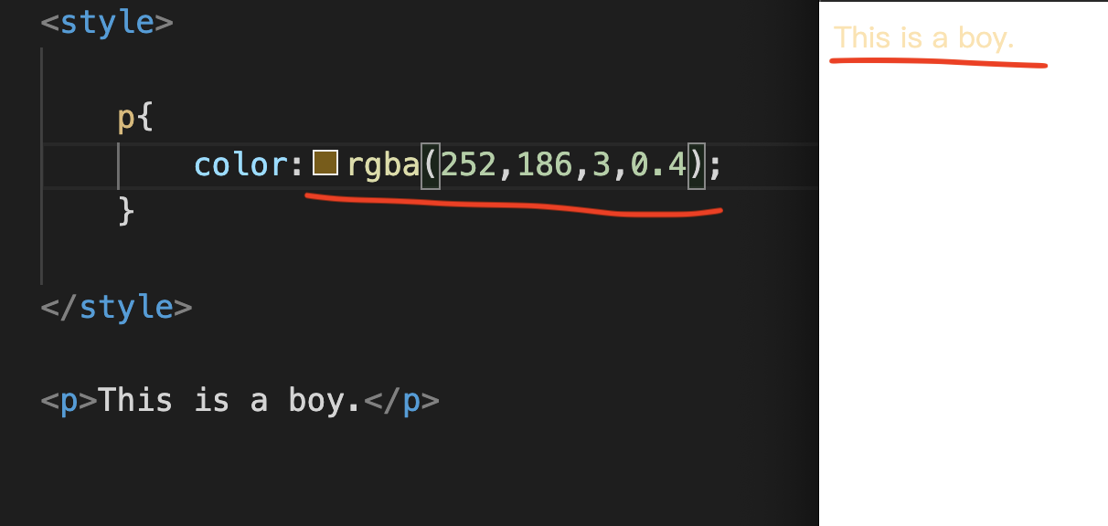
We try to enter 0.4, which has a slightly transparent effect.
See the Pen by Chan Ying Yeung (@chan-ying-yeung) on CodePen.
When will this feature be used?
This method can be used when you just want to change the color to make it transparent.
Font Size font size
In addition to changing the font color which is the most commonly used, the second most commonly used is changing the font size.
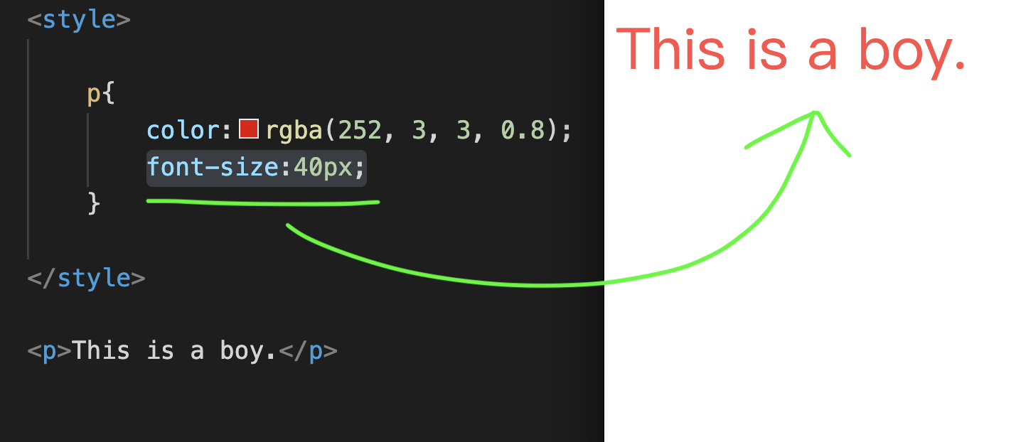
Let’s enter “font-size:40px;” in CSS together, as shown above.
p{font-size:40px;}
See the Pen by Chan Ying Yeung (@chan-ying-yeung) on CodePen.
After saving, you can try to use Chrome to open this File file to take a look.
We successfully made the text larger.
What should be noted here is that some people also use em or percentage as the unit.
Letter Spacing
After learning to change the font color and font size,
Next, the next thing to learn is letter spacing.
Letter spacing means the distance between words (kerning).
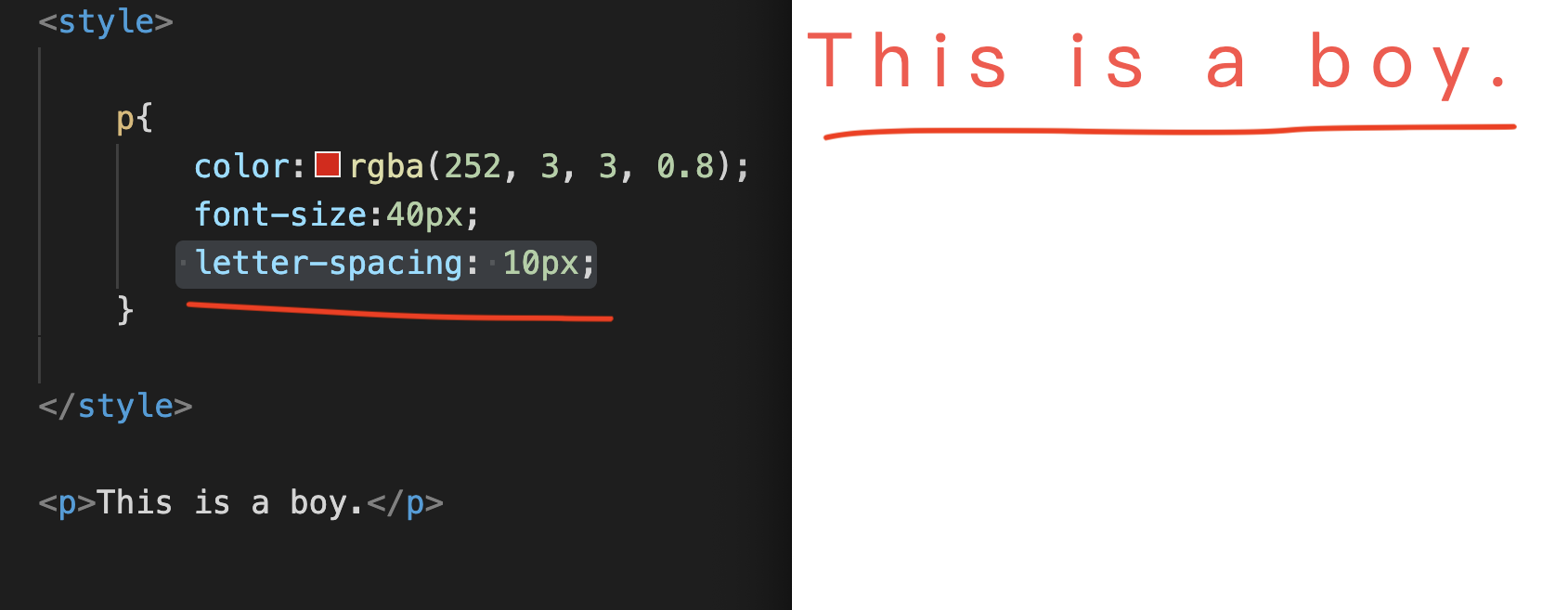
Let’s enter “letter-spacing: 10px;” into the CSS together, as shown above,
p{letter-spacing: 10px;}
See the Pen by Chan Ying Yeung (@chan-ying-yeung) on CodePen.
After saving, you can try to use Chrome to open this File file to take a look.
We succeeded in increasing the distance between words.
This effect is commonly used in titles,
Because sometimes, widening the character spacing in the design can add some modern effects.
Line-Height line spacing
After learning about kerning, of course, there is also line spacing!
The next thing to learn is line-height.
What is line-height?
Line-height is actually the distance between lines (line spacing).
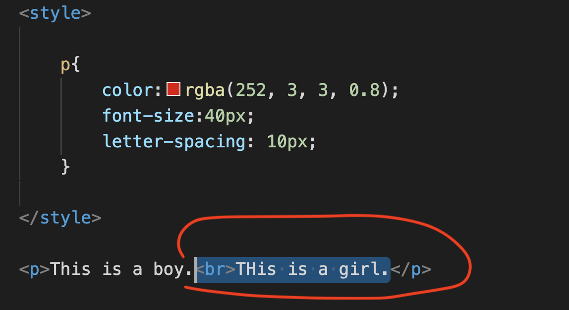
We are in the p Tag content,
Enter < br> to separate the lines, then enter “This is a girl.”
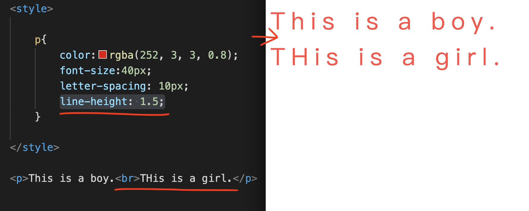
Then enter “line-height: 1.5;”, as shown above,
See the Pen by Chan Ying Yeung (@chan-ying-yeung) on CodePen.
After saving, you can try to use Chrome to open this File file to take a look.
We succeeded in increasing the distance between rows.
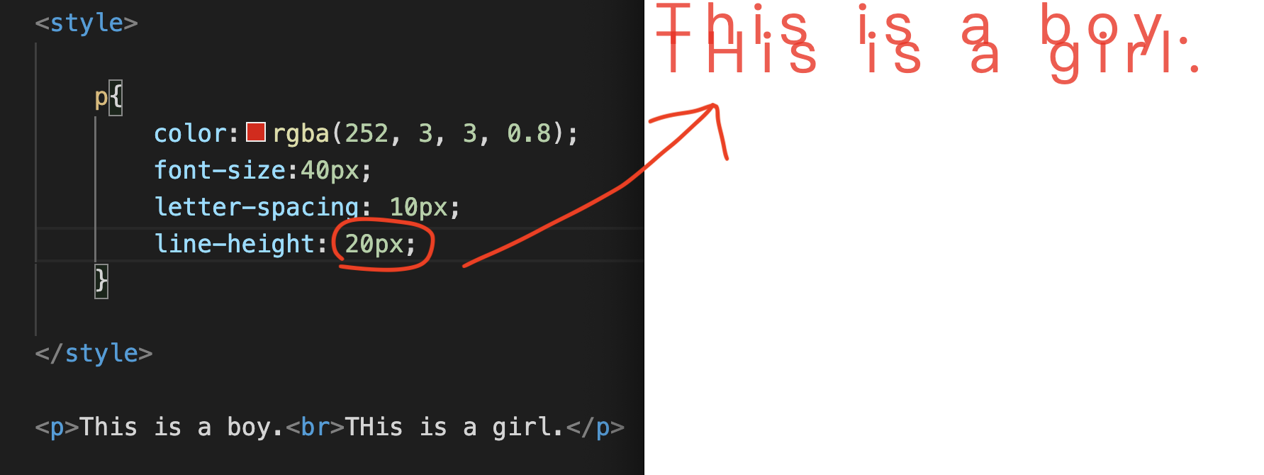
In fact, you can also choose to enter pixel to achieve this.
For example, enter 20px like this.
So everyone, practice more.
Make good use of this feature to design beautiful text layouts.
Font-Weight thickness
In addition to mastering the sense of space in font layout, the thickness of the font is also indispensable!
So the next thing to learn is font-weight.
It means the thickness of the characters (100-900 respectively).
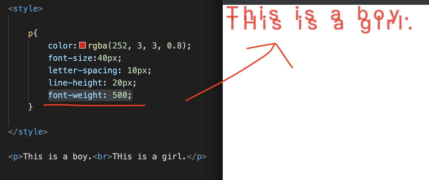
Let’s enter “font-weight: 500;” together to see what the effect will be if the font thickness is 500.
p{font-weight: 500;}
See the Pen by Chan Ying Yeung (@chan-ying-yeung) on CodePen.
In fact, changing the thickness of the font effect can be set from 100 to 900. You can adjust it according to the design style to suit the effect you want.
Text-decoration:underline bottom line
After we understand the thickness and thickness, we try to add another interesting function, such as increasing the bottom line of the font.
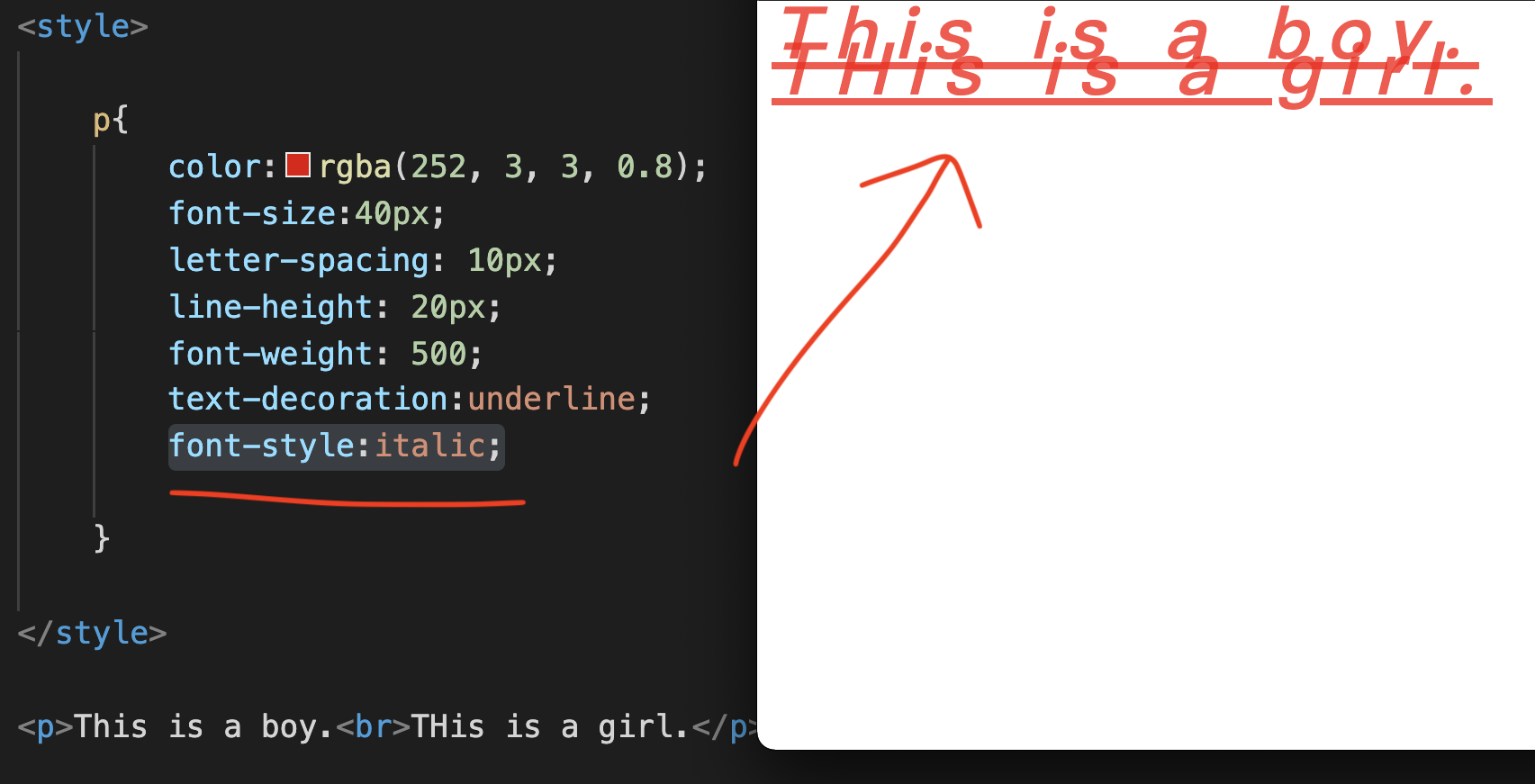
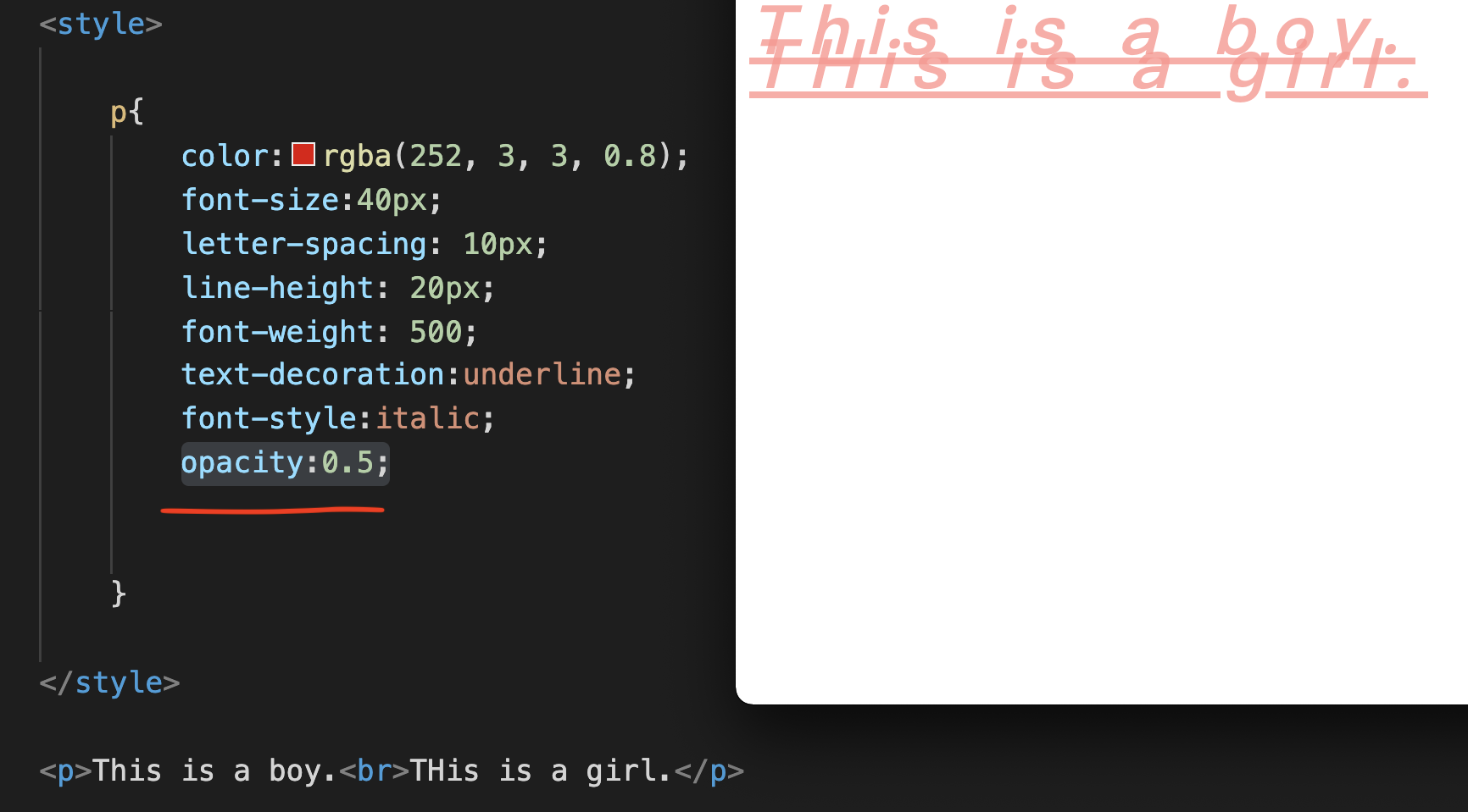
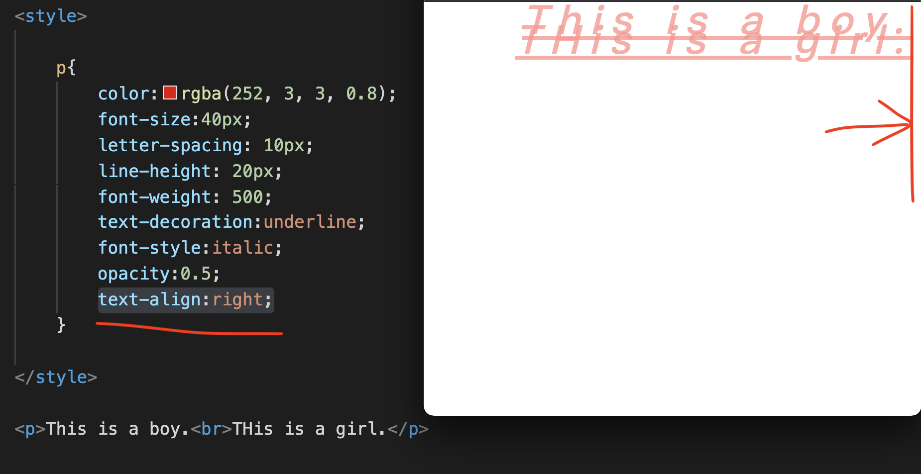
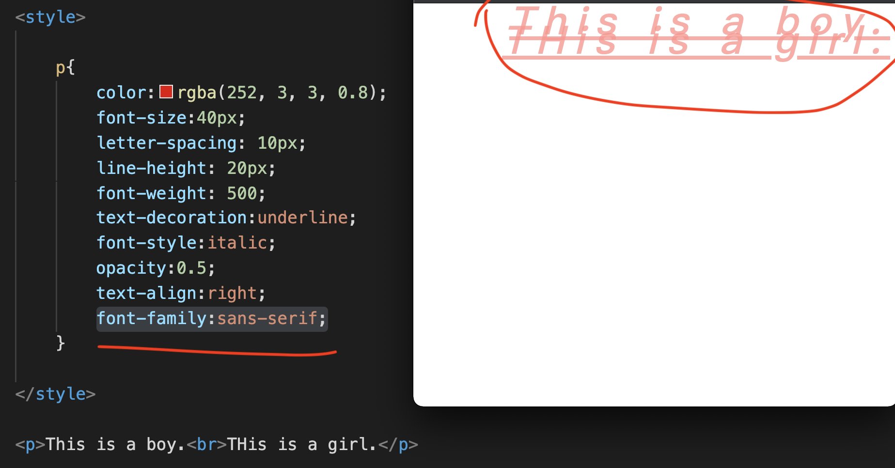
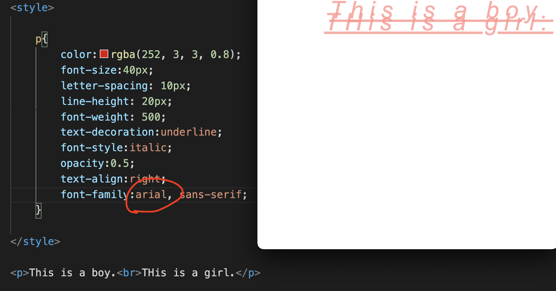
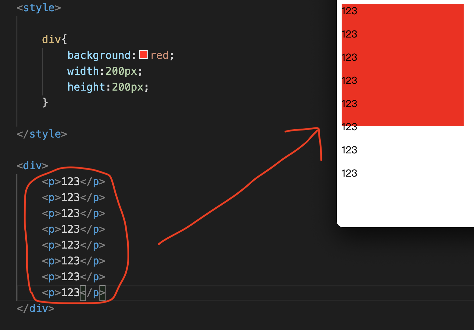
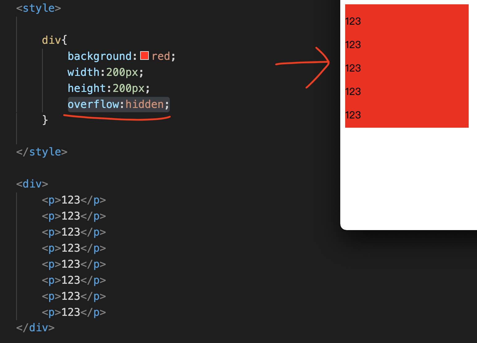
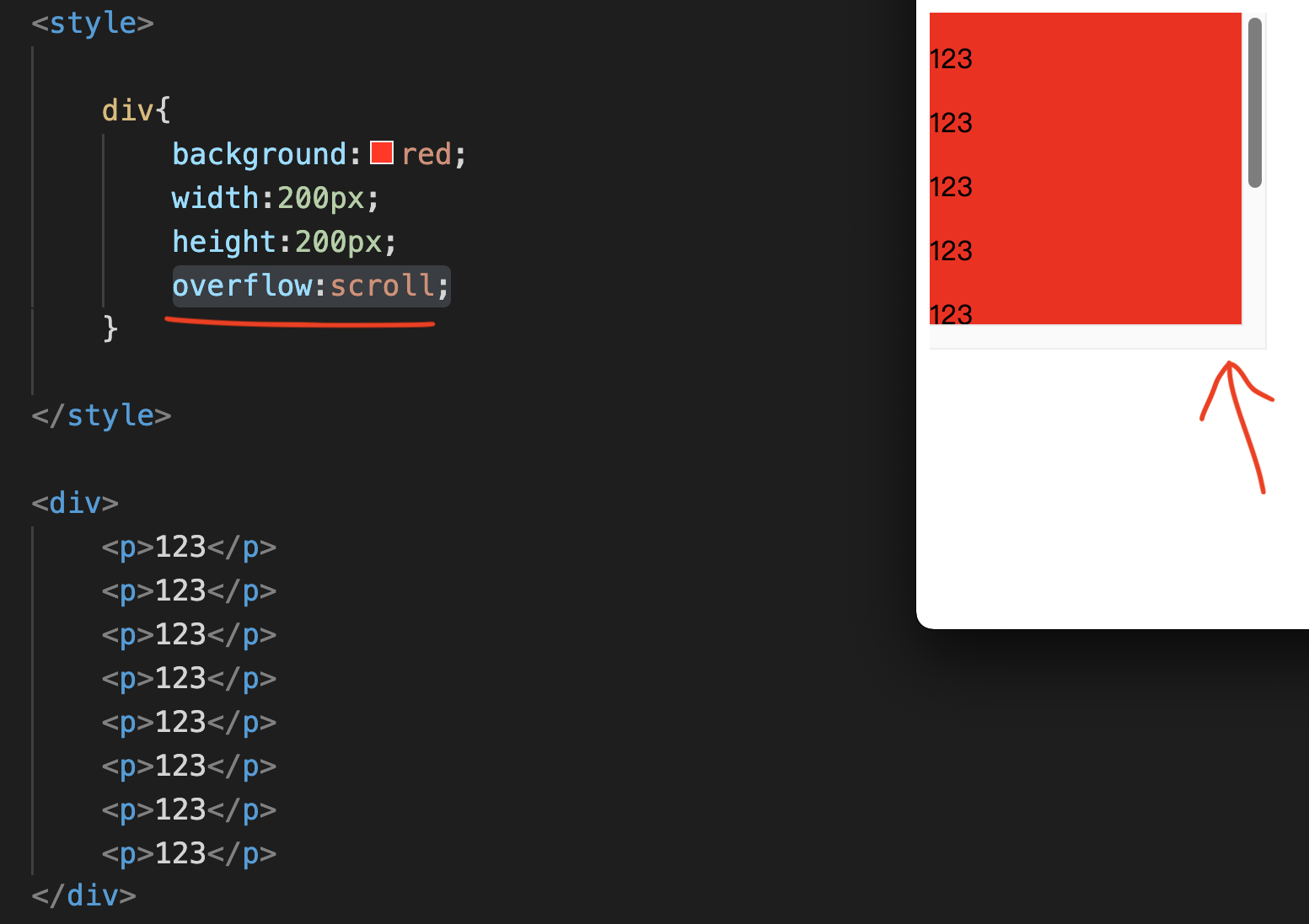
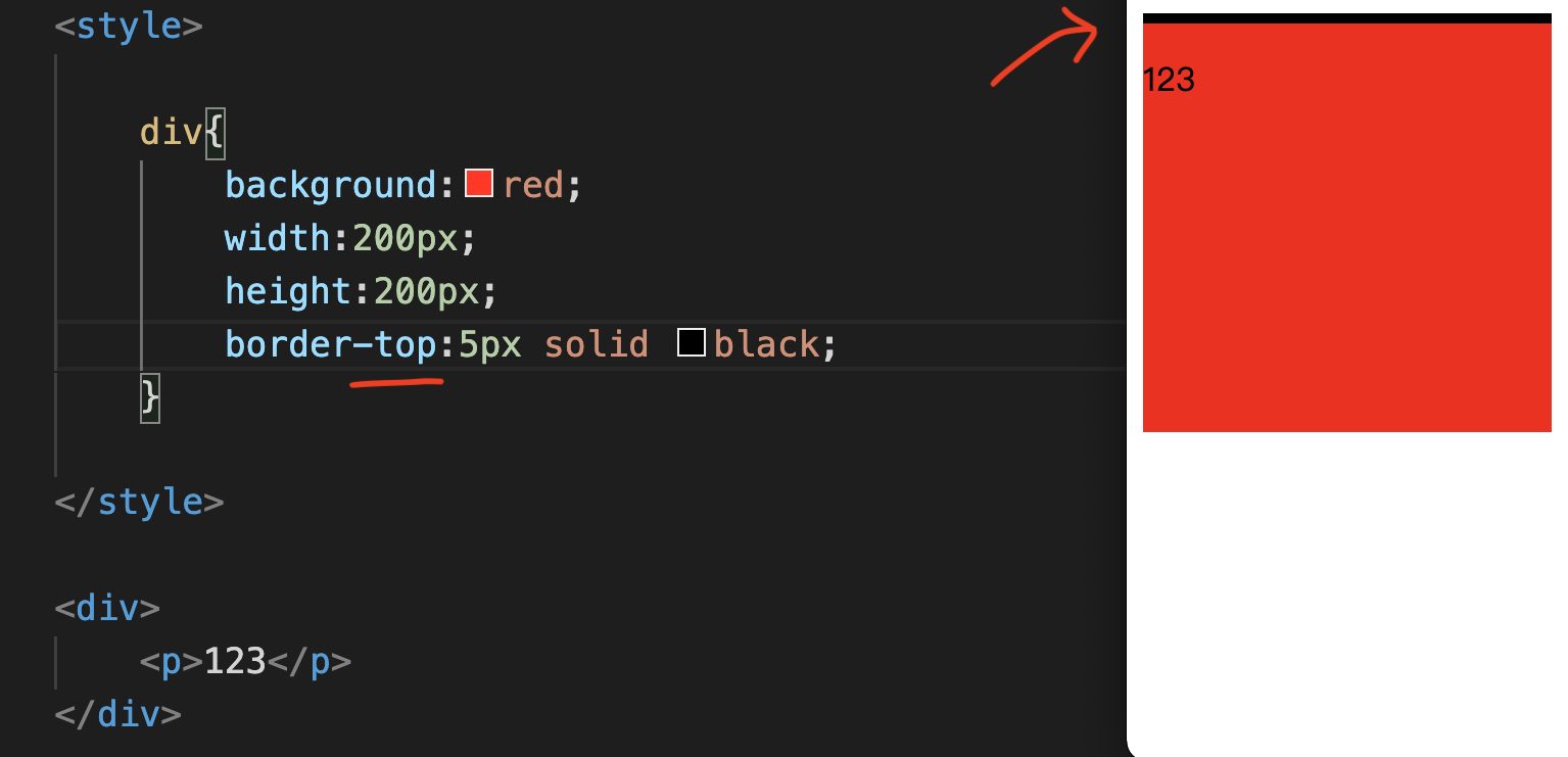
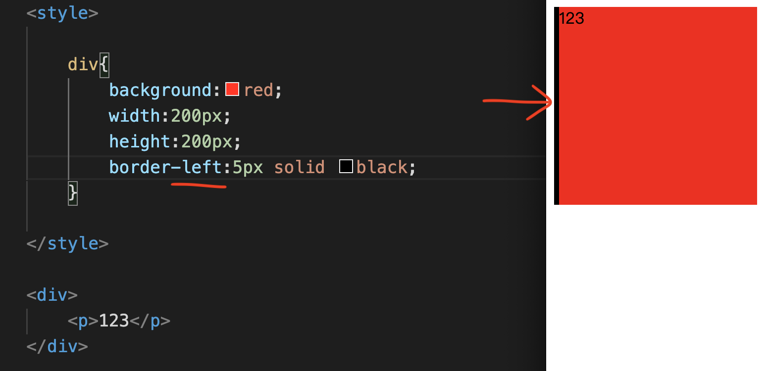
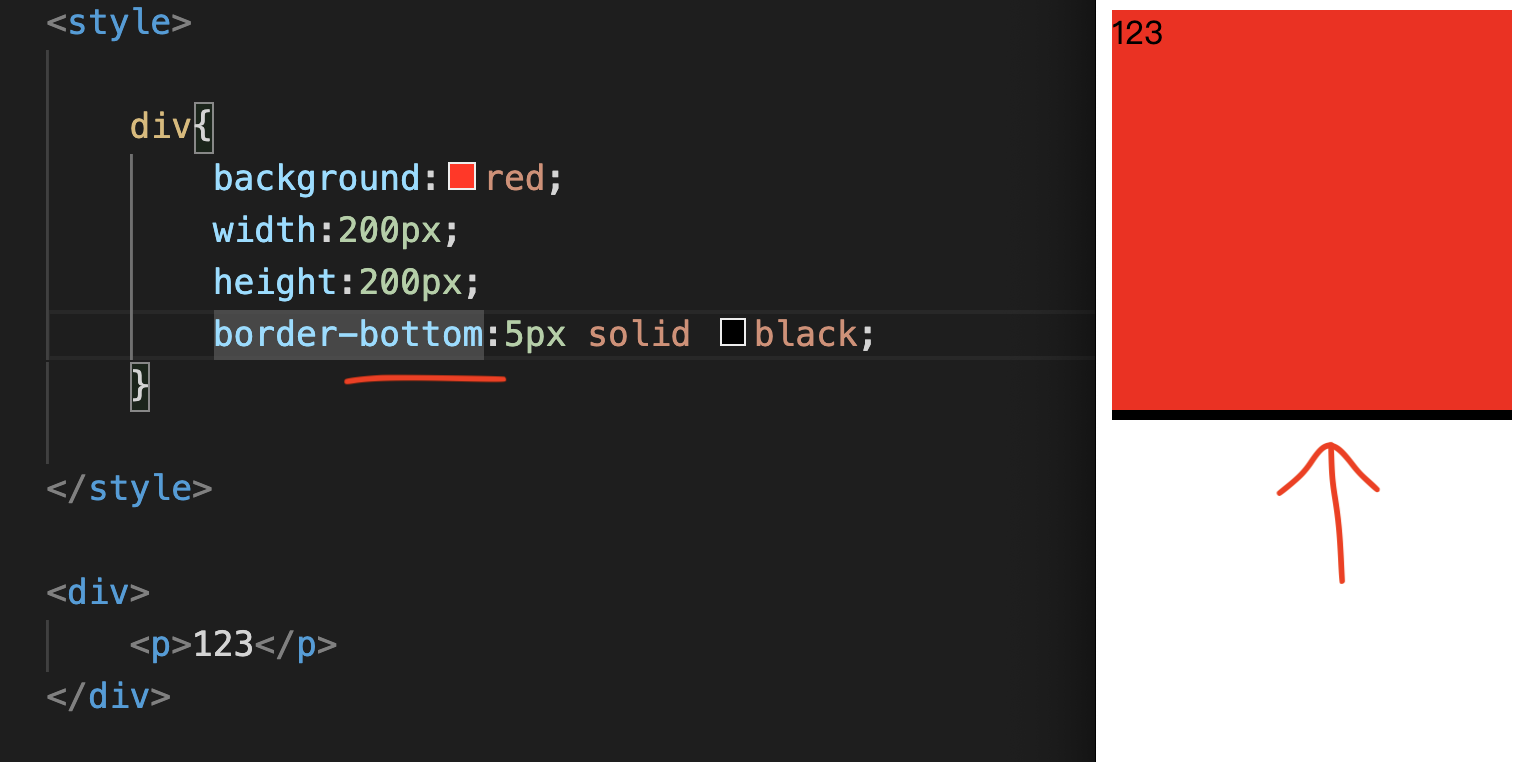
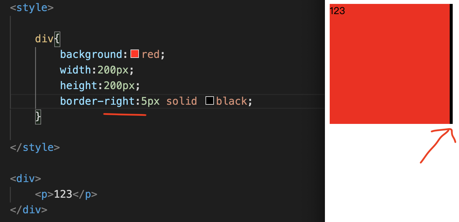
Let’s enter “text-decoration:underline;” together, p{text-decoration:underline;} See the Pen by Chan Ying Yeung (@chan-ying-yeung) on CodePen. See if you successfully increase your bottom line. Sometimes, in order to meet the design effect, it is necessary to change the font to italic. Now let’s take a look at how Font Style is input. Let’s enter “font-style:italic;” together, p{font-style:italic;} See the Pen by Chan Ying Yeung (@chan-ying-yeung) on CodePen. The most commonly used effect of Font style is to change the font into italics. After typing, see if it is successfully changed to italics. If the above functions are not enough to meet the design effect, for example, the transparency needs to be changed. Then, we need to learn the function of changing transparency. Please join me in typing “Opacity:0.5;” p{Opacity:0.5;} Change the transparency to 0.5, See the Pen by Chan Ying Yeung (@chan-ying-yeung) on CodePen. After inputting, see if it is successfully transformed into a transparent effect. Sometimes in order to facilitate the arrangement of space, sometimes we need to change the layout position of text. How can we do this? At this time, we need to use the text-align:center (text align) function. This function is to align left/center/right corresponding to text. We will teach you the details of this text-align later, but here we have a preliminary understanding of its functions first. Let’s enter “text-align:right;” together, p{text-align:right;} See the Pen by Chan Ying Yeung (@chan-ying-yeung) on CodePen. After inputting, see if the entire p Tag content has been successfully changed to the right layout! Coming to the final text basic teaching, in addition to the above different types of text changing functions, everyone also needs to learn how to change fonts. Regarding font conversion, I will use another font article to explain it later. Here you can first learn how to enter. Let’s try typing together, such as “font-family:sans-serif;”, p{font-family:sans-serif;} See the Pen by Chan Ying Yeung (@chan-ying-yeung) on CodePen. The text font in the picture above is already set to a sans-serif font. Then, we try to enter “Arial,” in front of sans-serif, This means to instruct the computer to use the arial font if there is “Arial”. If not, use the “Sans-serif” font instead. See the Pen by Chan Ying Yeung (@chan-ying-yeung) on CodePen. In addition to the Default font, you can also import other fonts by yourself. The above tutorial is a basic text CSS Statement. Only CSS text is actually not enough. Next, we need to learn various practical functions of CSS. In the practical part, you will learn more different CSS Statements, including: Are you ready? Let’s start the practical part of CSS right away! Next, we come to the next CSS Statement, I will learn some more practical things. The practical chapters will teach you the following: width、height、background、overflow。 We first enter a style Tag and div Tag, Then enter div{} in the style tag, Inner layer input background:red;, The above means that the background input is red. After saving, you can try to use Chrome to open this File file to take a look. We successfully made a red box, Width and height are both 200px. Then we try to enter more p Tags inside the div Tag. After saving, then refresh the File in Chrome to take a look. You will find that some of the p Tag text leaves the red box. How can this problem be solved at this time? We can add a Tag called “overflow:hidden;” div{overflow:hidden;} This function prevents text that leaves the red box from being displayed again. Another method is to enter “overflow:scroll;” div{overflow:scroll;} The extra text will be wrapped by a scroll bar. Box Model is one of the most commonly used concepts in the entire CSS Statement. Next, we need to learn the various functions of Box Model. There are 3 things in Box Model: Are you ready? Let’s get started right away! Next, we have more CSS Statements to learn. Box Model is one of the most commonly used concepts in the entire CSS Statement. Box Model includes: We call these box models for short. Box Model is a very important concept. To put it simply, each element, such as a piece of text, has a Border. The space between the Border and the text is Padding. The space outside Border is Margin. Something to note here, Under normal circumstances, it will not be displayed. That is to say, there is no border shape, which probably means there is an invisible border line. After understanding the basic concepts, Now let’s enter the Box Model together! We enter “border:5px solid black;” in style, div{border:5px solid black;} See the Pen by Chan Ying Yeung (@chan-ying-yeung) on CodePen. Solid represents solid color. The color is black and the width is 5px. After saving, then refresh the File in Chrome to take a look. Can’t you see, we successfully made a black border. This input method has left, upper, lower and right at the same time. What can you do if you only want to fall into one of the lines? We enter -top for border, and the black line will fall to the top position. See the Pen by Chan Ying Yeung (@chan-ying-yeung) on CodePen. There is also border-left, which is the left position. See the Pen by Chan Ying Yeung (@chan-ying-yeung) on CodePen. Next is border-bottom, which is the bottom position. See the Pen by Chan Ying Yeung (@chan-ying-yeung) on CodePen. Then there is border-right, which is the right position. See the Pen by Chan Ying Yeung (@chan-ying-yeung) on CodePen. After that, we try to enter padding:50px; See the Pen by Chan Ying Yeung (@chan-ying-yeung) on CodePen. Padding is the position where the border enters the surface. After saving, then refresh the File in Chrome to take a look. You will find that there is an additional 50px red blank space at the top, bottom, left and right of content 123. Similarly, padding can also only input one of the top, left, bottom and right sides. The input method is as follows: padding-top, top position, There are also some lazy input methods, For example, as shown above, enter “50px 10px”. See the Pen by Chan Ying Yeung (@chan-ying-yeung) on CodePen. Meaning, 50px represents the top and bottom positions, and 10px represents the left and right positions. There is also another lazy input method, which is to enter 4 numbers. The position represented by 4 numbers, It’s clockwise: up, right, down, left. For example, in the picture above: This lazier input method can support both padding and borders. In addition to changing the inside of the Box, you can also change the external position of the Box. Changing the external position function of Box is margin. Margin is at the top, outside the border. Let’s enter together: margin:50px; See the Pen by Chan Ying Yeung (@chan-ying-yeung) on CodePen. After saving, then refresh the File in Chrome to take a look. You will see that the margin is the location of the green circle in the picture above. Margin, like padding and border, can also use lazier input methods. What everyone should also pay attention to here is that, A commonly used input method is: margin:0 auto; See the Pen by Chan Ying Yeung (@chan-ying-yeung) on CodePen. What does it mean? It means that the upper and lower positions of margin are 0, Auto input method, Many are used with width. After learning this, do you all understand what Box Model is? The above is the entire teaching content of CSS Box Model. Remember to practice more. Next, we will learn more about CSS Position and CSS Statement. In this article, you will learn more CSS syntax, including: Are you ready? Let’s get started! CSS display is a very commonly used CSS syntax. First we organize the following interface input: It turns out that every element itself has something called display. The display is usually inline (flat row) or block (interlaced). Each tag actually has a display property of its own. For example, div, p, and h1 are block; a and span are inline. But we can change this display property through CSS. For example, when two div tags are together, you will find that they are displayed like this. If you want to change this preset, We can enter “display:inline-block;”, div{display:inline-block;} will change its default display. For example, the picture below looks like this: If you turn the Display back to block, it will look like it did before. Now try to enter two a Tags, you will see that they are arranged horizontally. Then in the inner layer of the style Tag, enter a{}, Then enter “display:inline-block;” Now, you will find that you have successfully turned a Tag into an interlaced display. Another most common display is “display:none;” div{display:none;} The entire div Tag content will be disappeared. This function is actually very useful. Because sometimes you need to change the template, change some templates, And sometimes the HTML cannot be changed, so you can only rely on CSS to change it. When you don’t want certain elements, You can use “display:none;” to solve the problem. Next, we have to learn CSS Position. There are four types of Position in CSS: The first type of position is “position:static;” In fact, you usually don’t enter position static, it is defaulted to position static. The second type of position is “position:relative;” What is the definition of “upper left corner coordinate”? Let’s try to enter “top:400px;” and “left:400px;” together to see, Add 400px to the top and left, and you’ll see the entire content move away. This function is “position:relative;”. The third position is “position:fixed;” What does it mean? After I entered many p Tags first, You will find that no matter how I move the upper and lower positions of the window, the red box is fixed at this position of the window. This is the function of “position:fixed;”. The last position is also the most complicated one. This is a more complicated method, Let’s first sort out the following format. Then follow me and enter p{}, Enter the inner layer again: position:absolute; What is Position Absolute? Position Absolute compares the element surrounding it with its position. Just like the p Tag in the picture, the wrapped element is this div. Comparing this div, its current position is top 10 left10. Similarly, you can also combine top and left, Change the input to bottom and right. So you will find that, position absolute and position fixed position relative and position static The above is the basic tutorial of CSS Position. After everyone has studied CSS Position, there are actually other CSS functions that are often used. In other CSS articles, you will learn more CSS syntax, including: Are you ready? Let’s get started! Coming to other CSS parts, the first thing to learn is CSS Float. The function of Float can be to place photos next to some text. First, we first go to Google to search for a photo, such as pig. After finding a photo of pig, Click on the photo, right-click “Open image in new tab” and put this link in the img tag. Then, add the width attribute of 400: If at this time, you want to change the text 123 to the right of the picture, What can be done? You can enter img{} in the style Tag, img{float:left;} After saving, then view the File file in Chrome refresh, The text has been successfully changed to the right side of the image for display. It turns out that float is the CSS Statement. In the above legend, the next element of img Tag, Therefore, the img tag will be to the left of the p tag. We try to enter 3 more sets of p Tags, All p Tag text will be changed to the right side of the picture. If you don’t want the third p Tag to be affected, What can be done? We can use “clear: both;” in the third p Tag. look! The third p Tag is now unaffected. What we need to learn next is the function of converting CSS text to State. The function of converting CSS text to State is most commonly used in a Tag. First, let’s enter a Tag together: <a href=”#”>click me</a> Then in the style Tag, enter a{}, and then enter color:red; in the inner layer. a{color:red;} You will see click me is red. Then, in the style Tag, enter a:hover{} every other line, You will find that as long as your arrow moves to click me, On this basis, you can add more CSS Statements, such as adding: a:hover{font-size: 60px;} When your arrow moves to click me, the text will automatically become larger. The next thing to learn is the CSS left and right centering function. Generally speaking, there are two situations: The first case is to center the entire div Tag left and right. In the first case, we first give the div a width. Let’s enter the div Tag together, Then enter div{} in the style tag, and enter in the inner layer: width: 300px; See the Pen by Chan Ying Yeung (@chan-ying-yeung) on CodePen. After making a box, you can use “margin:0 auto;” The second case is to center the text inside a div. Enter div{} in the style tag, and enter in the inner layer: See the Pen by Chan Ying Yeung (@chan-ying-yeung) on CodePen. This will center all the text in the div. Everyone should pay attention here, The same goes for pictures, which will be affected by this text align center. What does CSS follow order mean? Let’s take a look at the following examples: See the Pen by Chan Ying Yeung (@chan-ying-yeung) on CodePen. You will see that there are two Selectors pointing to this p Tag. Okay, let’s try typing in p Tag again: Now, there are 3 Selectors also pointing to this p Tag: red, blue, and yellow. Which CSS Selector will it follow? You will find that the p tag has changed to yellow. It turns out that if there are the same number of Selectors referring to the same HTML Element, it will first follow the inline style. (i.e. yellow) If there is no inline style, If there is no style tag on the same page, the program will follow the external CSS file. To summarize, the basic following order of CSS is: First, it is its own style attribute, In addition, the program will follow a “more accurate” selector. There are two selectors in the picture, both pointing to p tag. Which one is more accurate, div p{} or p{}? Of course it is div p{}, so you will see that the color is pointing to red. If there is no “more accurate” Selector, If you want to override this following sequence, what can you do? You can use “!important”. You just need to enter after red: See the Pen by Chan Ying Yeung (@chan-ying-yeung) on CodePen. Because this is a sequence that overrides all other following sequences. As a reminder, Because when you enter “!important” in the content, use this method. Do you think that after learning other CSS, you will understand the basic CSS functions? Of course not. In fact, the above are all PC layout layouts. In fact, there are also mobile and responsive CSS operation methods. The principle of mobile is actually the same as that of PC. The purpose is to beautify the screen size and make the appearance of the mobile exquisitely designed. Are you ready? Let’s start learning Responsive CSS right away! Then, we finally come to Responsive CSS sharing, In fact, the principle of mobile is the same as that of PC. We usually use media screen to do Responsive. Let’s first sort out the programming content: Enter a p Tag, content 123, At this time, 123 appears with the word blue. Next, open a new line in the style tag and enter: Enter the inner layer again: See the Pen by Chan Ying Yeung (@chan-ying-yeung) on CodePen. You will find that as long as you drag the screen to 900px, Then, we enter one more style tag: This time the inner layer input: See the Pen by Chan Ying Yeung (@chan-ying-yeung) on CodePen. You will find that as long as you drag the screen to 600px, By using media screen, you can run different CSS styles on different screen sizes to achieve a responsive effect. The last thing to note is that It is enough to input the normal width to 600px. The second one we often use, Now we enter img and add an image link with a width of 800px. You will find that after the screen is zoomed in, the picture does not shrink on its own. So, at this time, we are in the style Tag, You will find, Sometimes, if the desktop stuff is too complicated, congratulations! After 8 chapters, you have finally learned basic CSS. However, at this moment, if you want to use HTML and CSS to create a website from scratch, you will still find it very difficult. This is absolutely normal! Because after learning basic CSS, we need to use some frameworks, such as bootstrap, to easily write the appearance. Today, the basic CSS programming knowledge goes here. Everyone, please review the above knowledge~ Come on! Source: KOCPC Chinese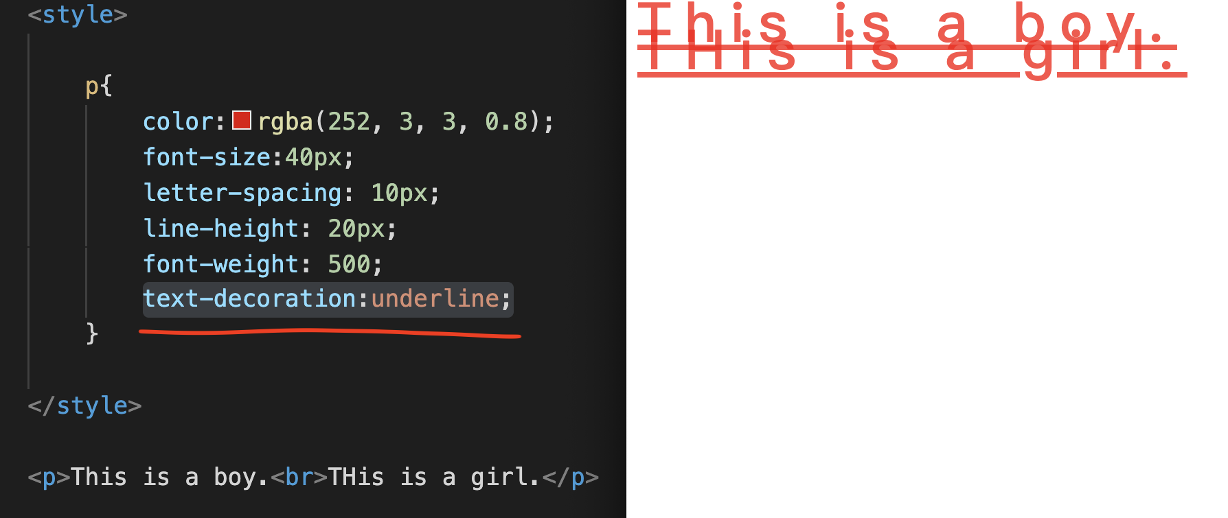
Font Style italic
Opacity transparency
Text-align:center text align
Font-family conversion font
Our common method is to use font face or Google font to import.Chapter 4CSS Statement Practical
CSS practical articles
Enter width:200px; on the next line,
Enter height:200px; on the next line.
width represents the width of 200px,
height represents a height of 200px.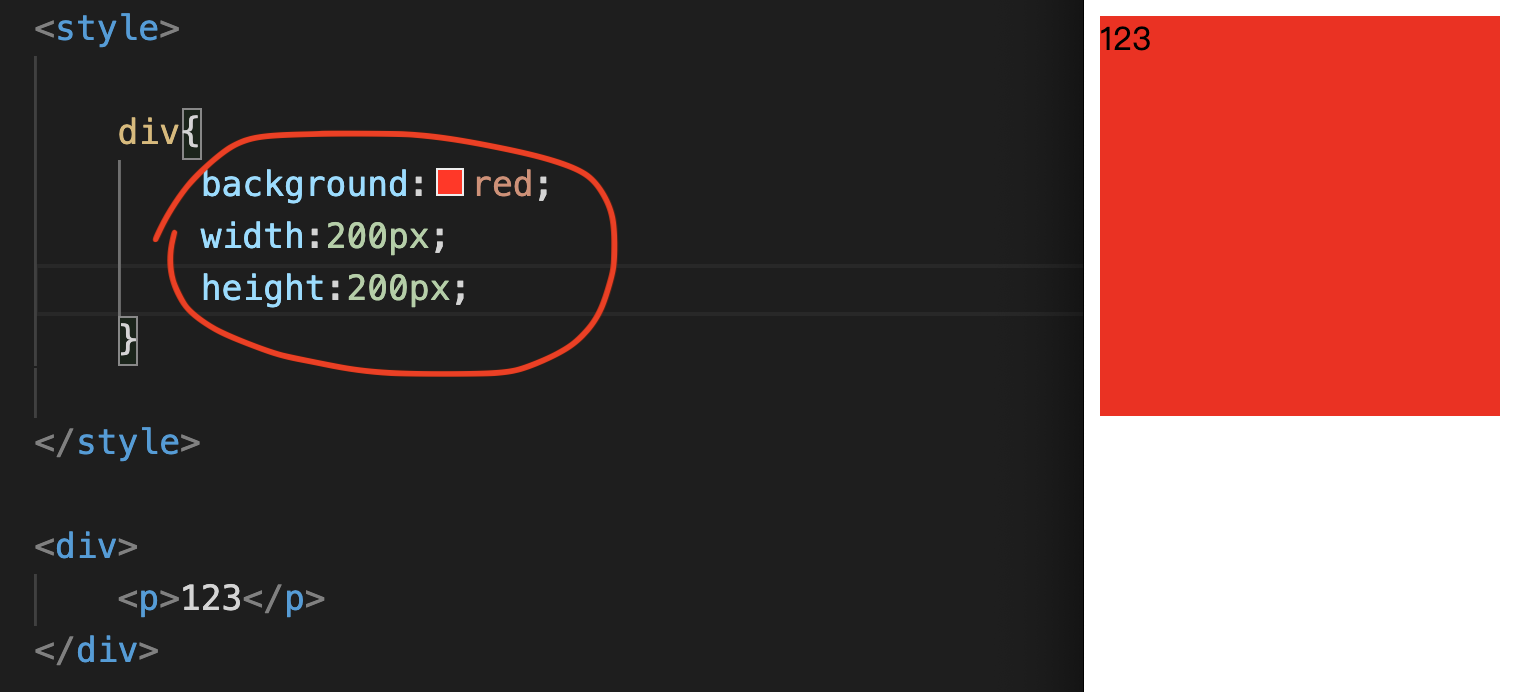
Chapter 5CSS Box Model
CSS Box Model
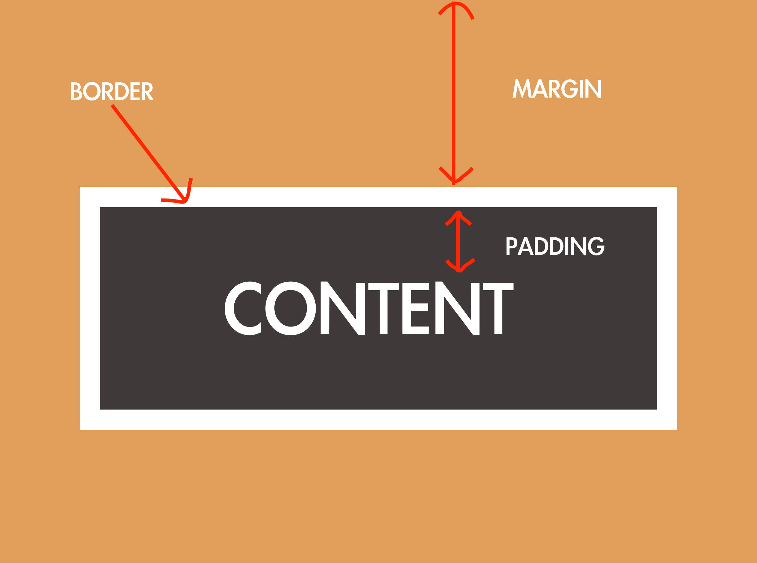
In reality, the border line is not that thick, it is usually just a black line.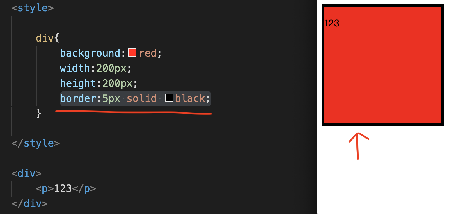
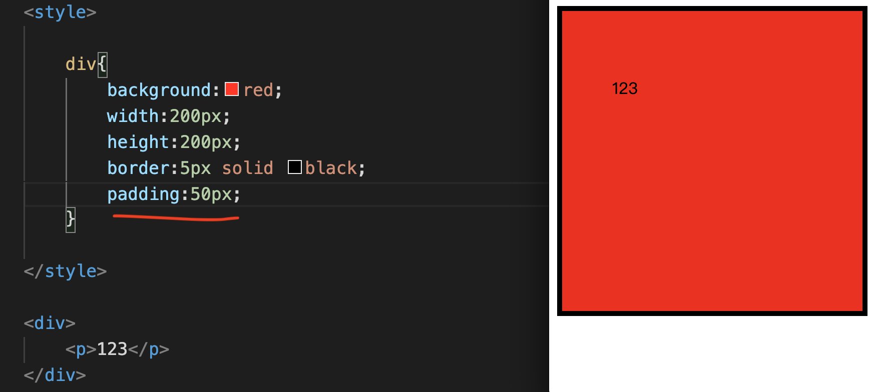
padding-left, left position,
padding-bottom, bottom position,
padding-right, right position.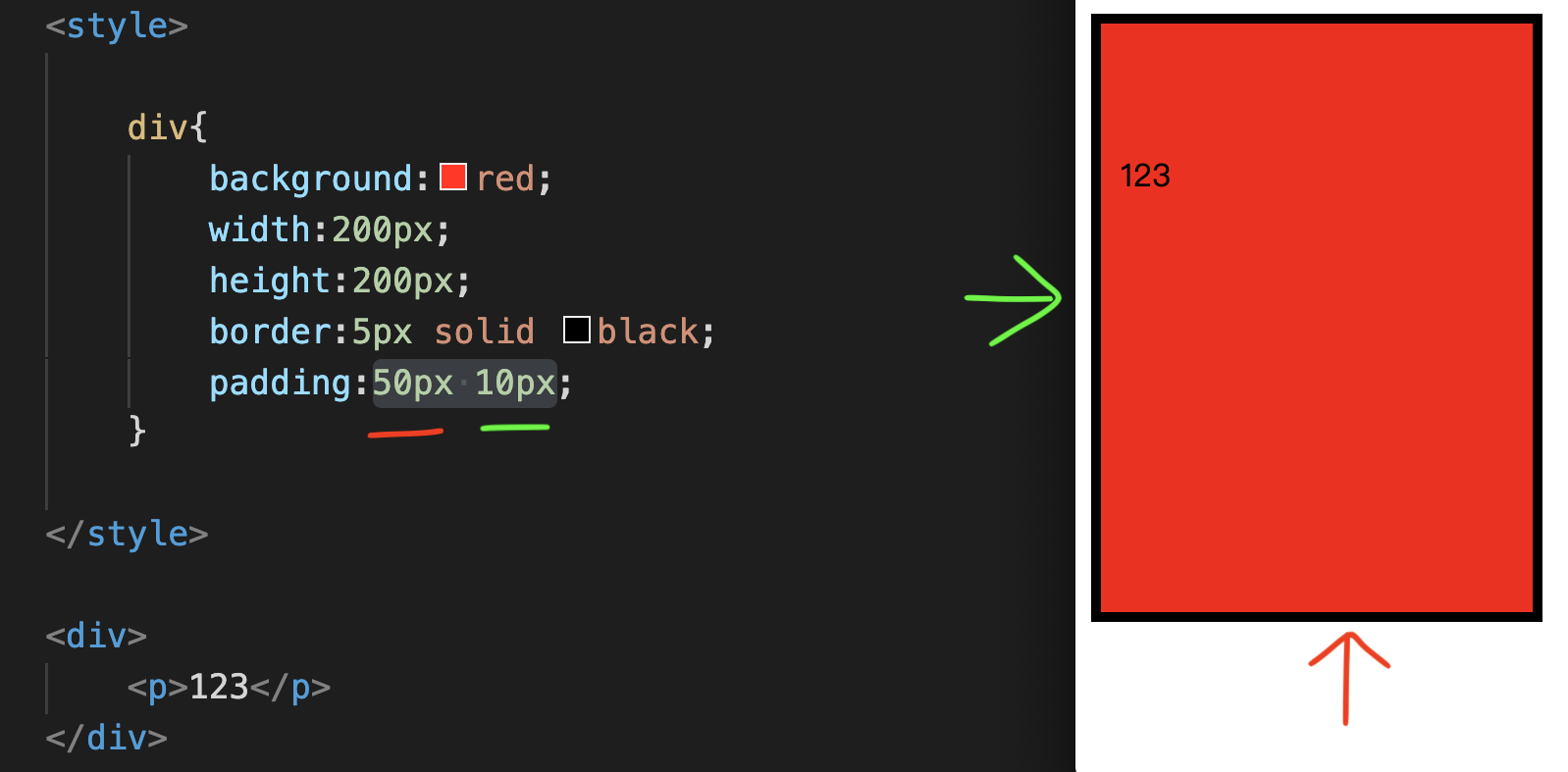
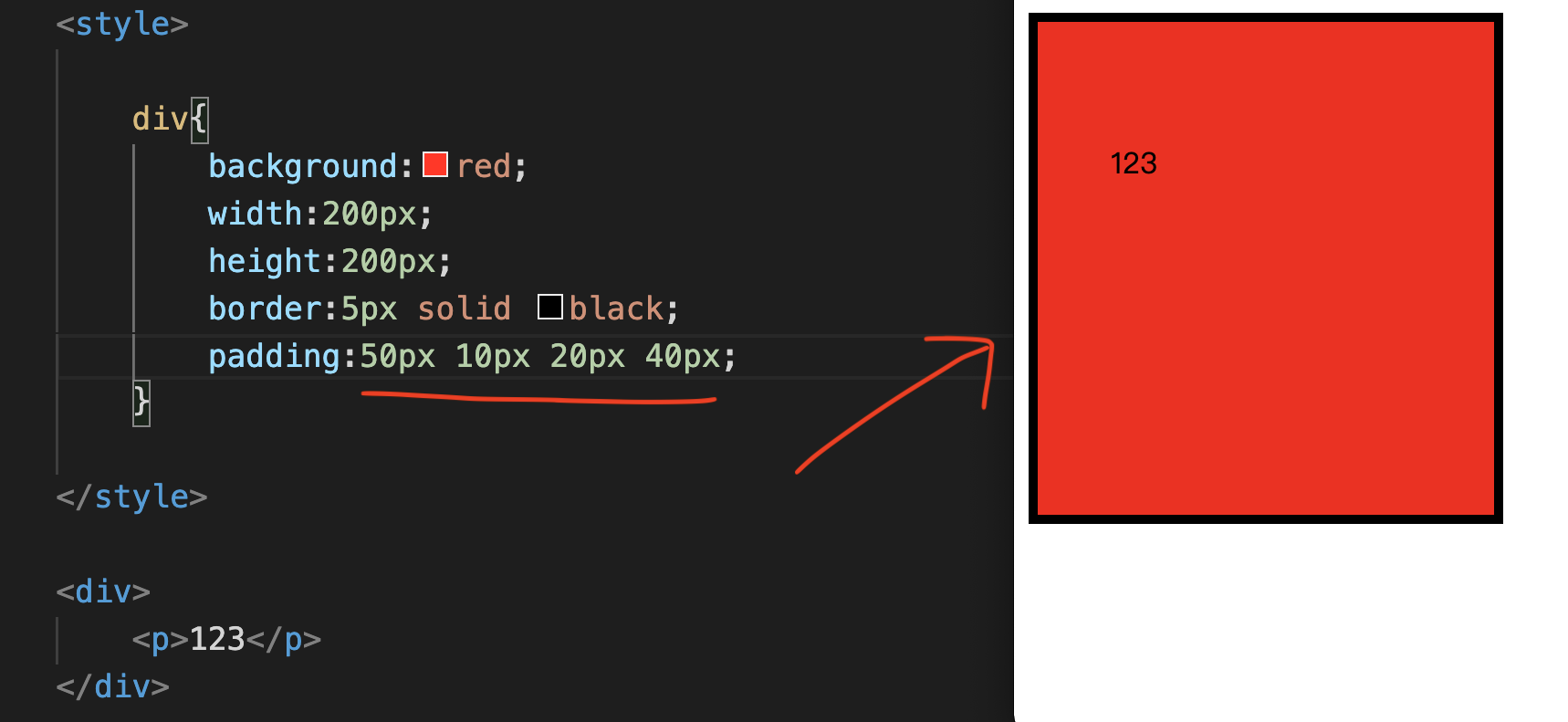
50px up,
Right 10px,
20px down,
40px left.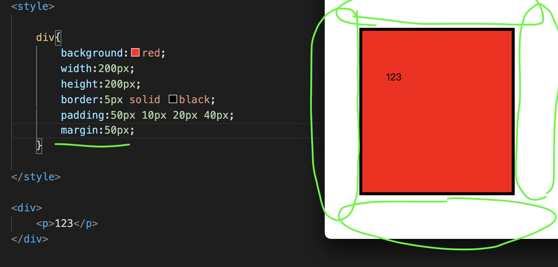
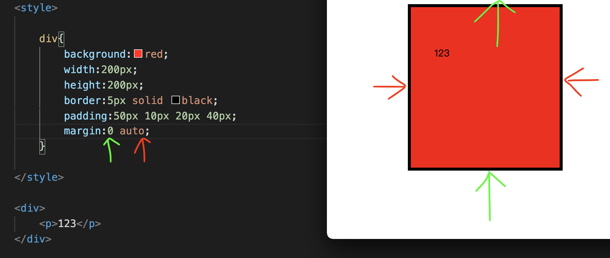
The left and right are auto (meaning to center this div).Chapter 6CSS Position
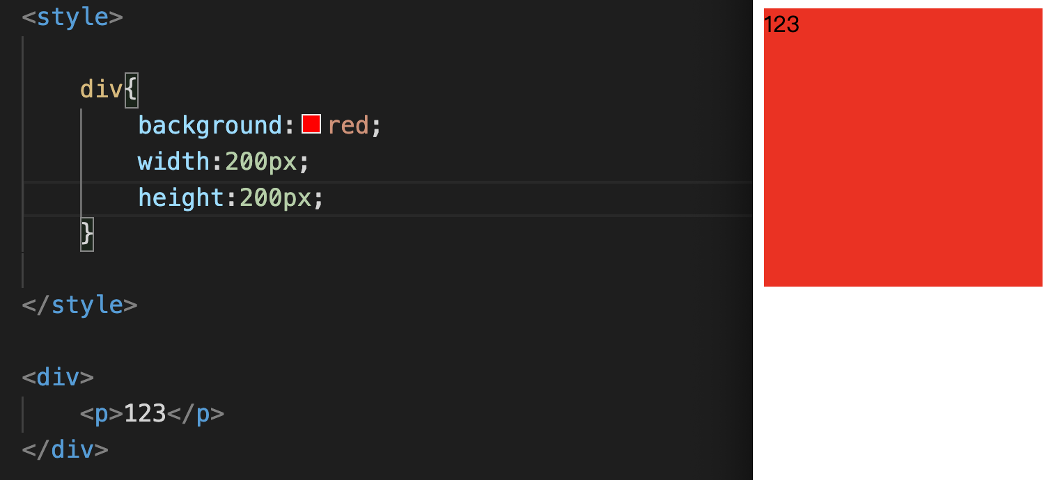
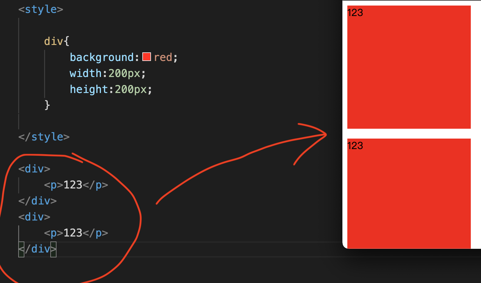
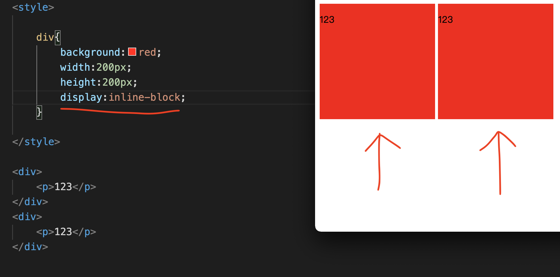
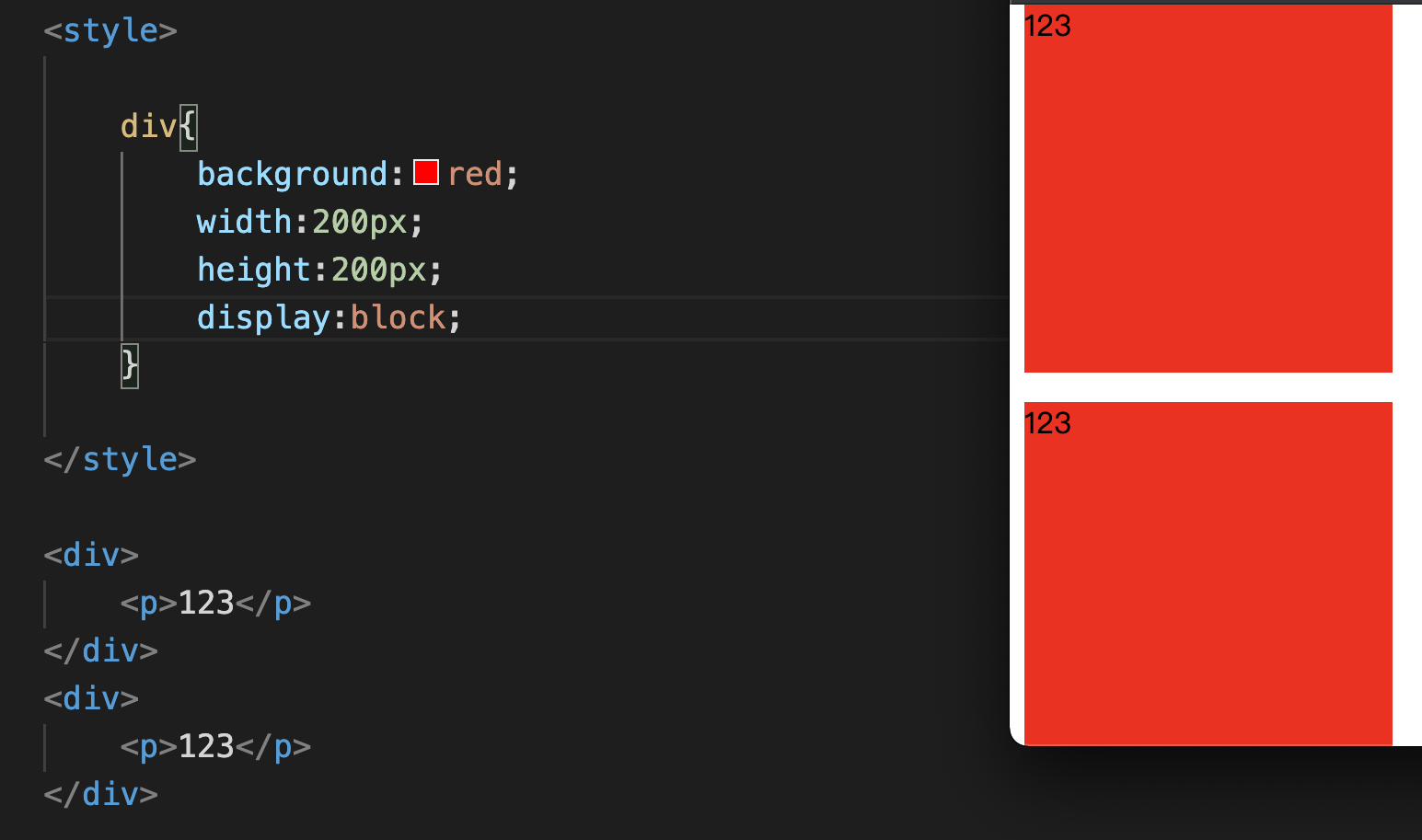
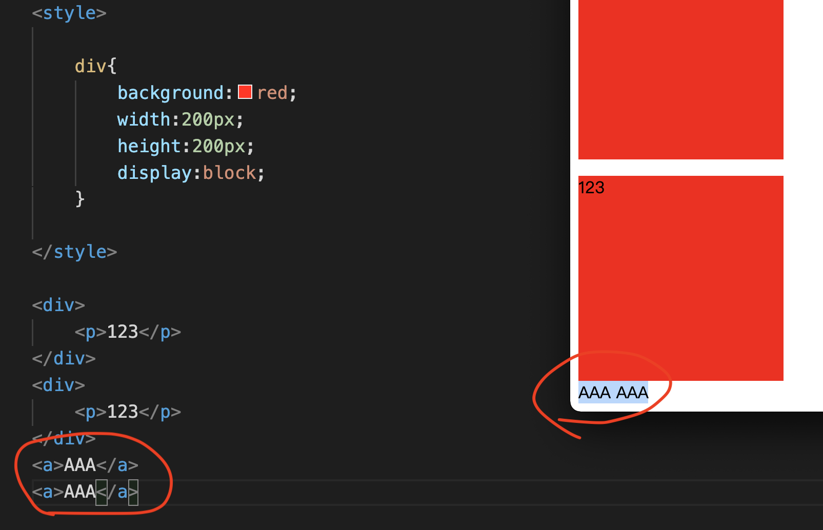
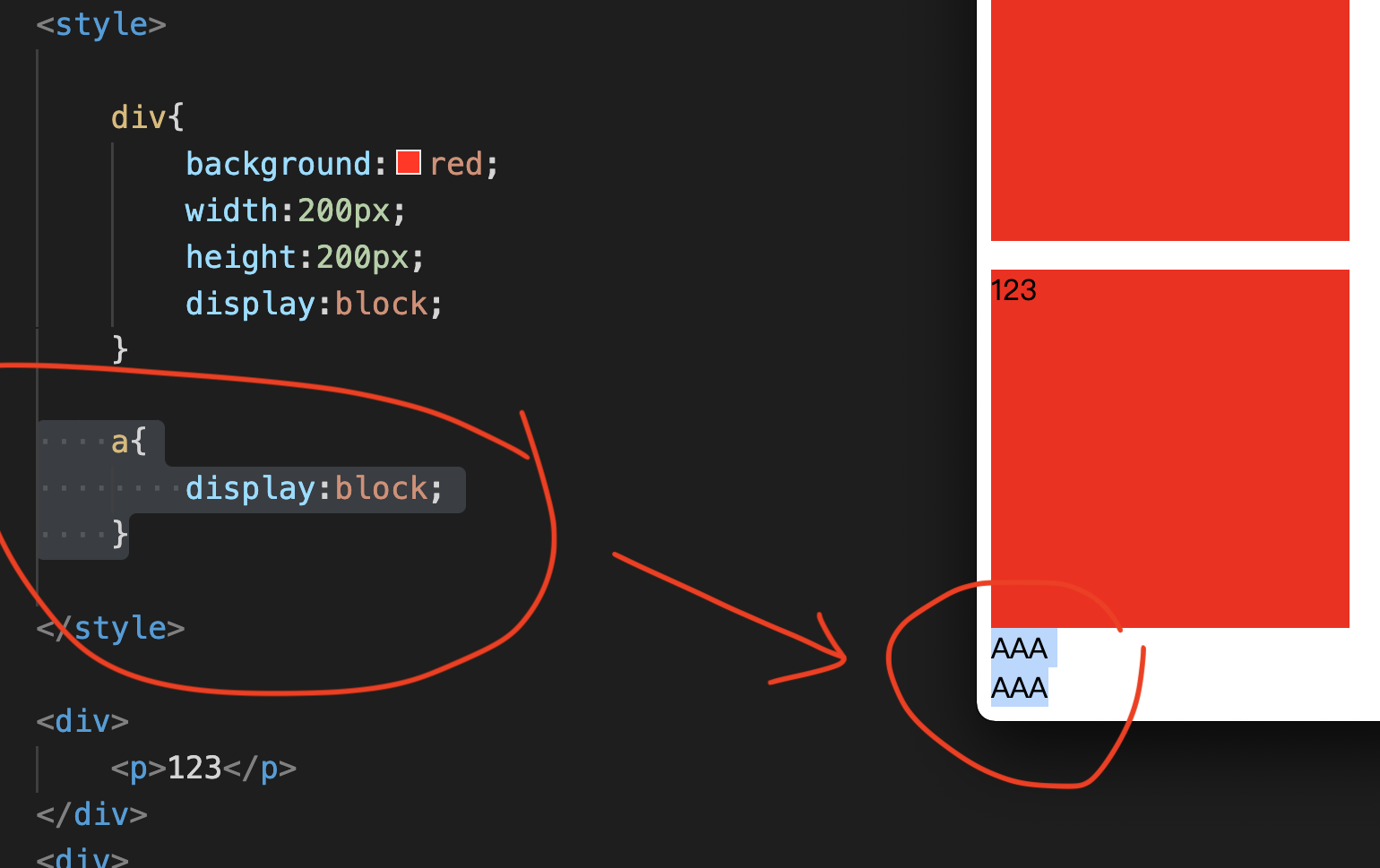
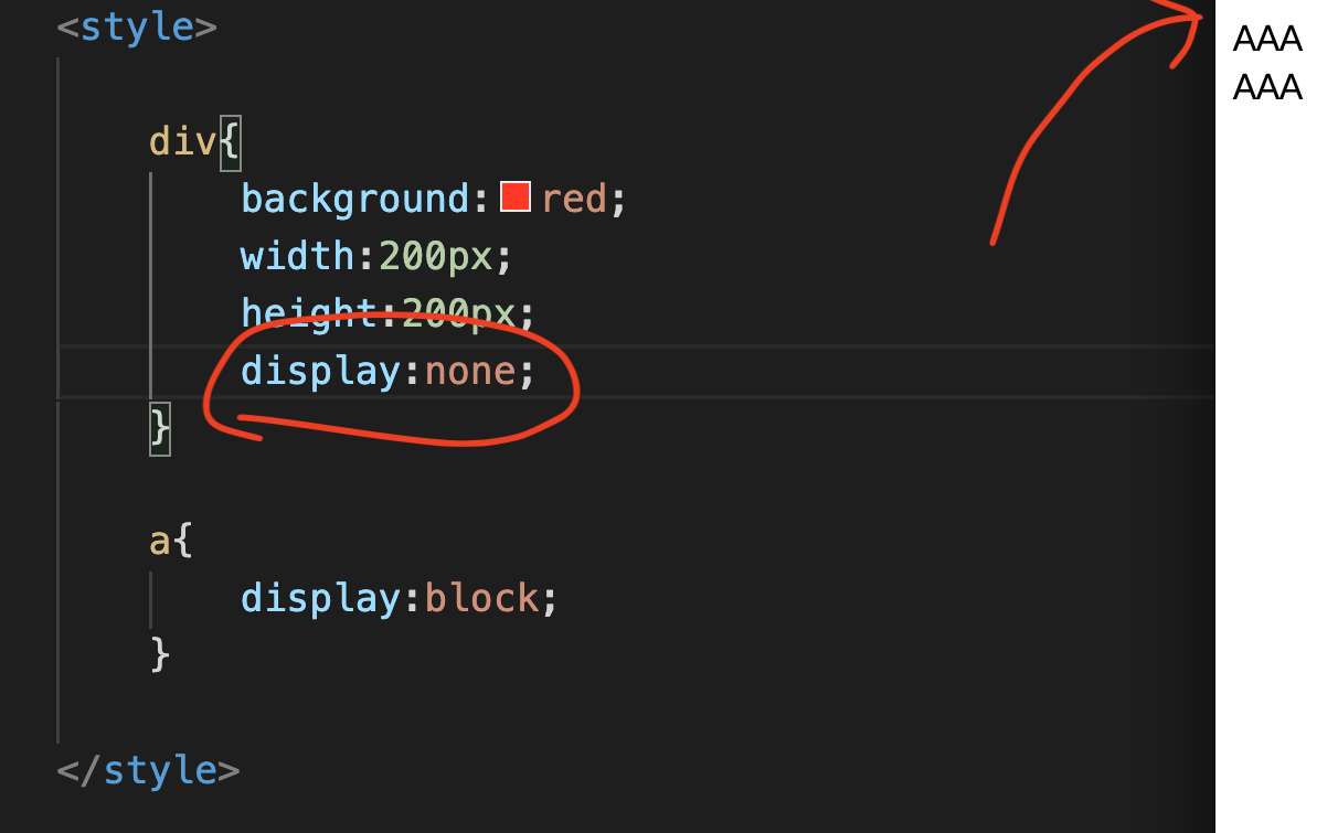
CSS Display
CSS Position
The first type: postion:static
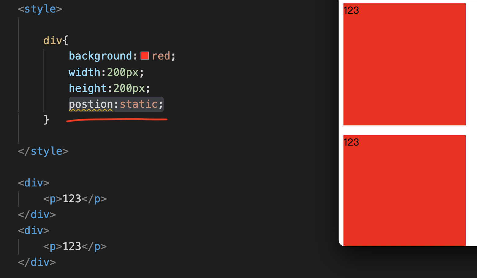
The content will be displayed from top to bottom without overlapping.The second type: postion:relative
Relative is actually very similar to Static.
But position relative can define another upper left corner coordinate.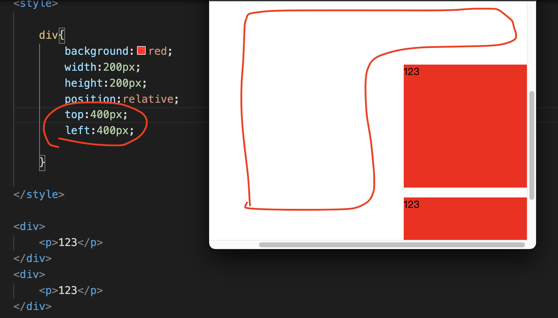
The third type: postion:fixed
Fixed is actually the same as relative, but the special bit of fixed can freeze it.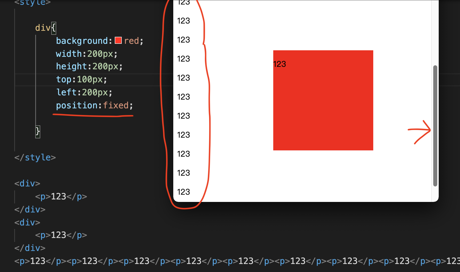
The fourth type: postion:absolute
It’s “position:absolute;”.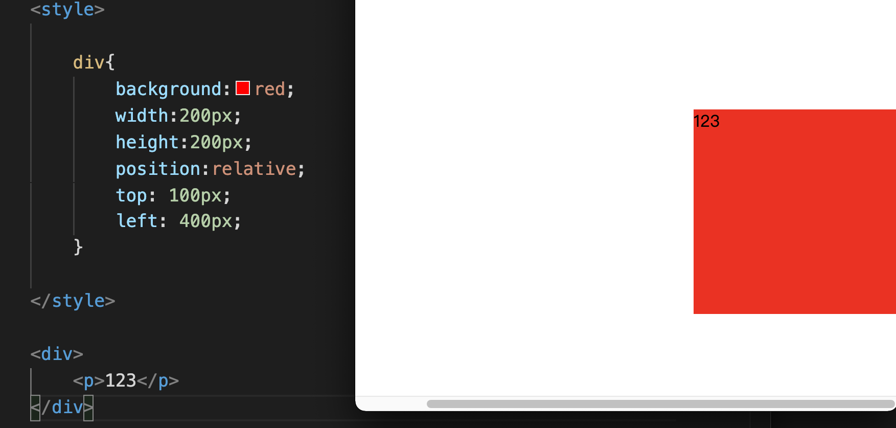
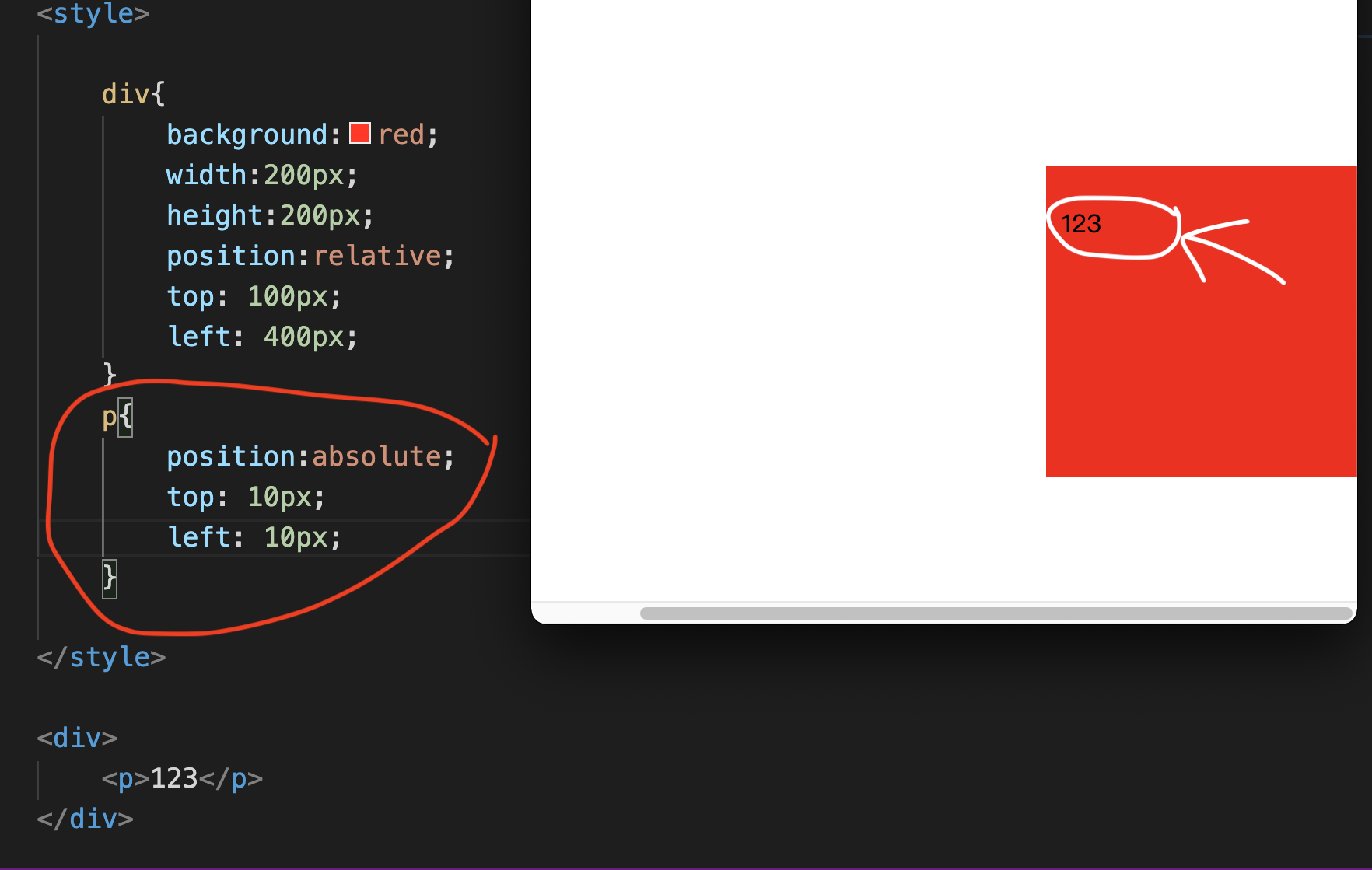
top: 10px;
left: 10px;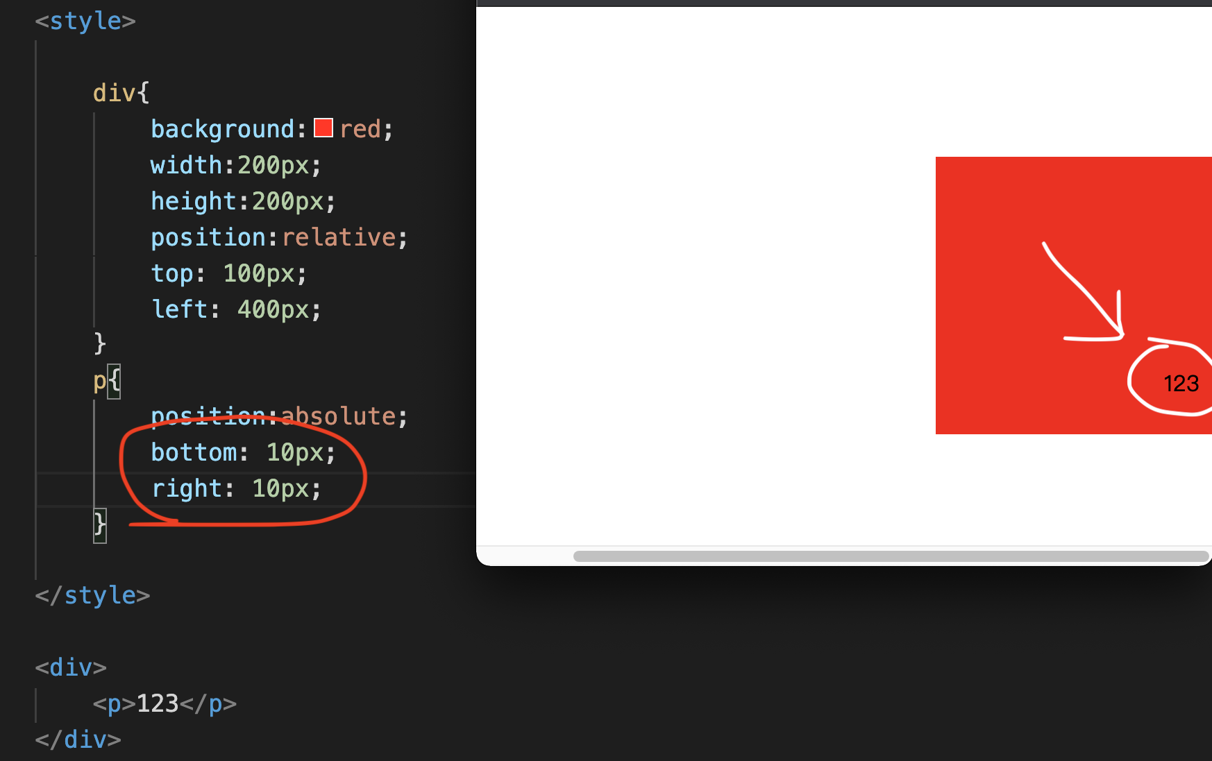
Will overlap things
You won’t overlap things.Chapter 7Other CSS
CSS Float
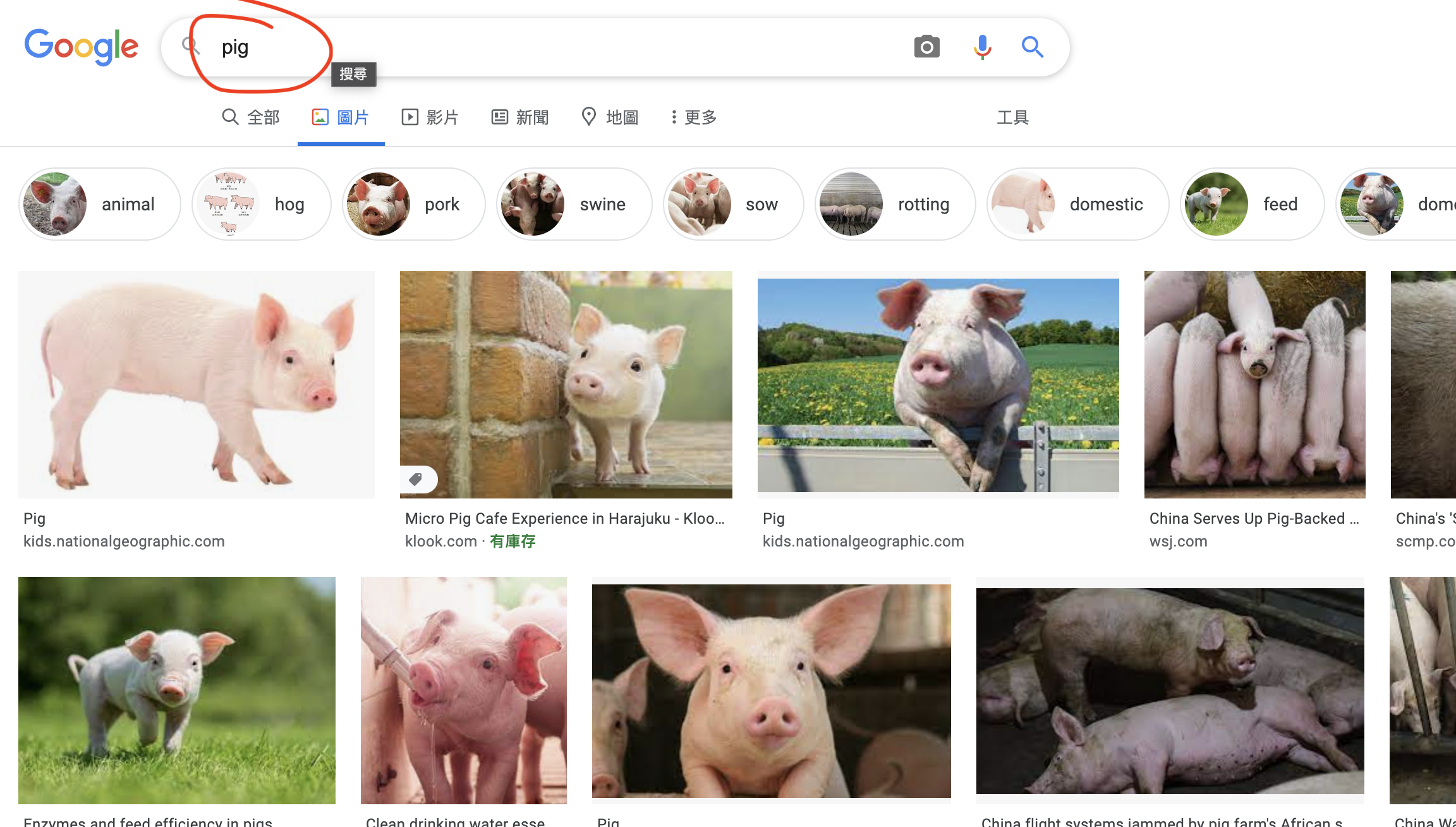
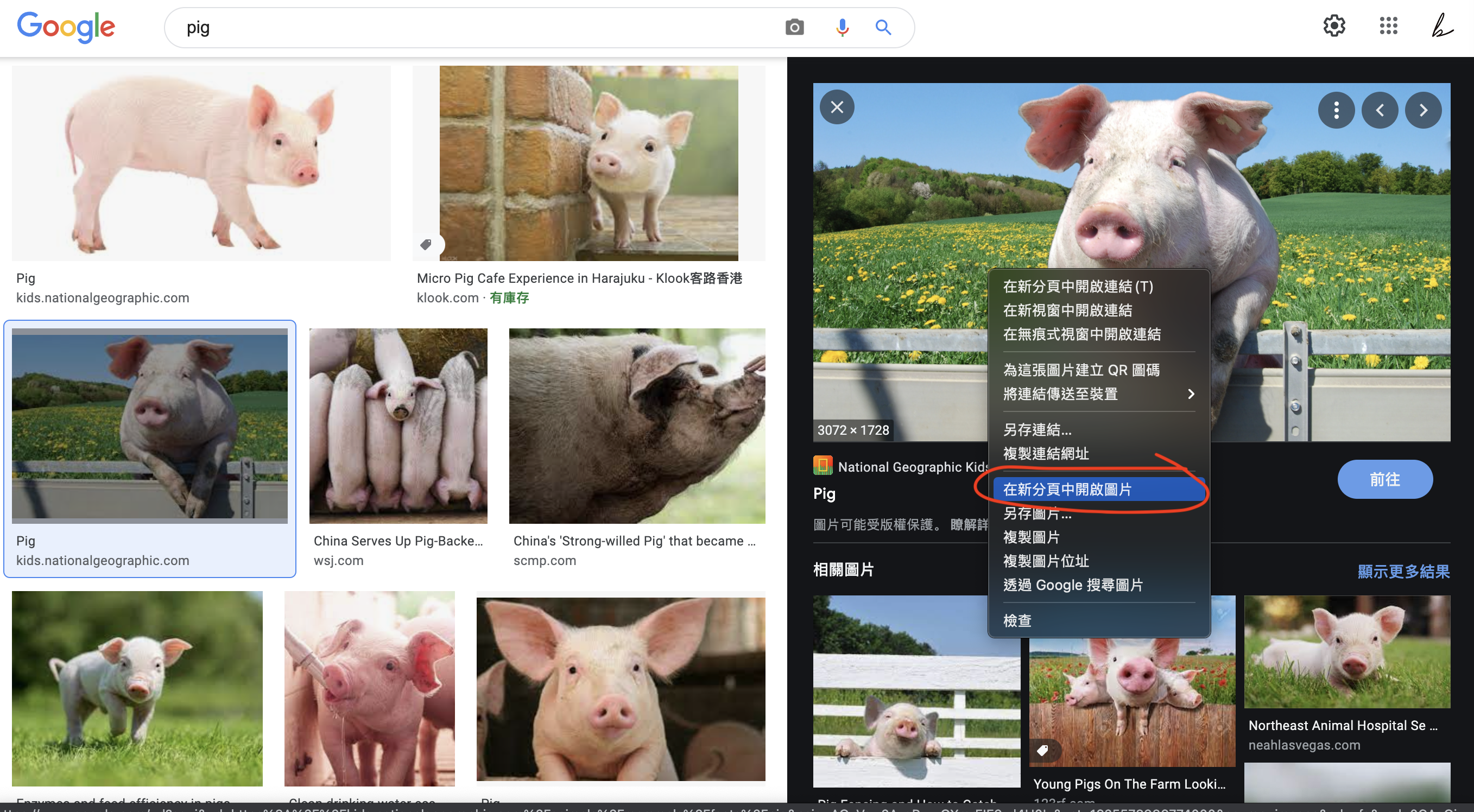
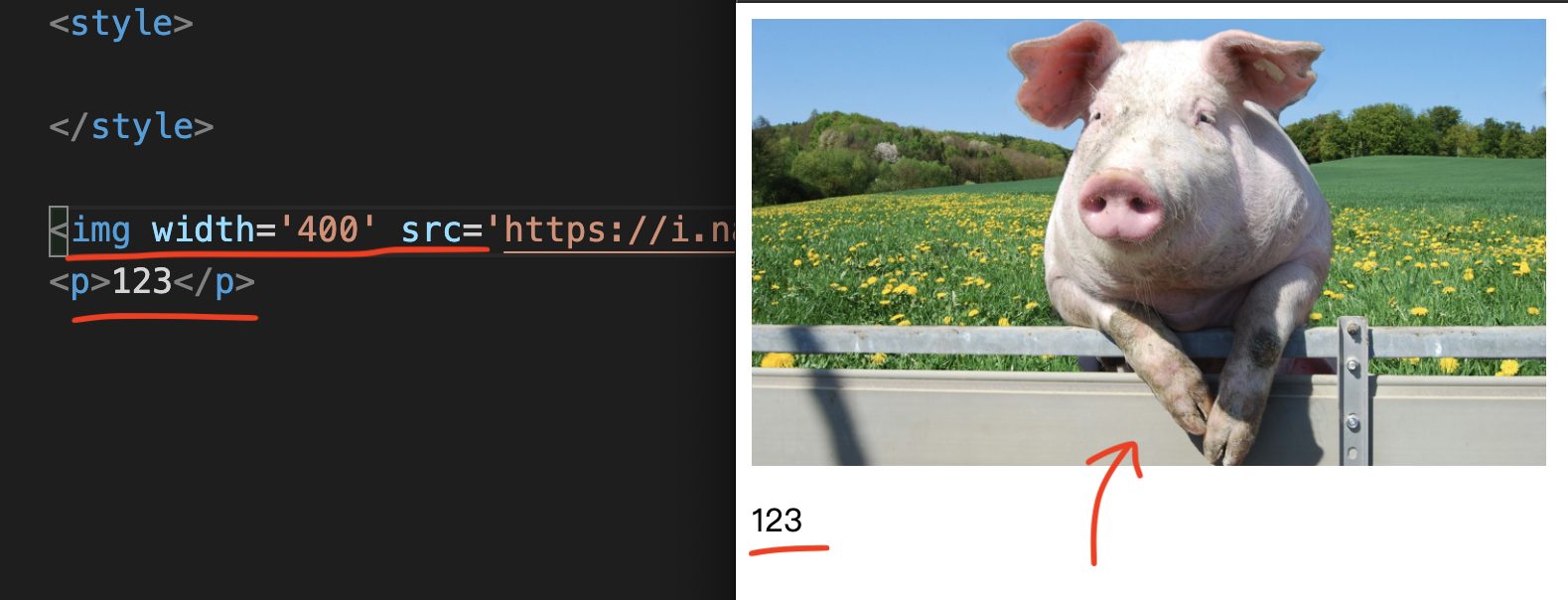
,
Then enter p Tag again,
Content input 123.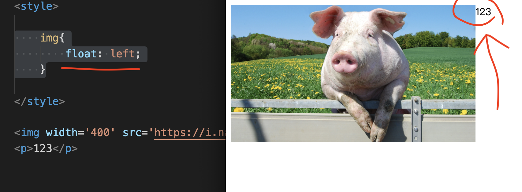
Enter “float:left;” in the inner layer.
That is to say, where is the position of this HTML element compared to the next element.
It’s p Tag.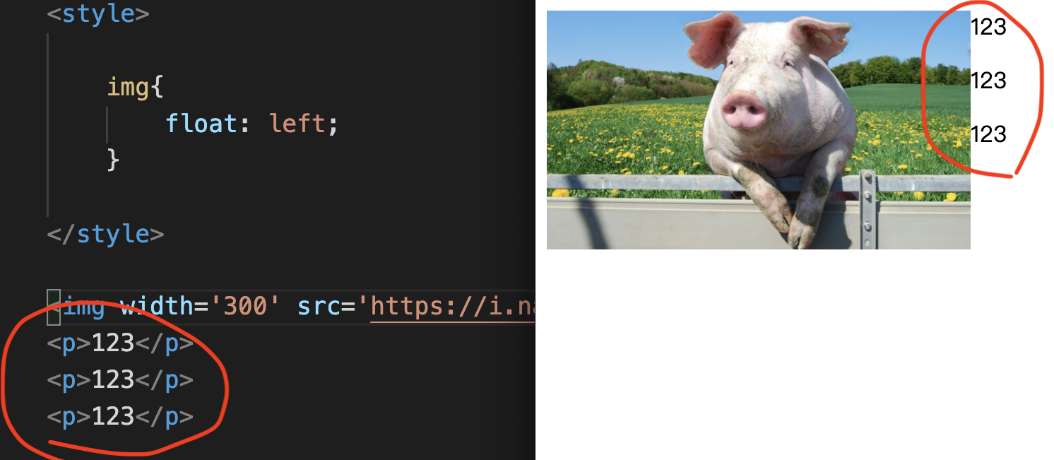
You will find that this float will continue to affect it.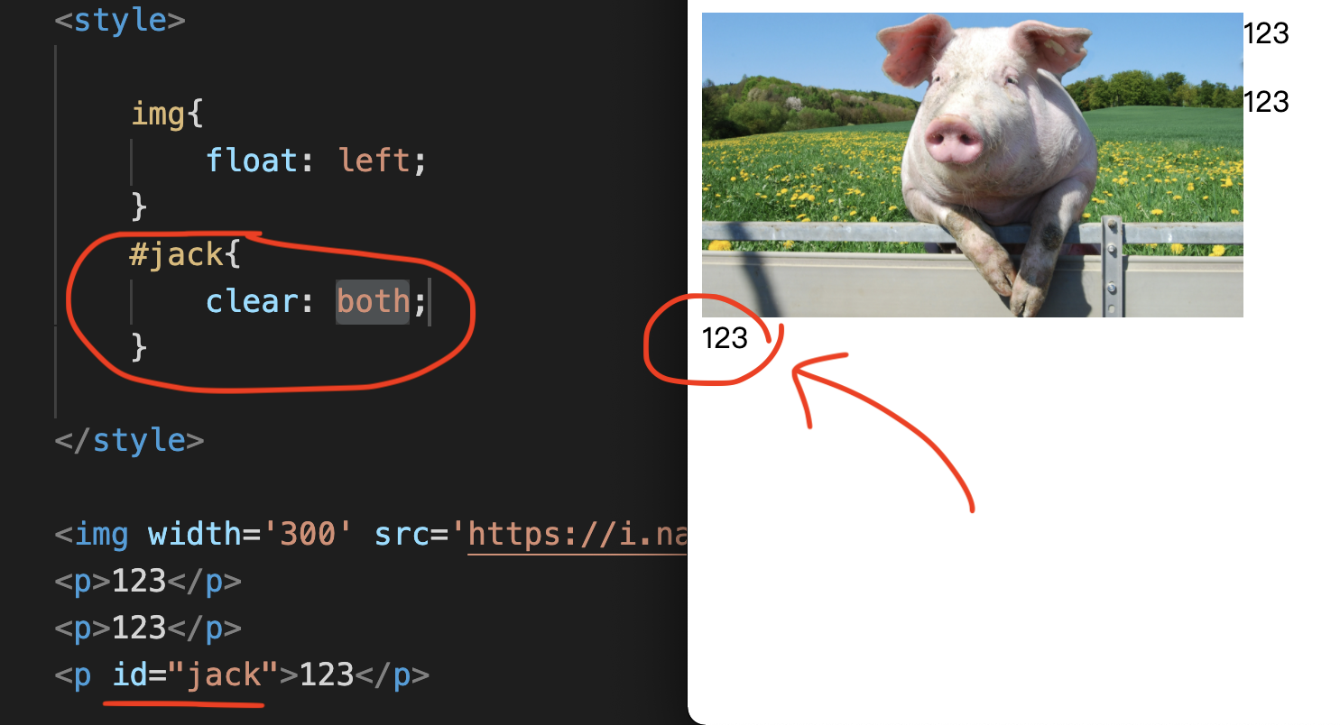
CSS text to State
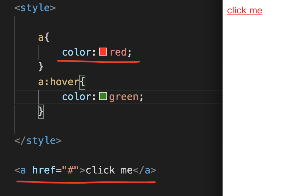
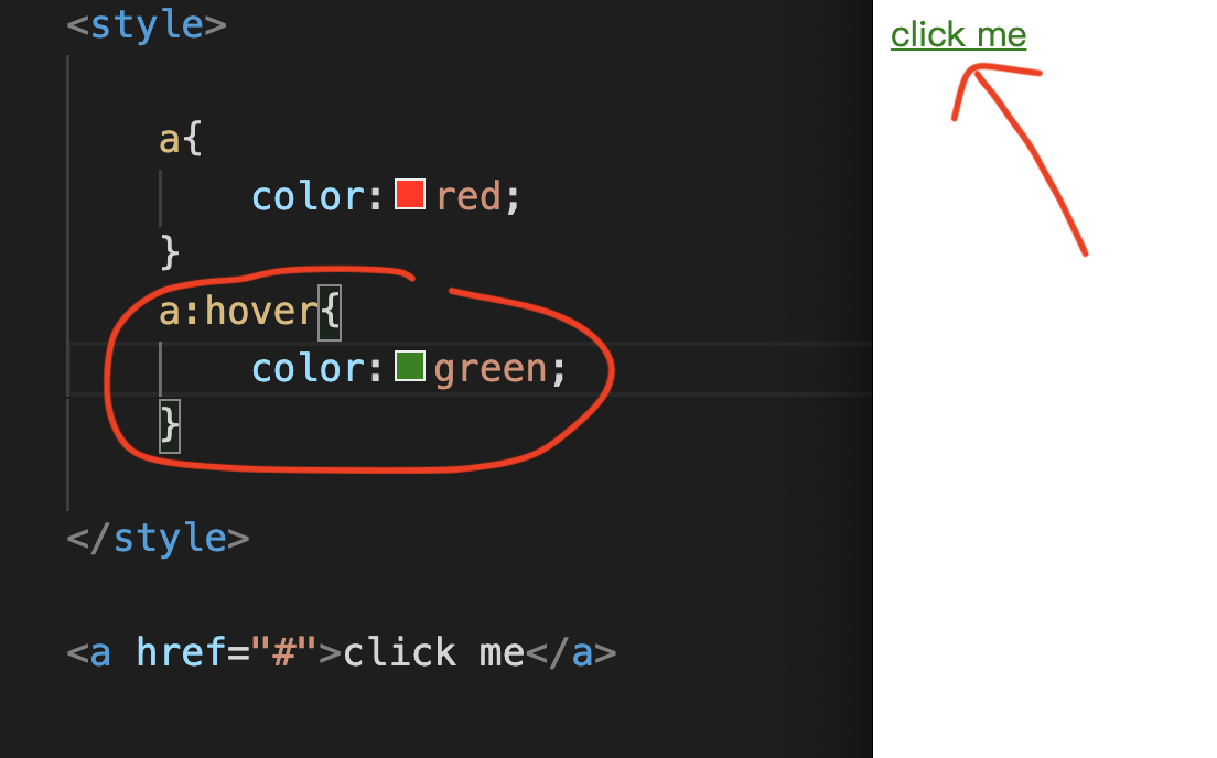
Enter color:green; in the inner layer.
It will automatically change from red words to green words.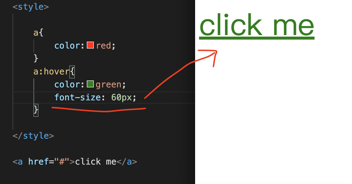
The second case is to position the text or pictures in the center div left and right.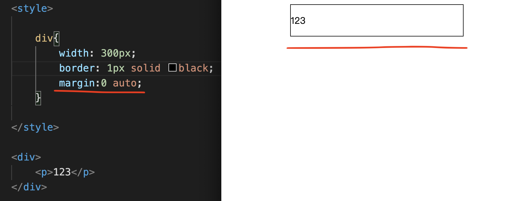
Inner layer p Tag, content input is 123.
border: 1px solid black;
margin:0 auto;
You can center the entire div.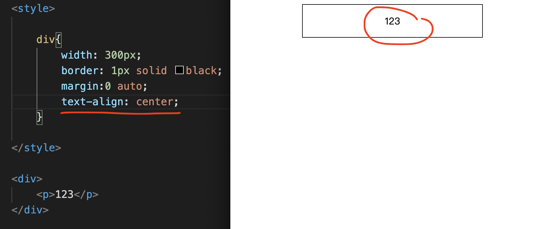
text-align: center;
This “text-align: center;” is not entered in the p Tag.
Instead, it will be correct if it is entered in the div that surrounds it.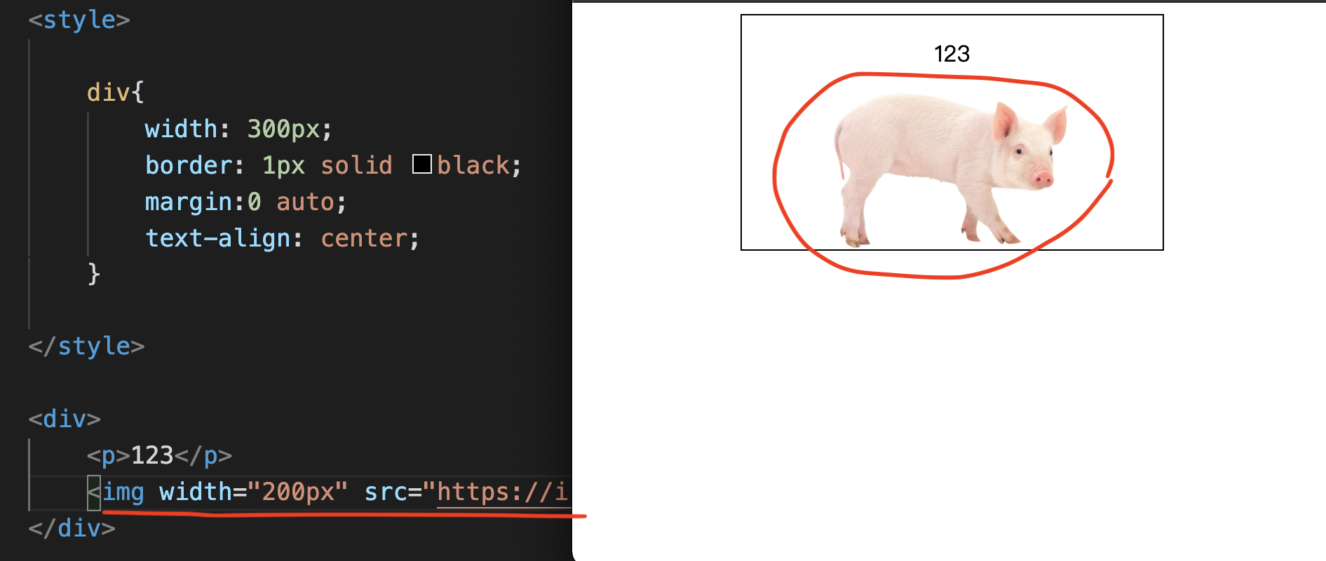
CSS follow order
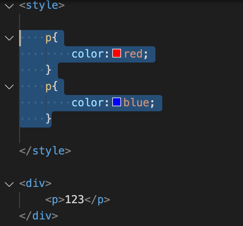
One is red and the other is blue.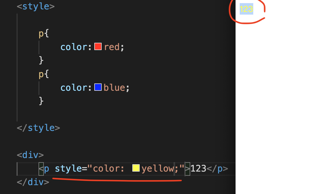
style=’color: yellow;’
The next one that follows will be the Selector in the style tag on the same page.
Next, is the style tag of the same HTML,
Finally, there is the external CSS File.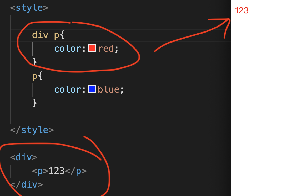
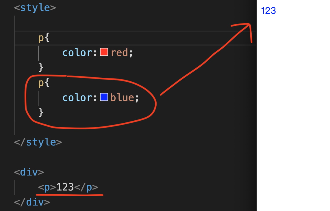
The program will follow the bottom Selector.
Just like the blue one in the picture above.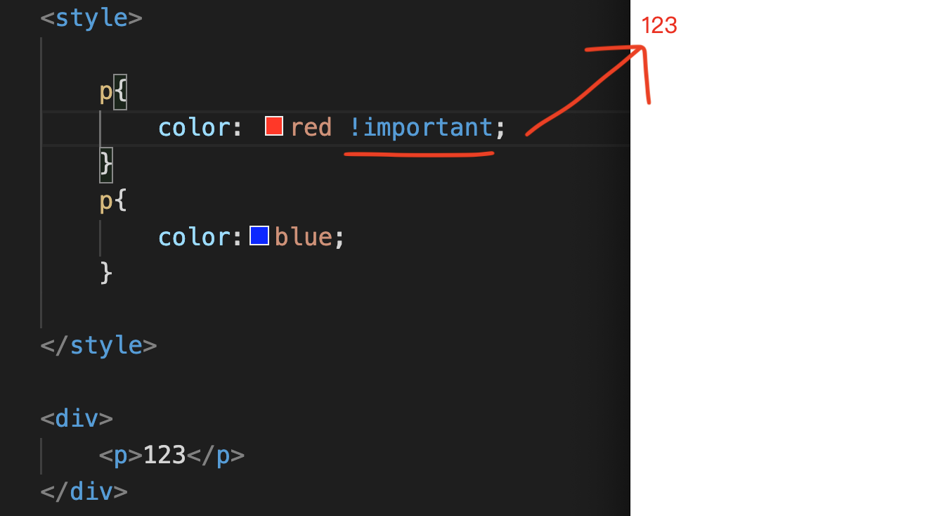
「!important」
This !important is not recommended for everyone to use too much.
Following the sequence becomes complicated and boring.Chapter 8Responsive CSS
Responsive CSS
I will share with you how mobile and responsive CSS works.
The purpose is to beautify the screen size and make the mobile appearance beautifully designed.
Enter a style Tag, inner layer p{}, and then enter color:blue;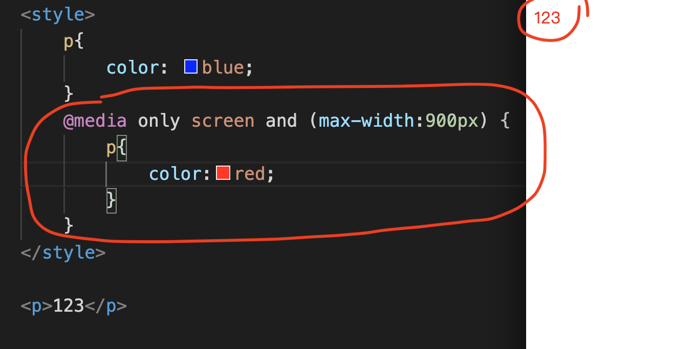
@media only screen and (max-width:900px) {}
color:red;
The text will change from blue to red.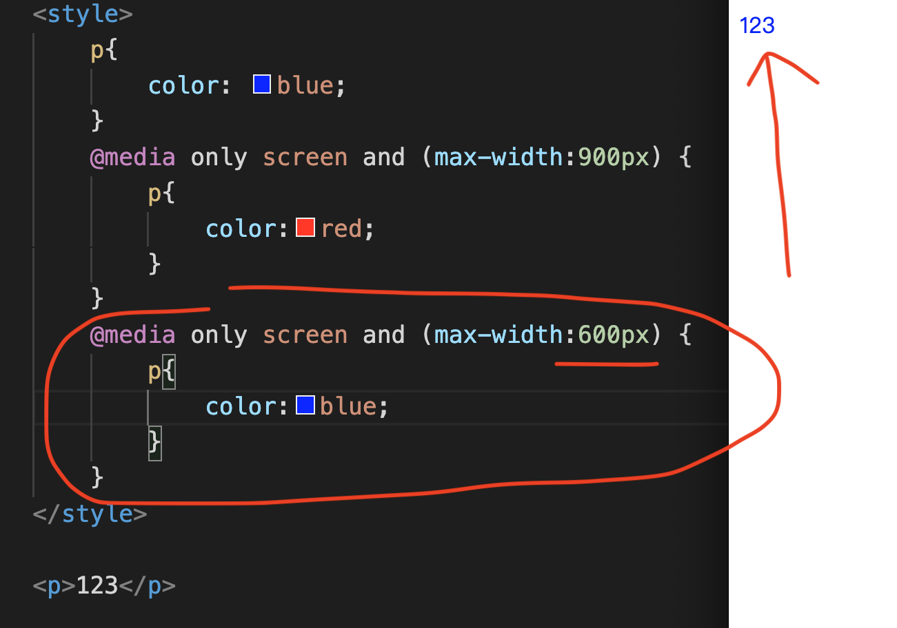
@media only screen and (max-width:600px) {}
color:blue;
The text will change from red back to blue.
The width of the Screen is from high to bottom,
Enter a larger px first, and then enter a smaller px.
At present, most smartphones are 300px to 600px.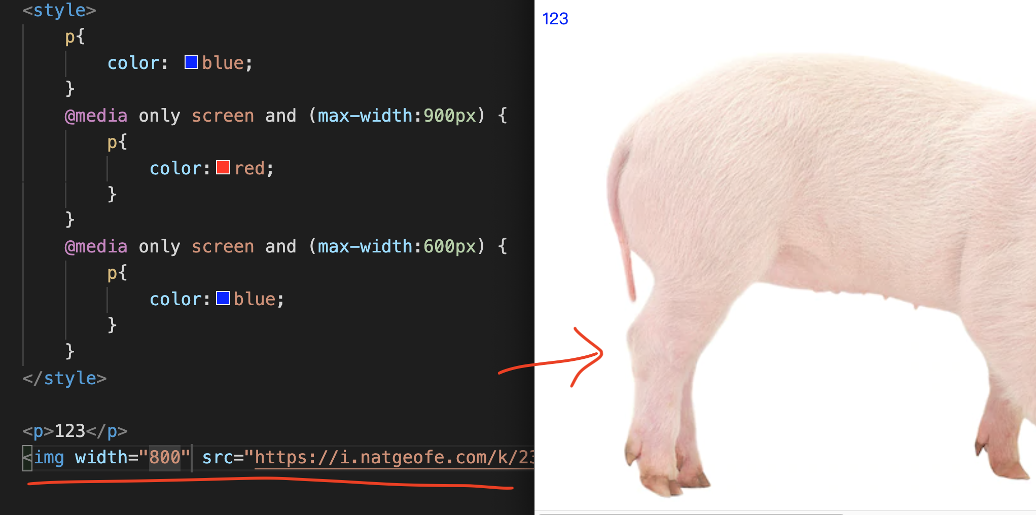
It’s max width.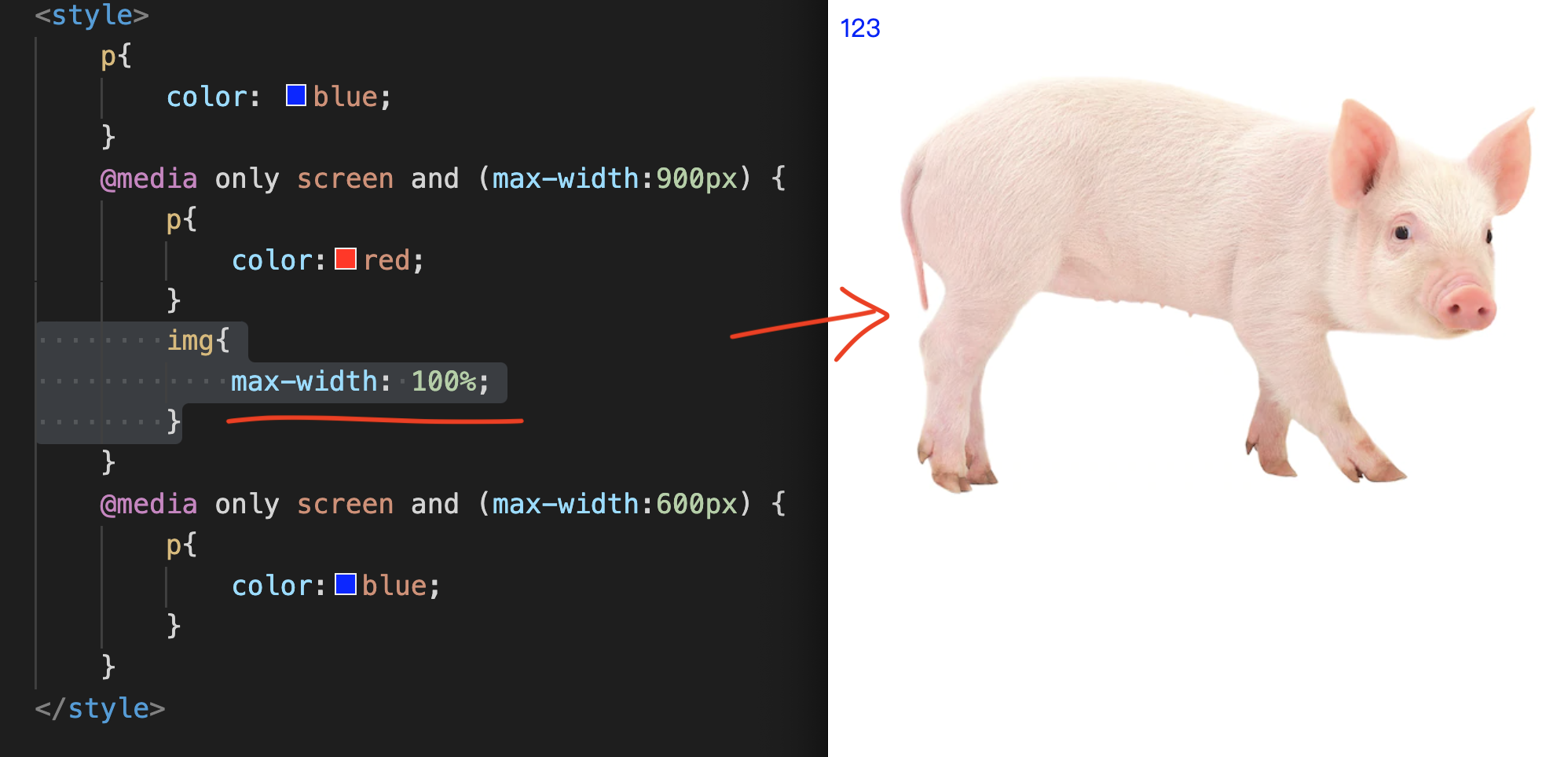
Retrieve the 900px media screen,
Then enter an img{} on every other line and enter the text:
max-width: 100%;
As long as the screen is stretched to 900px,
The width of the image will be automatically scaled to 100% for display. Because the maximum width of the image is 100%.
You can display none for the entire div,
Then, open a new div, and only mobile will display the block.
This is also a common method for us to do Responsive Layout.Summarize