


Perhaps it is forced by the staggering cost of Bard AI, which competes with Bing Chat, or perhaps Google really wants to push more and more exclusive information to desktop users. In short, the Google search page, which has accompanied you and me in study/work for a long time, now gives people a tendency that the complexity of the interface will be full at once. It has been revealed by foreign media MS Power User that the latest test of the more complex Discover exploration page interface has been launched. Continue reading Google has begun testing a new search homepage full of information.
▲Image source: Google
It was revealed that Google has begun testing a new search homepage full of information. Will the original simple style no longer exist?
Perhaps it is forced by the staggering cost of Bard AI, which competes with Bing Chat, or perhaps Google really wants to push more and more exclusive information to desktop users. In short, the Google search page, which has accompanied you and me in study/work for a long time, now gives people a tendency that the complexity of the interface will be full at once.
has beenForeign media MS Power User broke the news, launching the latest tests of a more sophisticated Discover page interface. The original simple page on the desktop version is filled with information from all parties. Including news, stock prices, competitions and other information. Suddenly it gives people the feeling of too much information as a traditional portal website.
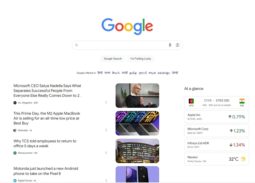
▲Picture source:MS Power User
That is to say, from the “At a glance” title above the stock price and competition information, you can actually notice that Google has actually just copied the similar discovery page interface on the mobile version of the application to the desktop version. However, compared to the mobile version, even the iPadOS version only uses at most two columns to display information. This new interface for Google Search seems to be much more complicated.

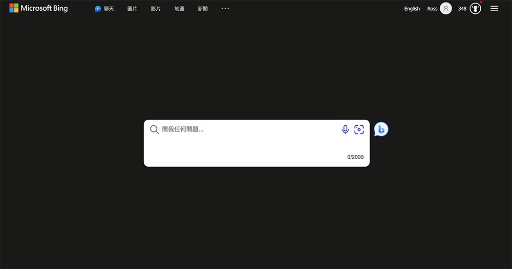
In addition, I believe everyone will quickly think of it. In fact, Microsoft’s Bing Search interface has adopted a similar experience for many years. However, in the sandwich menu provided by Microsoft, you can separately check and cancel the “Menu Bar”, “News and Interests” and even cancel the “Home Page Image”.
Just like the picture below, the whole thing is so refreshing. However, in the test page that has been exposed so far, Google does not seem to provide similar settings. Therefore, I believe that friends who prefer simple Google pages should not have much expectations for such a change. All I can say is, fortunately, this test is currently limited to some users.
In fact, Google has been spotted testing card-based interfaces before – just… Also similar to Bing…
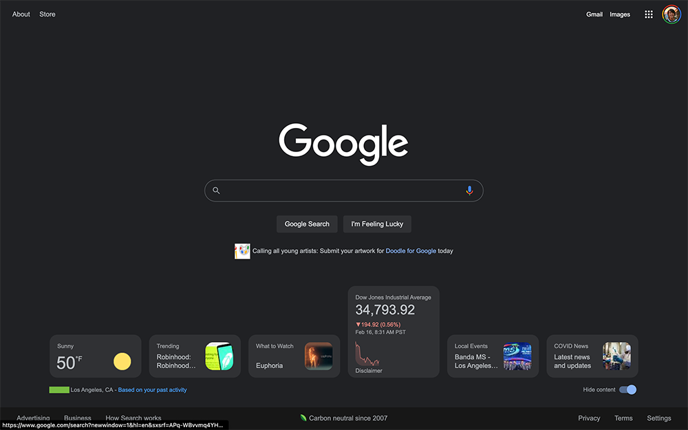
▲Image source: 9to5Google
Although I didn’t see Google’s intention to further promote it to all users in the future. However, with this test of the Discover page, we can feel that they really hope to make more use of the wider page space of the desktop version to provide users with more rich information.
However, the control and layout of this “amount of information” obviously also tests Google’s design aesthetics. But I can only say that I hope that no matter what, at least the flexibility of user switching interfaces will be provided on the desktop version so that people can freely choose the interface they want to use. I believe this will be a better development direction than forcing it to be provided.
Quote sources:MS Power User
Source: KOCPC Chinese