


As the epidemic situation is slightly lifted, corresponding measures such as downgrading may follow. If you originally work/study from home, you may have to face a new daily routine of commuting by public transportation. Although the epidemic is slowing down, life must return to normal. But what follows is the unknown and uncontrollable “crowding level” factor in the carriage, which is still very worrying? Now it seems that Google Maps plans to lend a helping hand through technology, at least giving you the opportunity to grasp the status of public transportation more accurately. Continue reading Google Maps tests the congestion level display of “each carriage” to let you get used to the new daily report content after the epidemic.

▲Photo source of this article: Google
Google Maps tests the crowding level display of “each carriage” to help you get used to the new daily life after the epidemic
In fact, regardless of whether it is during an epidemic or not, ordinary people usually want to avoid crowded public transportation services if they can. Because of this, the new function of displaying public transportation congestion levels provided by Google Maps has become quite useful recently. Although you can’t avoid the crowds of people who will get on the train later, you can at least check whether you should go to the station later or earlier before getting on the train. After comprehensively analyzing historical and real-time information through Google Maps, the congestion level display function provided automatically diverts traffic.
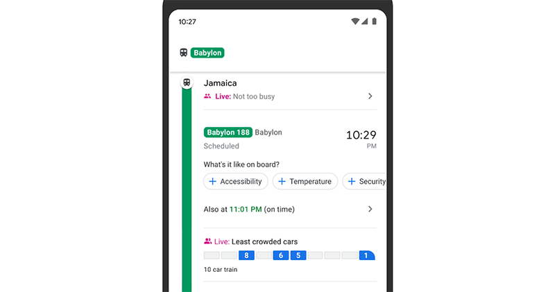
Now it seems that this function is also going to give you more accurate information from the transportation unit, giving you the opportunity to find gaps in the cracks and go to individual carriages that are relatively less crowded. It has been confirmed that new functional tests will be launched in Sydney and New York. You can see the congestion level display function in carriages in the public transportation query function.
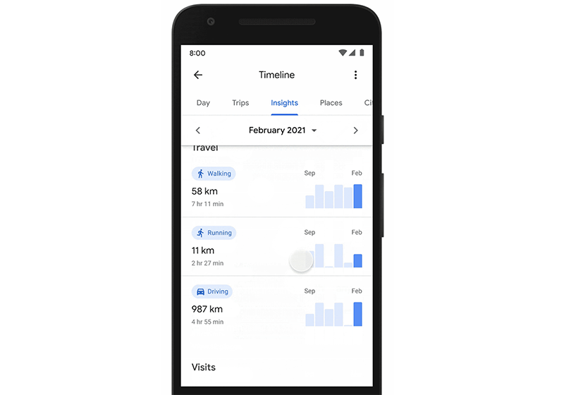
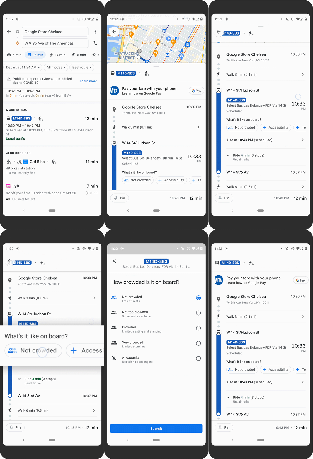
In addition, the function is similar to the detailed reporting function of the car’s congestion level, temperature, and presence or absence of monitors. Google Maps has now added a more detailed ticket return function to the review function of attractions. It is expected that detailed options will allow the system to have a clearer understanding of restaurant dining conditions and other information. Finally, the information collected by Google Maps Timeline can now be integrated into walking/running/driving ratio analysis similar to sports applications, allowing you to easily understand your activity status through more in-depth chart functions.
Pictures/sources cited in this article
Further reading:
The official version of Clubhouse is here, no invitations are needed anymore


Source: KOCPC Chinese