


After the latest revision of the system file application Files App, I believe many people have noticed that there have been considerable changes in the interface – the three major functions originally at the bottom, including cleaning, browsing and nearby sharing functions, have now all disappeared – basically without the buttons at the bottom, the file type display in my hand can be easily viewed on one page! Keep reading to give you more space! Android Files App File application new interface hands-on report content.
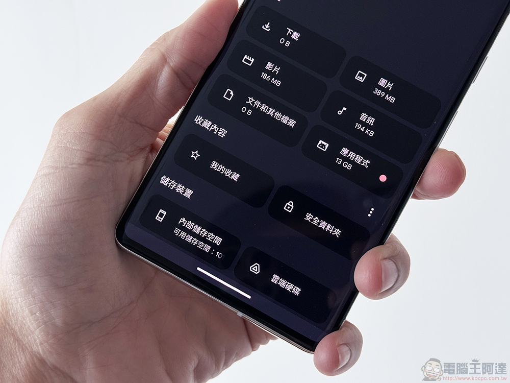
Give you more space! Android Files App file application new interface hands-on play
Google has really been working very hard recently to gain “space” for Android users (see more:Android 15 may allow the bottom system bar to make more display space)! After the latest revision of the system file application Files App, I believe many people may have noticed considerable changes in the interface.
In addition to the basic purpose of using Files App to find or copy files, one of its important tasks is to help users find files that waste space and recover more precious storage space on their mobile phones. However, rather than actually freeing up storage space, Google has gained a lot of breathing space for the application interface through the revision of Files App this time – to be precise, display space.
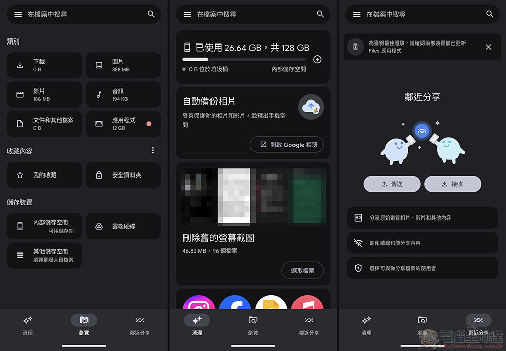
▲Picture: Screen of the old version
After updating to the latest version 1.2424.602139702.0, I believe it is not difficult to find that the three major functions originally at the bottom, including cleaning, browsing and nearby sharing functions, have now all disappeared – basically without the buttons at the bottom, the file type display in the editor’s hand can be easily viewed on one page! Although this change is quite intuitive and gains more display space for file listings. But I believe everyone is also curious about where the original functions are now.
First of all, it has been renamed Quick Share (see more:Have you changed too? The name change of “Proximity Sharing” has occurred on some Android models) has been fully integrated into the Android system experience. Naturally, there is no need to give it a special column or function option.
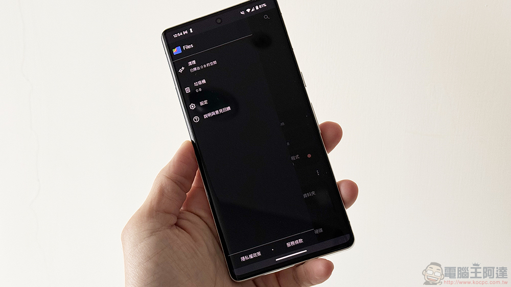
As for the “Clean” function, I believe all of you who are smart should have noticed that in fact, just click the “three” sandwich button in the upper left corner to call up the function buttons including: Clean, Trash, Settings and Description, etc.
That is to say, if this functional change encounters a new interface in Android 15 that allows the bottom system bar to make more display space. I believe that the entire Files app will be able to display more range. I have to say that this kind of development and design direction seems to be one of the main pillars of progress for the Android system after the previous Material You?
Personally, I quite like this direction. I feel that I can utilize more of the display range of the so-called full screen. I wonder if everyone feels the same?
via|
Further reading:
Source: KOCPC Chinese