


For those who are a little bit obsessed with UI, or who want to use the largest screen area possible, the side bar that takes up about three times the thickness of the navigation bar is really eye-catching. Now it seems that on the latest generation of Android 14 systems, Google also intends to solve this UI design that may be particularly uncomfortable for some groups, and currently provides new settings in the developer options. Continue reading No more “bottom line”! The Android 14 beta version has changed the annoying display problem of the navigation bar.

▲Image source: Google
There is no “bottom line” anymore! Android 14 beta fixes annoying display issue with navigation bar
Even though it’s just a small “detail” – it’s really a detail. However, many people should have the same feeling as you and me. That is, whether it is iOS or Android, after the introduction of the gesture-operated navigation bar experience in the subsequent system navigation bar experience, although there is really a lot of white/black borders of the thick system buttons at the bottom. Only in certain UIs (which is actually quite common), you still encounter the situation where the upper and lower edges of the gesture navigation bar still have white/black edges occupying the bottom of the screen.
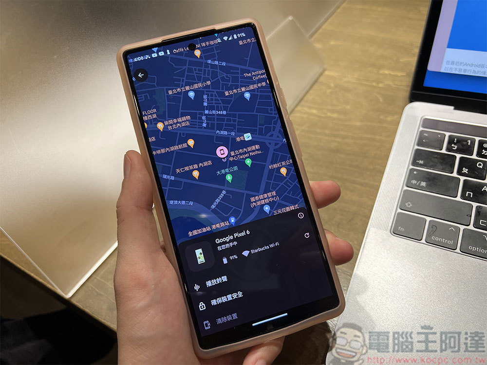
Although this display seems to be designed to prevent the navigation bar from interfering with specific screen components. But for people who are a little bit obsessed with UI, or who want to use the maximum screen area as much as possible (the editor is the latter, and I used to seriously study related applications of how to hide the navigation bar XD), you will find such a side bar that takes up about three times the thickness of the navigation bar very annoying.
Now it seems that on the latest generation of Android 14 systems, Google also intends to solve this UI design that may be particularly uncomfortable for some groups, and currently provides new settings in the developer options.
▲Image source: Android Police
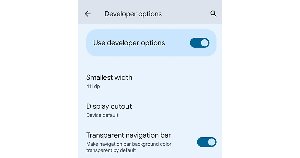
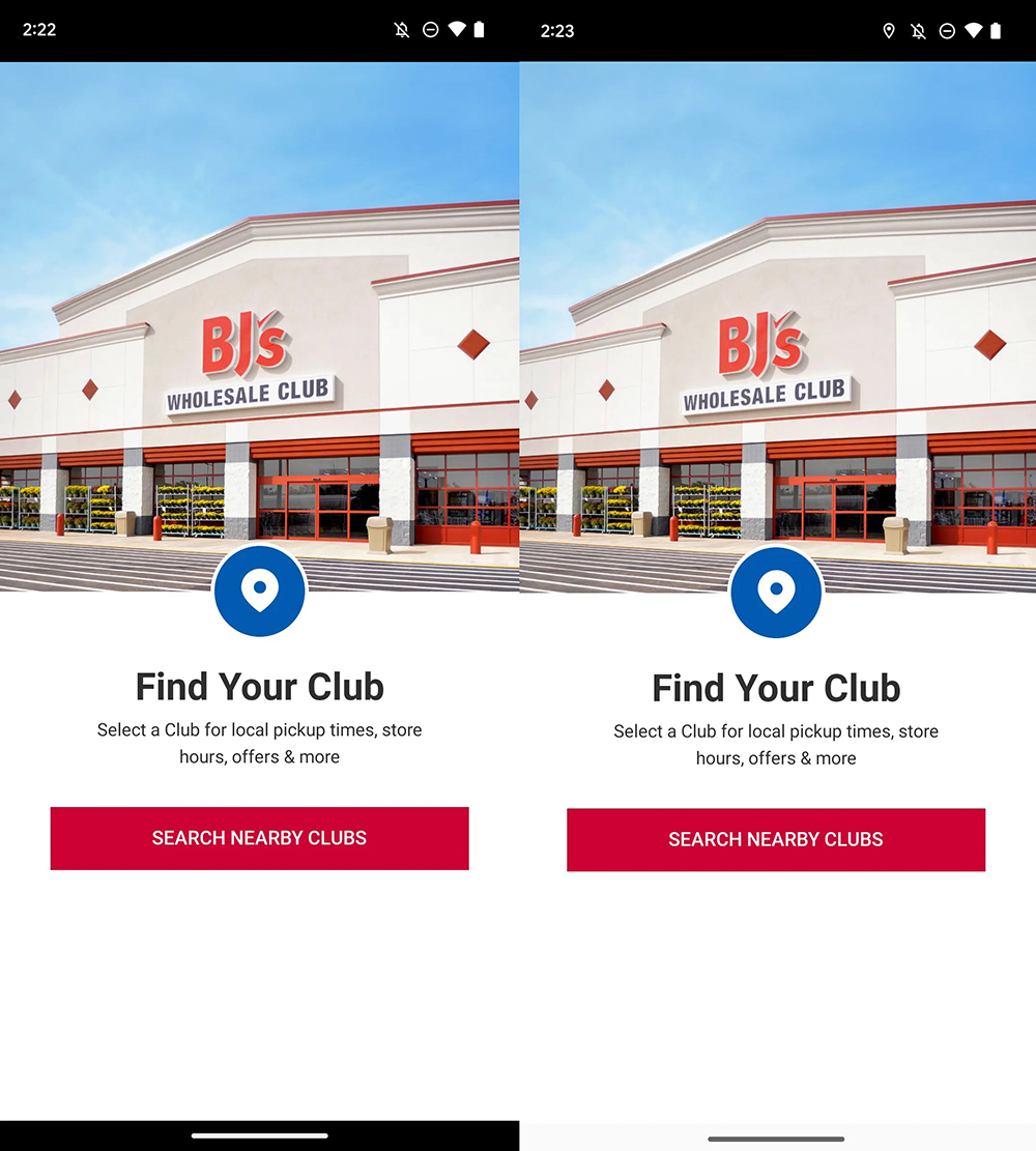
According to foreign media digging into the latest Android 14 Beta test version, the latest “Transparent Navigation Bar” switch can be found in the Developer Options of the system settings. As the name suggests, this navigation bar transparency setting can force the background color of the navigation bar with white or black borders to be changed to a transparent display mode (speaking of it, it should force the App that still has a background color to be changed to a transparent state). Of course, the navigation bar will still remain at the bottom.
▲Image source: Android Police
In response to this change, Android Police believes that this should be because Google initially allowed developers to specify the background color of the navigation bar when it introduced the Material Design interface. Later, it did not consider that users may not like this kind of screen-occupying experience so much, so it had to provide another option to solve this problem. That is to say, in fact, according to the results of the editor’s homework, earlier, through the ADB tool, even the navigation bar could be turned off directly through the “Gesture Prompt” option.
However, the new options in Android 14 Beta this time give people some hope that the official may bring a similar experience to the official version. I wonder if everyone is looking forward to the official arrival of such a function? Are you looking forward to this new system more because of this small interface change? Can you share your views with us?
Further reading:
Source: KOCPC Chinese