


Previously, converting data into comparison charts required a significant amount of time and effort, and it was especially difficult for those with no relevant operational experience at all. As AI Now with just your data, you can easily generate the chart type you need through this free AI Graph Maker tool, and you can also modify the data or add more afterwards. Even better, there’s no need to register an account to use it for free—it’s very convenient.

AI Graph Maker Tutorial: Automatically Convert Data into Comparison Charts with AI.
AI Graph Maker is a free AI chart generation tool that can be used without registration. However, without registering, you can only download chart image files and can’t get embedded code or shareable links. For those who want to share in articles or online, registering is recommended. A free account gives you 10 credits per day, and generating one chart costs 2 credits, meaning you can generate 5 charts per day. I think that’s quite enough.
The operation is very simple: feed your data to the AI or input the content you create, select the chart type you want, hit generate, and it’s done in just a few seconds.
After clicking the link above to enter AI Graph Maker, enter your requirements in the box. If you want to try it out first, you can click the examples below, such as: sales data bar chart, website traffic line chart, department pie chart, etc.:

The auto-select menu on the right lets you choose the type of chart you want to generate. Auto mode lets the AI decide which chart type to create on its own. It supports a wide range of charts, including line charts, bar charts, stacked bar charts, radar charts, pie charts, tree diagrams, scatter plots, 3D Scatter Charts, relationship diagrams, Sankey diagrams, funnel charts, sunburst charts, and pyramid charts.

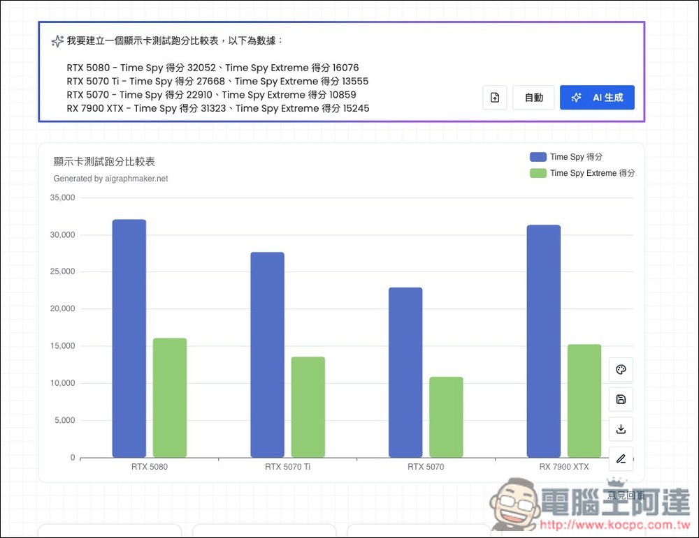
I’m asking AI to generate a comparison chart of graphics cards, and include the benchmark scores for each card. Keep the chart type set to automatic, let AI pick it, and finally click AI Generate:

In less than 2 seconds, the chart was generated—and it’s the kind that needs zero modifications. The data I provided is all correct and ready to use directly:
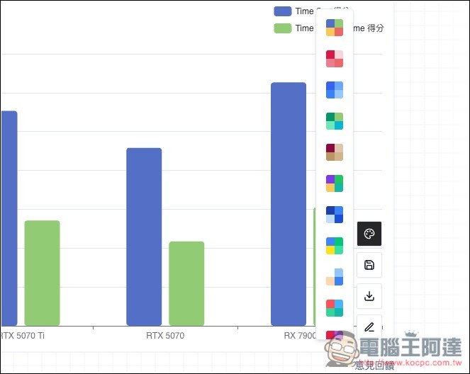
The first option can modify other color schemes:
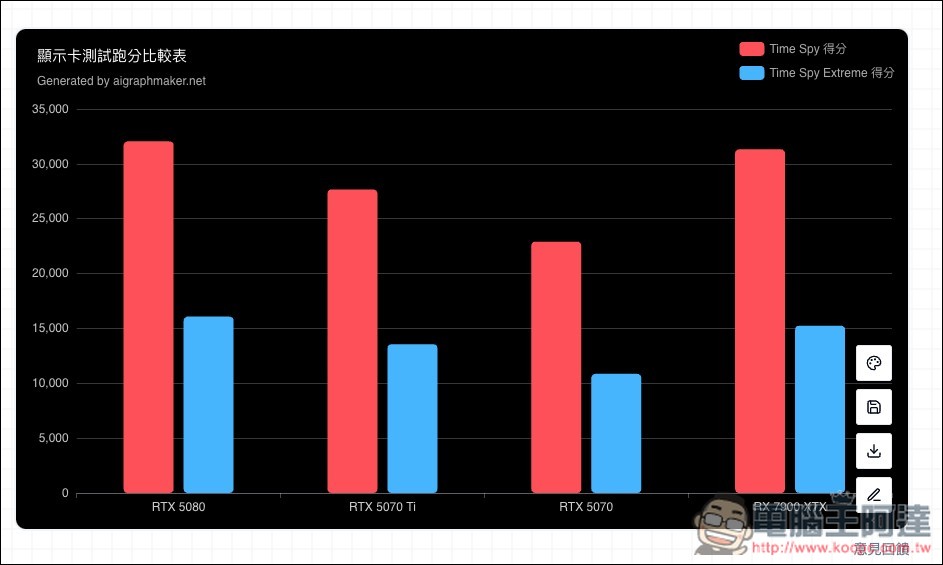
Once selected, it will be applied immediately:
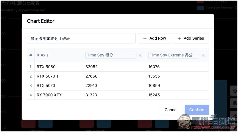
If you want to add more data or modify the content, click the pencil icon and you’ll enter Chart Editor. The download icon is for downloading the image file—the resolution isn’t very high, but it’s still 892×500 (in my example):
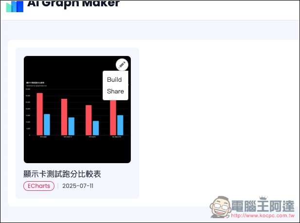
And if you want to share this chart directly on a website or blog, remember to register an account. After logging in, click the chart’s save button, and it will be saved in your account dashboard. Once you’re in, the pencil icon at the top right will let you find the Share function:
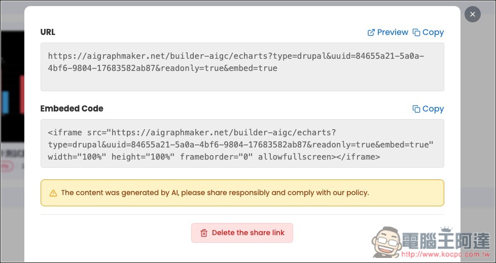
Then the chart’s URL and Embedded Code will be displayed:
Below is the actual effect. Hover over it to see the data:
Another thing to note is that the free account’s dashboard can only save 2 charts. If you want more, you’ll need to upgrade to the paid version. The price isn’t expensive; after upgrading, you can save unlimited charts, get 500 credits per month, and enjoy no ads or watermark. Those who need a large number of charts may want to consider it.
Source: KOCPC Chinese