


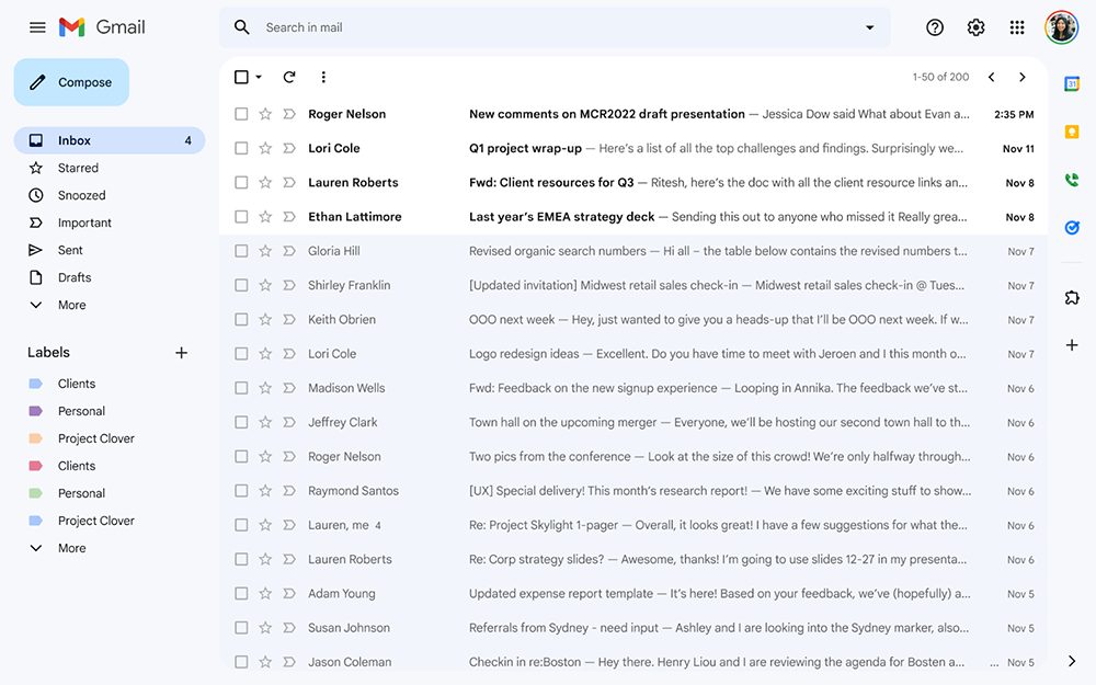
It seems that the design concept of Material You is not limited to the Android system. Google has planned to bring this system interface to more corners. In this wave of Gmail revisions that started to be imported from Workspace (yes, it has been changed again), the official has clearly mentioned the import of design elements from Material You. In addition, for the Google Chat and Google Meet sidebar interfaces that may have bothered you for a while, this time they also provide settings to better guide you to close them. Continue reading The web version of Gmail imports Material You design, and can also use settings to make you forget the content of Chat and Meet reports.
▲Image source: Google
The web version of Gmail imports Material You design, and can also make you forget about Chat and Meet through settings
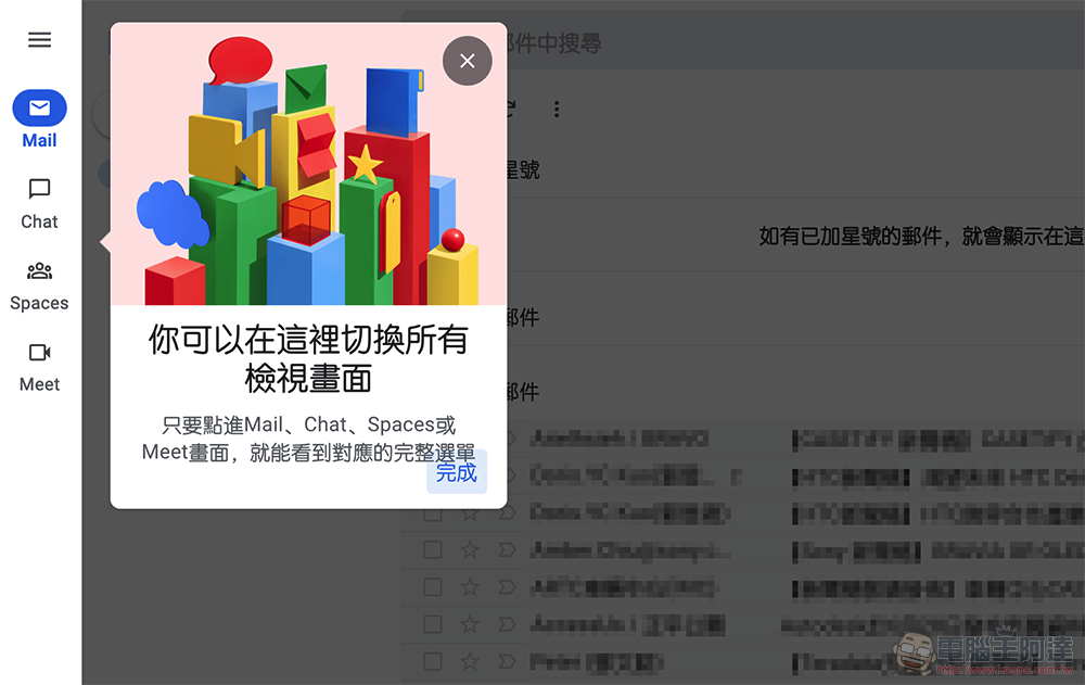
This time it is expected that a new redesigned design will be launched for Workspace and individual users. If you are very resistant to new things and just want to use the old version. “Currently” Google will still provide you with the switching function of the classic and original Gmail view screen version. You can freely switch between the old and new interfaces at any time, so you don’t have to worry about incompatibility.
If you see a new version prompt, you can feel free to switch over and take a look – of course this is now, and I am not sure whether there will be a forced revision in the future…
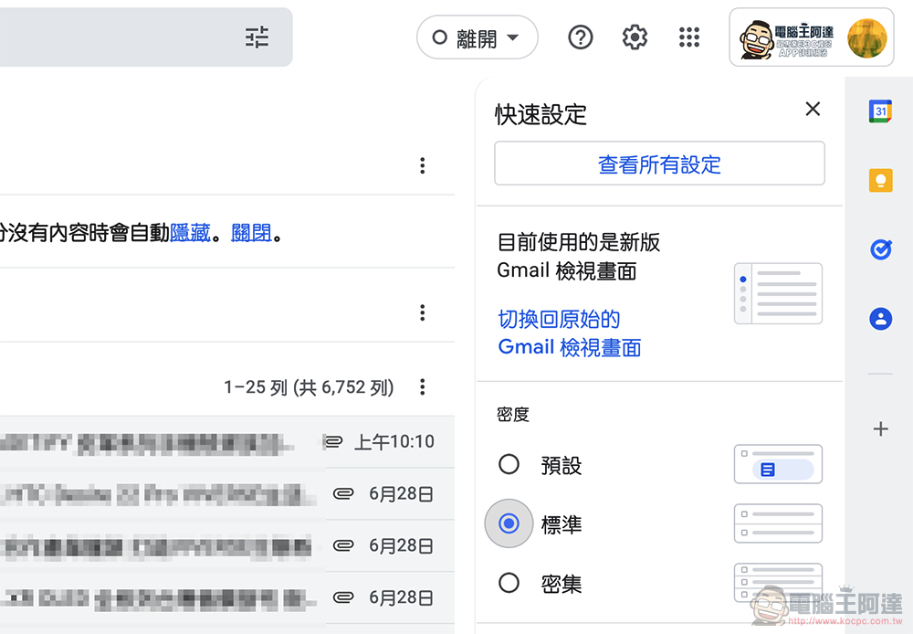
For those who love the Material You design but haven’t seen the revised version yet, don’t worry, because according to Google’s announcement, the new version should take up to about two weeks to be pushed – as far as the account I have is at work, it has been pushed, but the version for personal use currently only has the old version.
In addition to the design of more “bubble” buttons, in this revision, in the default theme state, you can see that the webpage color system is mainly white and blue – the unread email list will be displayed on a white background, and the rest will be displayed through different shades of blue blocks. And since Google mentioned that this revision has introduced the concept of Material You, it is estimated that these color combinations should be very easy to change with the theme?
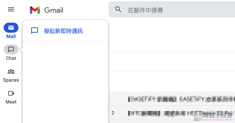
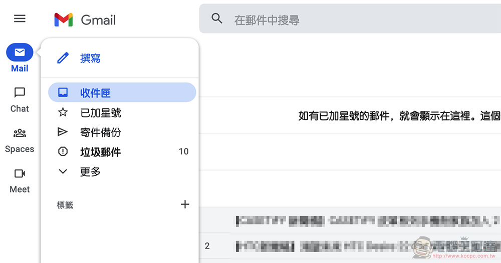
Another change that I personally think is great this time is the shortcut bar on the left. The functions that now include Mail/Chat/Spaces/Meet have collapsed redundant information and only display the shortcut list function in a floating window. If you want to open the list, you can also use it through the “San (Meiji)” menu in the upper left corner. Because of this simple design, I am less likely to think about turning off Google Chat and Google Meet directly through settings like before – because it was really messy before.
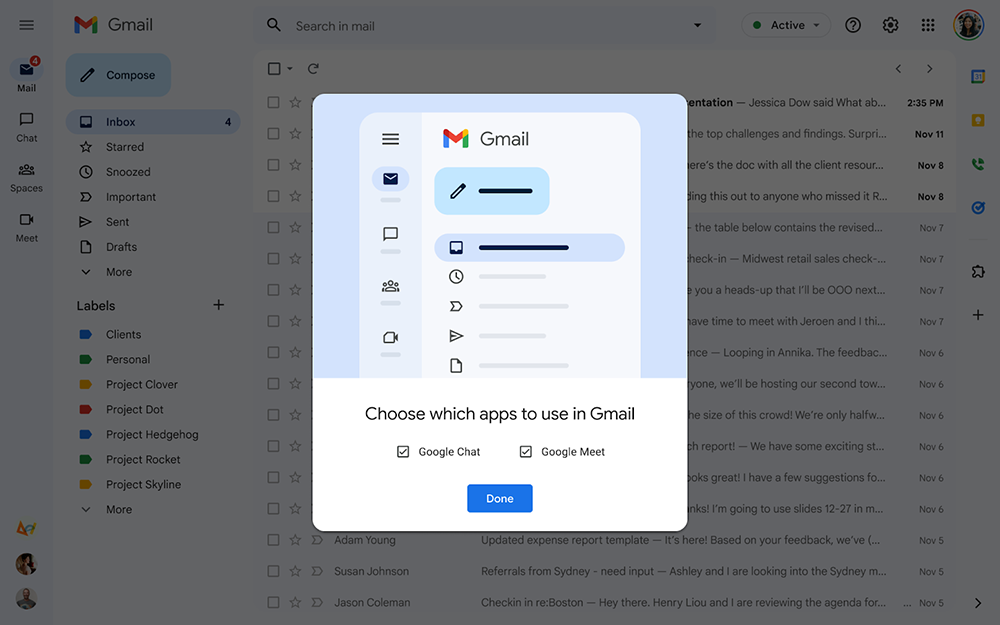
Perhaps because I am more confident about such an interface revision, the picture of the official demonstration mentioned that there will be a page that will guide you to choose whether to activate these two functions – I said I saw it in the official demonstration because the editor did not pop up such an option when I started the new version of the interface.
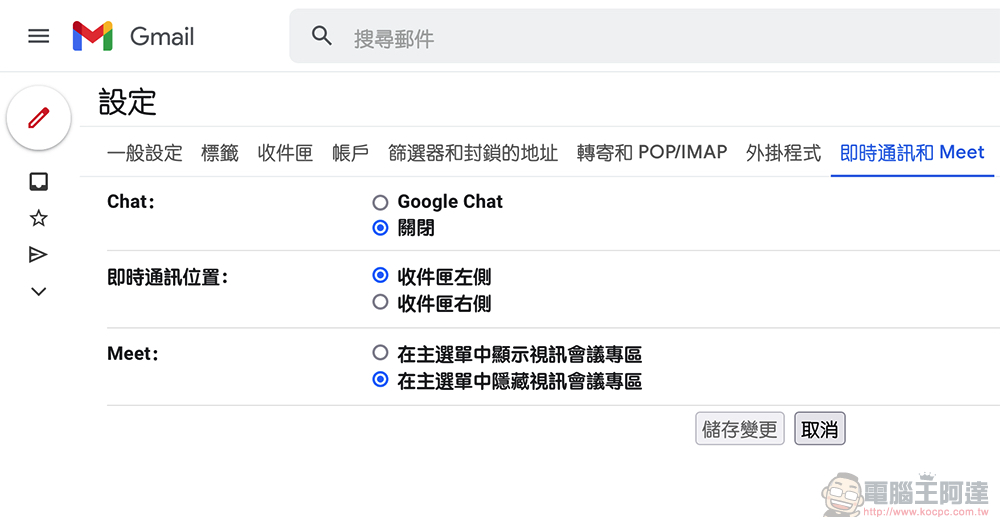
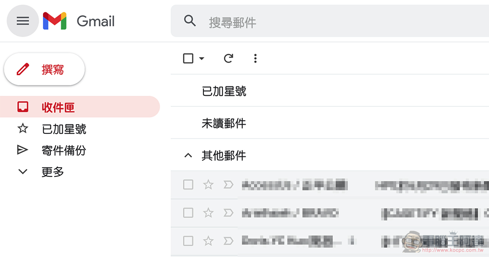
If the same applies to you, don’t worry, because if you want to close the left column, you can still go to “Messaging and Meet” in “All Settings” to set it up (I’ll put the link here, if you only have one account logged in, you should be able to connect directly). The interface status with only the Gmail service will appear – after setting it up, the editor will find that the interface will actually jump back to the old color scheme with mainly red tones, which is quite wonderful.
If you receive an update, I suggest you give it a try.
Further reading:
The first Android Wear OS 3 smartwatch supporting iOS is here
Source: KOCPC Chinese