


in new generation iPhone Before it officially debuts, about iPhone 18 Pro News about the appearance and color matching of the series have already been quietly fermented on the Internet. The information leaked this time is not the complete model, but more detailed lens base accessories, which actually makes the overall design outline clearer.
From the color selection to the style trend, it seems to reveal a signal that this generation of Pro series may be quietly changing its positioning and visual language, and people can’t help but look forward to the texture and difference when it is actually used.
▲Picture source:Majin
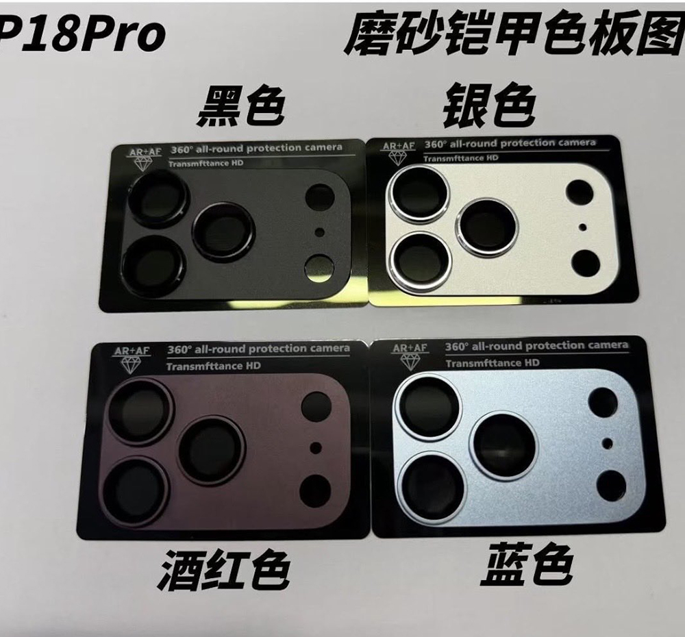
iPhone 18 Pro lens base sticker exposed! An early look at the 4-color design of the new phone, with burgundy being the biggest highlight?
Recently about iPhone 18 The latest revelations about Pro once again put the focus back on the “color matching strategy”. This time it is not a simple rendering, but the exposure of the base sticker accessories from around the lens module. These parts are usually matched according to the final body color, so to some extent they are also regarded as important clues to the color matching of the new machine.
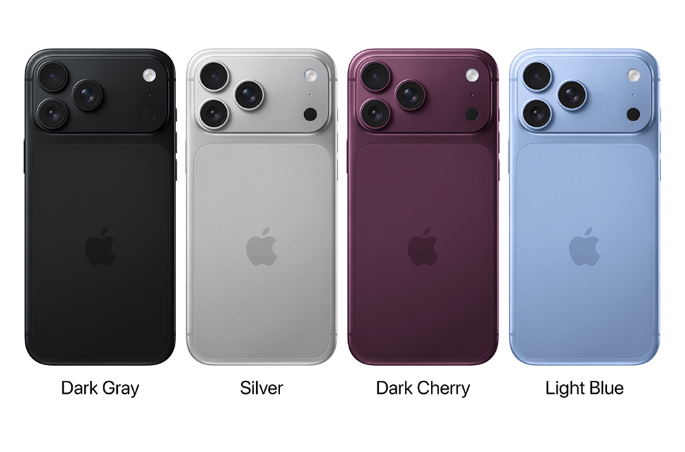
Judging from the pictures currently leaked, these lens base stickers show 4 different colors, corresponding to black, silver, burgundy and blue. This combination may seem familiar, but in fact, the details and style are slightly different from past generations.
The most interesting thing about this revelation is that it is not a traditional body shell or complete model, but a “lens base sticker.” This area has become more and more important in the design of recent generations of iPhones, as the size of the camera module continues to increase, and the visual center of gravity on the back is almost concentrated on this area. Therefore, the color and material of this area will directly affect the overall look and feel.
As can be seen from the exposure content, the overall tone still maintains the matte metallic texture, continuing the low-key and refined line emphasized by the Pro series. However, color saturation and depth contrast seem to be more layered than in the past, rather than pure flat colors.
This kind of adjustment is actually in line with the trend of the high-end mobile phone market in recent years. Rather than high-color or eye-catching designs, more and more brands choose to use delicate textures to differentiate their positioning.
▲Picture source:Apple Hub
Burgundy becomes the main color, and the style becomes mature and steady.
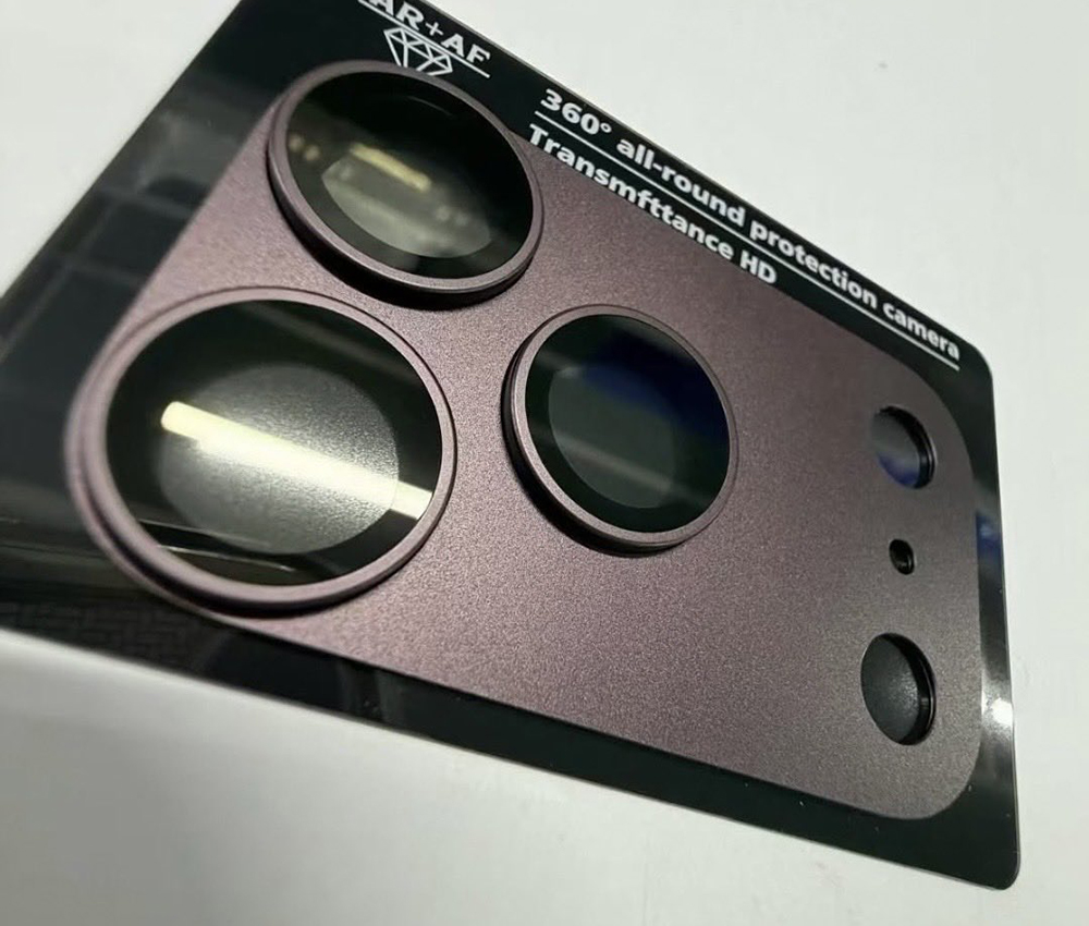
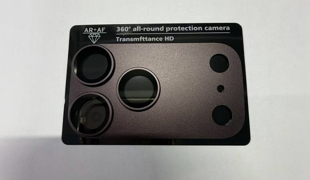
Among the four colors exposed this time, the one that attracts the most attention is undoubtedly “burgundy”. This color is not bright red or bright red, but rather a deep red, or even a bit dark brown, red wine tone. The overall vision is closer to the burgundy or dark cherry red style, and the first impression given is that it is stable, restrained, and a bit high-end.
▲Picture source:Majin
If you look back at the main colors of the iPhone Pro series in the past few generations, you can find that Apple usually chooses a recognizable color to drive conversation, such as deep purple, titanium primary color, etc. This time, the burgundy color is obviously closer to the “mature market”.
Such a change is actually not difficult to understand. As the prices of high-end mobile phones continue to rise, the main customer group of the Pro series is no longer just young users, but includes business groups, professional creators and other broader groups. The color strategy will naturally be adjusted accordingly, moving in a direction that is more durable and less likely to get tired after long-term use.
▲Picture source:Majin
Classic black and silver are not absent, stably supporting the product line
In addition to the main colors, “black” and “silver” are still the basic colors in this color combination.
These two colors are almost the fixed lineup of every generation of the Pro series. The reason is simple. They are the most accepted and the least likely to go wrong. For users who prefer a low-key style or want their phone to blend into various occasions, black and silver are still the safest choices.
Especially black, in recent generations of designs, it is usually paired with matte or titanium-like textures, presenting a low-key but technological atmosphere. The silver color tends to be classic and pure, with a retro feel, and it can also highlight the lines of the fuselage.
The existence of these two colors actually stabilizes the sales of the entire product line, ensuring that even if the main color changes, the overall sales are still supported by the basic market.
Blue is a variation, taking into account the sense of technology and the young market
As for the fourth color “blue”, it plays a more flexible role.
Blue is not new to iPhone color history, but each generation has presented it slightly differently. Sometimes it’s darker, sometimes it’s lighter, and sometimes it even has a grayscale tone. Judging from the description, the blue color exposed this time should be between technical blue and low saturation blue. It is not too ostentatious and can maintain a certain degree of recognition.
This positioning is actually very smart. On the one hand, it can attract users who like changes, on the other hand, it will not be too risky and affect the overall product tone. To put it simply, blue is like the “balance point” in the entire color scheme, so that the overall color scheme will not be too conservative and will not lose acceptance in the mainstream market.
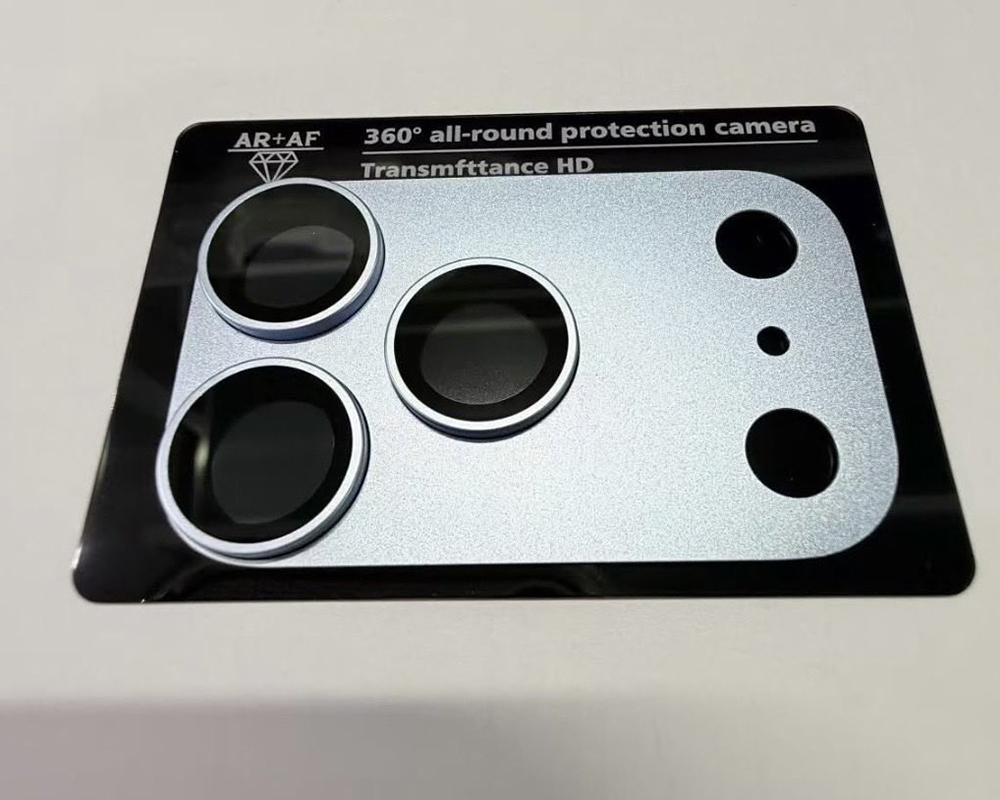
▲Picture source:Majin
It is still in the breaking stage, and there are still variables in the final version.
Of course, we still have to remind you that this information currently comes from leaks and leaked parts, and is not the official final version.
In fact, the color name, hue and even material when it is launched may be further adjusted. There have been cases in the past where the leaks were slightly different from the final product, so this time the 4-color configuration can still be regarded as a direction reference rather than a final decision.
As the release date approaches, more real machine models or complete renderings should be exposed in the future, and the overall design outline will be clearer by then.
Further reading:
Source: KOCPC Chinese