


Google Clock has undergone a fairly significant interface overhaul as part of the latest wave of Material 3 Expressive design updates. This redesign not only reshapes the visual style but also subtly alters a core interaction that users encounter every day—the gesture for turning off an alarm. The familiar left-to-right swipe has been replaced by a large, colorful, pill-shaped button that takes up the entire screen. While this button’s design aligns with Material 3’s dynamic color scheme, many users feel it makes the alarm “too easy to turn off”—and they might even accidentally tap it while half-asleep, causing them to miss important appointments.
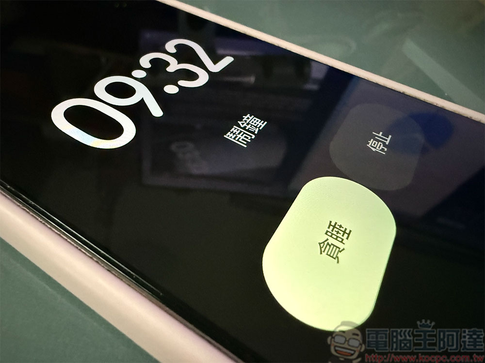
Google Clock will make it harder for you to accidentally miss your alarm
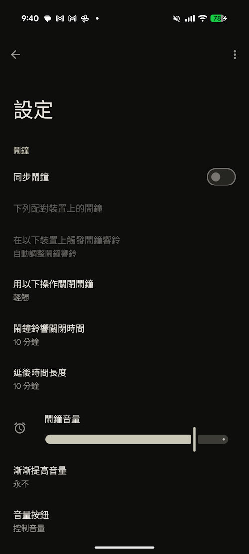
Google has clearly taken this user feedback to heart. Recently, Google Clock began offering a new option that allows users to switch back to the traditional swipe gesture to dismiss an alarm. The addition of this option is, to some extent, a response to user habits; it also reintroduces a “deliberate action” barrier to alarm operation, preventing the frustration caused by accidental taps. When users choose to revert to the swipe gesture, the operation logic remains the same as before: swiping left means snooze, while swiping right turns off the alarm completely. Compared to the light touch required to trigger a single large button, the swipe gesture demands a more deliberate action, thereby effectively reducing the likelihood of accidental presses. For those who are often groggy in the morning and have uncoordinated fingers, this “resistance” actually serves as a protective mechanism.
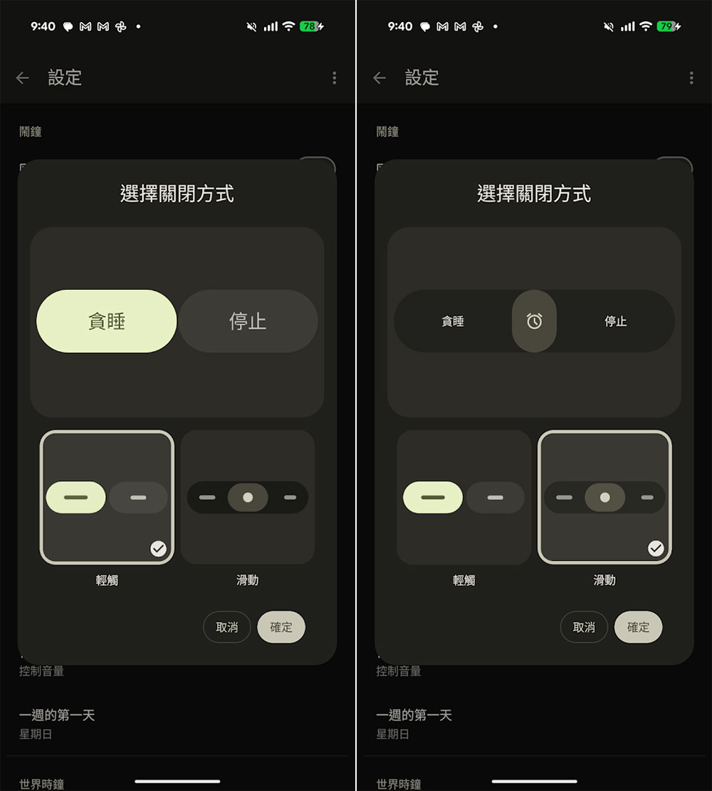
However, the rollout of this feature is a bit complicated. Although it’s tied to Google Clock version 8.5, it also requires Google to enable the relevant settings on the server side. In other words, even if you’ve updated to the latest version, you may not see this toggle option right away. Based on the current situation, it appears that Google is conducting a small-scale A/B test to gradually gauge user feedback before deciding whether to roll out the feature to all users. It is expected that more devices will receive this update over the coming weeks.
It’s worth noting that Google has actually been offering similar interaction options in its Phone app for some time. On the incoming call screen, users can choose to answer or reject a call using pill-shaped buttons, or switch to a swipe gesture. This update to Google Clock, to some extent, extends the design philosophy of “optional interaction methods” to more system apps, allowing users to choose their preferred method of operation based on their personal habits.
In addition to the change in the alarm-snooze gesture, Google Clock v8.5 also introduces another small but useful update: the alarm volume slider is now thicker and more prominent. This change is also in line with the Material 3 design philosophy, making the control element easier to tap and recognize. In addition, Google has added a feature for fine-tuning alarm volume, allowing users to set the volume increment between 1.00 and 7.00, with these values roughly corresponding to different decibel levels. Unlike the gesture-based switching feature, the volume adjustment feature is fully enabled in v8.5 and does not require a server-side push to use.
Overall, this update to Google Clock highlights an interesting trend: while striving for design consistency and a modern visual aesthetic, Google is also beginning to place renewed emphasis on the user’s actual operational experience. While large pill-shaped buttons are aesthetically pleasing and align with the design language, in a high-stakes scenario like setting an alarm, overly easy operation can actually cause problems. By reintroducing the swipe gesture option, Google has demonstrated a willingness to strike a balance between design and practicality.
Source: KOCPC Chinese