


Nowadays, many office workers or students often have to make PowerPoint presentations to present their proposals or topics. However, if a presentation looks untidy, unprofessional, or confusing to the audience below, it will really be a waste of your hard work. This time, the author has sorted out the mistakes that are often made when making PPT, and of course we will also tell you what measures you should take to avoid making the same mistakes again.
These 8 common PowerPoint mistakes will teach you how to avoid them!
The arrangement of objects is messy and misplaced
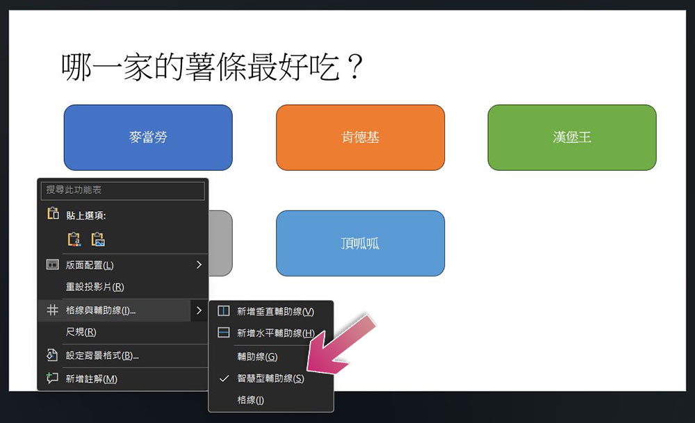
If the objects on the PPT slide are not really aligned (that is, they seem to be aligned, but in fact there is a slight difference), the entire presentation will look sloppy, and the audience below will also feel a bit messy, like a barb on the thumb. Although it is not a big deal, it is uncomfortable to look at. The best way is to make good use of PowerPoint’s built-in “smart guides” function to help you align. This function will help you arrange each object in the slide neatly and with consistent spacing. To enable this feature simply follow these steps:
- Right-click in the empty area of the PowerPoint presentation and click the arrow next to “Grids and Guides.”
- Just check “Smart Auxiliary Lines”.
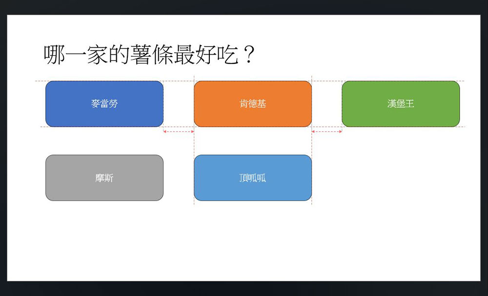
After activating the smart auxiliary line function, you can see as shown below that when you drag each object, a dotted line will be displayed to help you arrange each object. Of course, if you want to control the layout more accurately, you can also check the grid and auxiliary line functions at the same time to help you better place each object in the best position.
Too many bullet points in a single page of PowerPoint
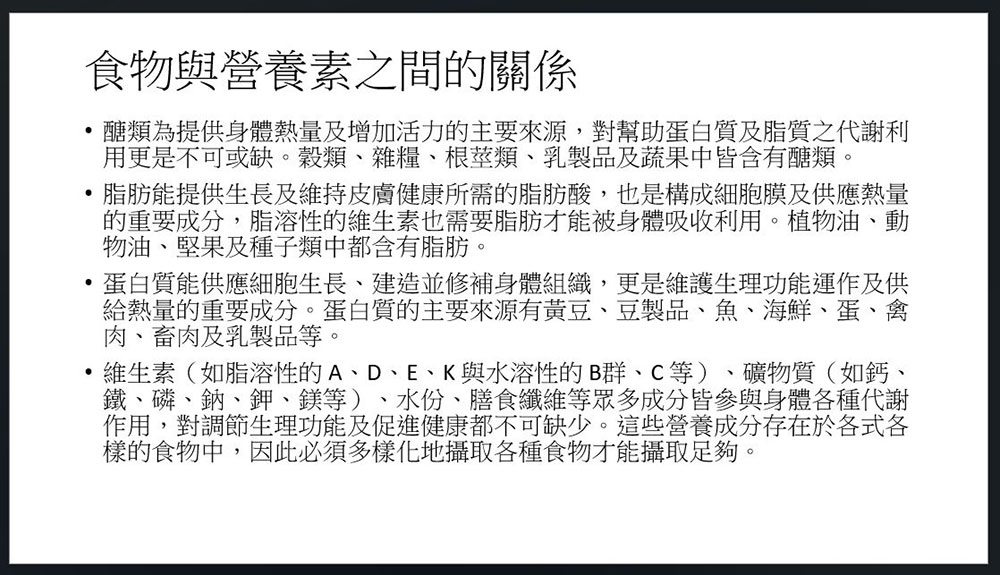
If a single page of PPT is densely packed with words, it will be a nightmare for the audience. Not only will it look very bland and unprofessional, but when you are speaking orally, the audience will still be following the words on the presentation, and you will almost be reading from the PPT. Generally speaking, you will try to avoid writing all the text into the presentation. Instead, you will only list the key points, write what you want to say in the memo of the slide (this function is in “View”, the memo will only be seen by you, not the audience), and explain it orally.
But if it is important information that cannot be deleted in any case, you can have a better way to write your presentation, let us invite “SmartArt”!
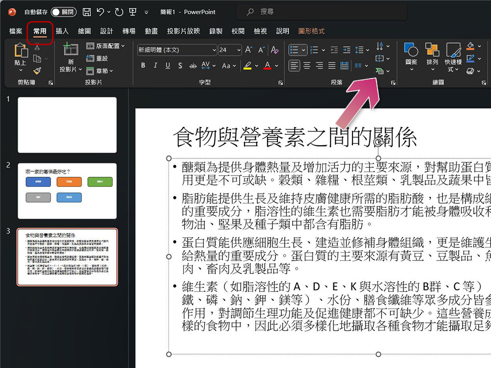
If you have entered text and want to convert the text into SmartArt, please select the text box first, then open the “Common” tab in the ribbon, and then click “SmartArt”.
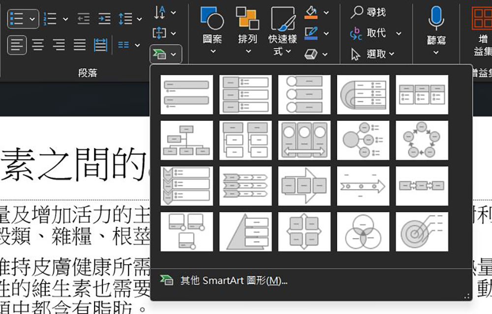
Next, you will see a variety of available designs. You can hover your mouse cursor above to preview the appearance. Find the one that suits you and click to apply.
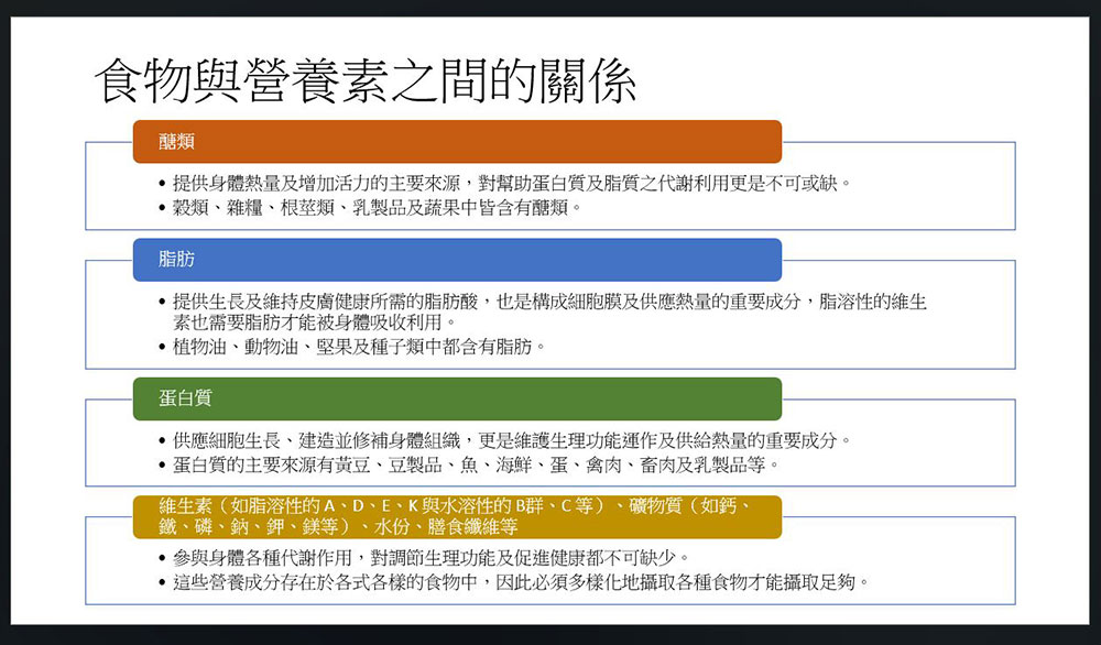
But remember, our goal is to make the slide more beautiful and easier to read and understand. After applying the design, the slide still looks soulless. It’s up to you to adjust it next. Just select the element you want to modify and make the changes you want, such as resizing the box, adjusting the font size, or select the SmartArt Design tab in the ribbon to make more adjustments.
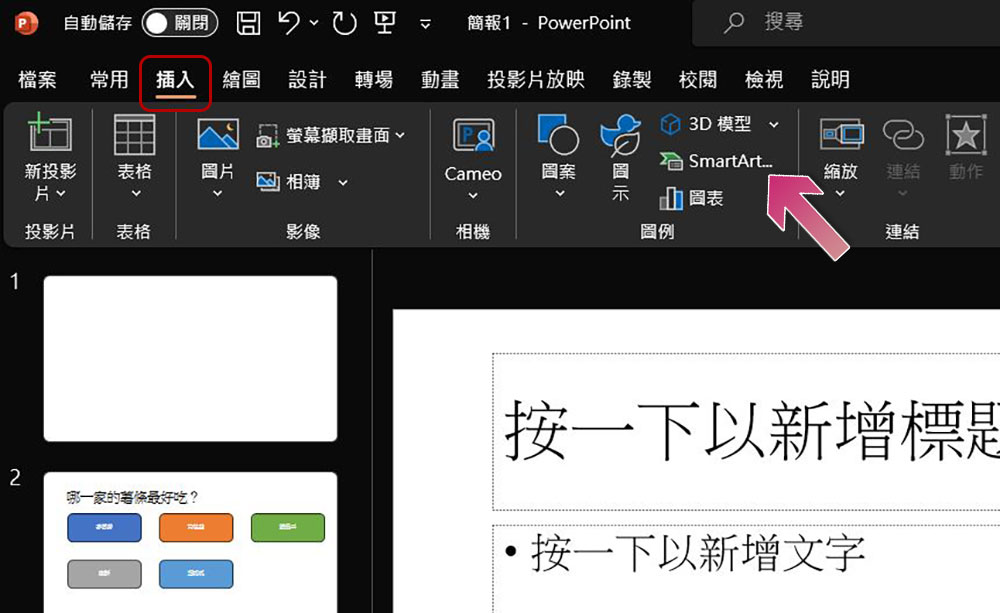
If you know that you should use SmartArt before entering text, make sure that no text or image in the PPT is selected, then switch to the “Insert” tab in the ribbon, click the SmartArt icon to first put the format into the blank PPT, and then fill in the content you want.
Using too many animations and transitions in PowerPoint
Animation is a great way to emphasize details in a PPT slide or to gradually introduce information during a presentation. Use transitions between slides to look smooth and vivid. However, overusing these features can distract the audience and look tacky, which is more than enough. So I recommend that you keep the number and type of transitions and animations to a minimum by following the following 4 principles:
- Ask yourself first, does adding this animation or transition make the briefing better? If the answer is uncertain or negative, don’t let it go.
- Use animation effects that last less than 1 second and do not change the speed of the animation.
- “Fade in” and “split” are the most popular transitions because they look professional and neat, while “appear” and “fade” are the most practical animations.
- Use the same transitions for every slide and the same animation for every object.
- Try to avoid adding multiple animations per object.
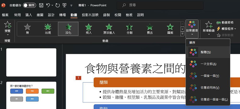
To use animation, click on the object you want to animate (it can be a picture, shape, text box, etc.), and then select the effect in the “Animation” tab of the ribbon. You can view more setting details by clicking the drop-down arrow of “Effect Options” on the right after making your selection.
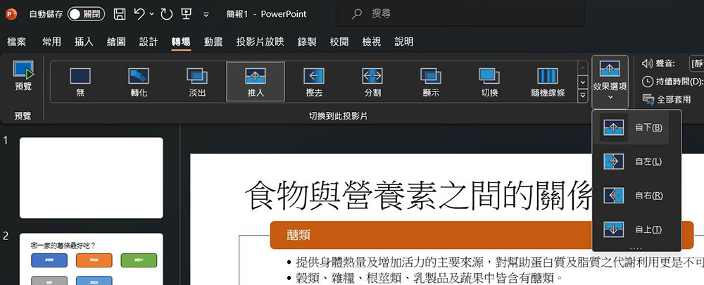
Transitions are how your PPT presentation switches from one slide to the next. You can find it in the “Transitions” tab of the ribbon. Similarly, after you select the transition effect, click the effect options next to it to make more settings.
Using the wrong color combinations in PowerPoint
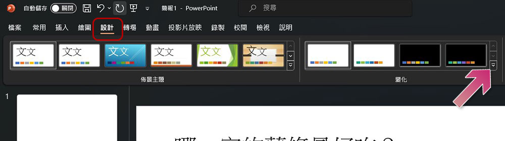
The latest version of PPT provides us with colorful and rich color choices. However, if you are not careful, you may tire the audience’s eyes by choosing the wrong combination. The best way to solve this problem is to use the “change” function of PPT. In the “Design” tab of the ribbon, double-click the down arrow attached to “Changes.”
When you hover your mouse cursor over “Color”, you can see that PowerPoint provides you with a variety of color matching options. You can also hover to preview the results directly on the PPT.
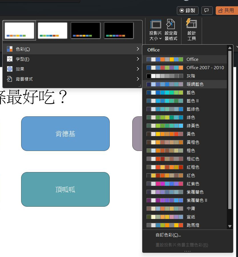
Whenever you add text or change the color of an element in your presentation, you can choose from a selected color palette, which helps you avoid colors with poor contrast. In addition, please try to abide by the following three principles:
- Don’t use red text, which often results in poor color rendering when projected, especially on a poor quality projector or when sunlight hits the projection screen. The worst color combinations are blue with red and green with red, avoid these at all costs.
- When coloring your own, remember to use dark fonts on light backgrounds and light fonts on dark backgrounds.
- Never use colored fonts for emphasis, as this may cause confusion for color-blind or color-impaired listeners.
Use low-quality or distorted images in PowerPoint
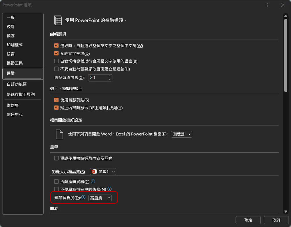
Images look vivid in PPT, but people often forget that their presentation will be displayed on a huge screen, so proper resolution is extremely important. To do this, use images with at least 150 PPI or make the image larger to avoid blur. Additionally, you can force PPT to use the maximum image resolution available:
- Click the “File” tab in the ribbon.
- Then click “Options” in the lower left corner.
- In the dialog window that pops up, click “Advanced” in the left column.
- Change the “Default resolution” in the “Image size and quality” section to “High quality.”
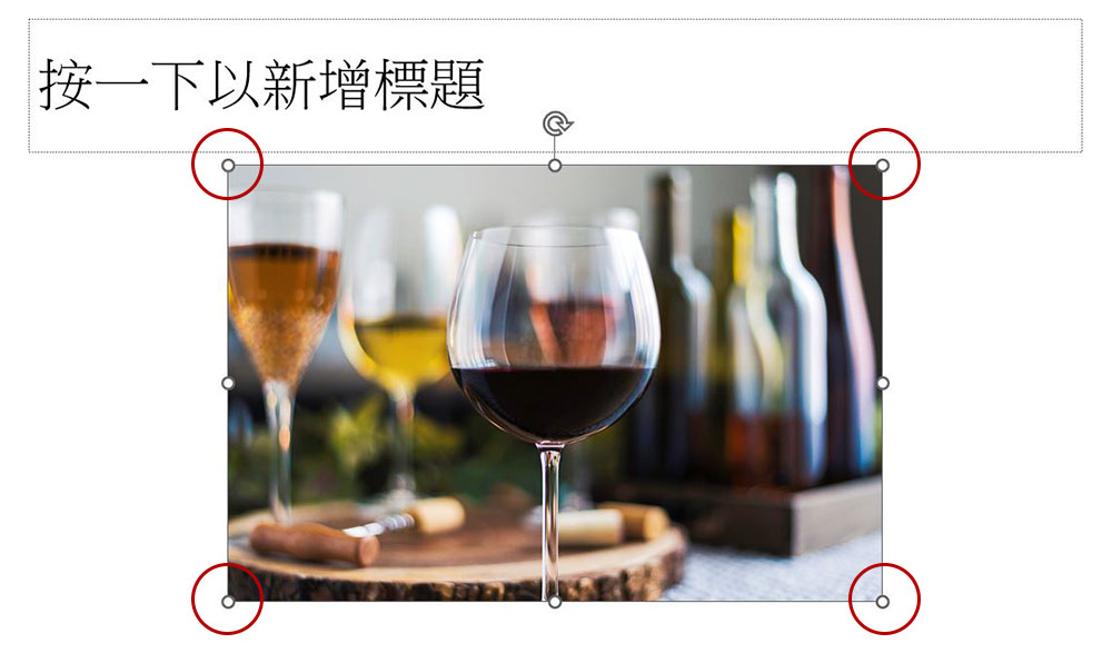
Finally, when resizing your image, be sure to zoom in and out from all four corners to maintain the correct proportions and avoid squashing or stretching that could distort the image.
Inconsistencies between PowerPoint slides
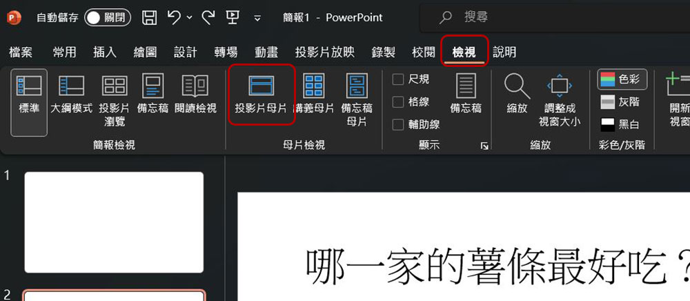
When you move from one slide to the next, your audience will immediately notice inconsistencies. The easiest way to solve this problem is to copy (Ctrl+C) and paste (Ctrl+V) the entire slide, and then modify the content, but inevitably there will be areas that were not corrected. Your best option is to use the “Slideshow Master” feature, which you can find in the “View” tab of the ribbon. Edits you make in the master slide will affect the content in each slide layout, which means you can ensure consistency from slide to slide.
Text in PowerPoint is difficult to read
You may want to mix and match various fonts and colors to make the slides look lively, but this can easily be overdone. Please follow the following three major principles and you will basically not go wrong:
- Do not use fonts that are too fancy, especially fonts with decorative lines, fonts that are too artistic, scrawled handwriting, etc.
- Avoid too much text and make fonts larger appropriately. Because there is a large amount of text on the slide, the font size is too small. Please split the input content into two projections or reduce the content.
- Avoid using red fonts.
Use pictures or patterns as PPT slide backgrounds
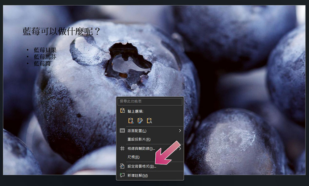
You may want to use a picture or pattern as the background of a slide, but if you are not careful, it will take over the focus and make the text difficult to read, like the picture below.
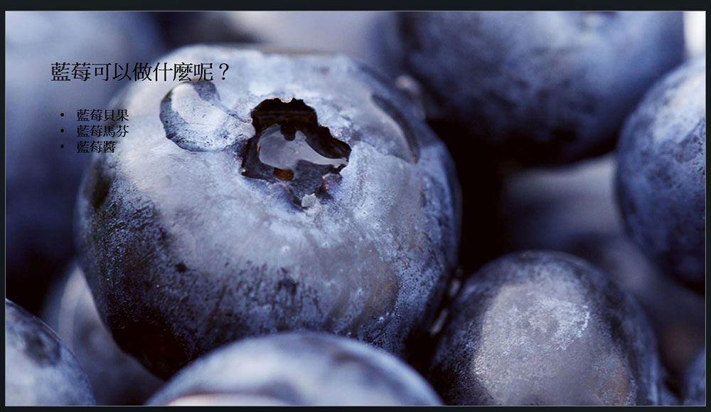
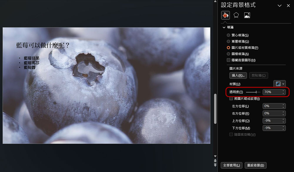
The most direct way to avoid this completely is to put away your fancy creativity and use a plain background, but what if you really want to keep the image? Please adjust the transparency at this time:
- Right-click outside the slideshow and click “Format Background.”
- Drag and slide the transparency lever on the right sidebar until it reaches the transparency you want.
Source: KOCPC Chinese