


In the settings list of a monitor or TV, brightness and contrast are two settings that everyone is already familiar with, and you can operate them very intuitively. But you may see a project called “Gamma”. You can’t figure out what it is from the name, so you just don’t touch it. This time we’ll tell you all about Gamma and how you can set it up.
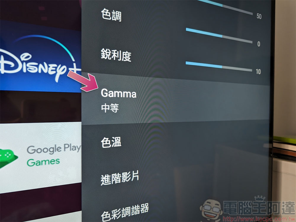
What is the Gamma value in the monitor or TV settings? What is the ideal setting?
What is gamma?
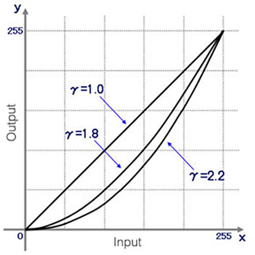
Gamma is a correction factor that adjusts the full brightness level of an image to ensure it is correctly perceived by the human eye. This need for gamma correction stems from the difference between the way cameras capture light in a linear pattern and how the human eye interprets those lights, which may sound a little confusing. Let’s look at a practical example.
Suppose you take two identical lights and place a random object in front of them. When you turn on one of the lights, the object will be illuminated. If you now turn on the second light, you have theoretically doubled the reflected light from the object, but your eyes will only perceive a small difference in brightness. However, cameras are very effective at capturing differences in brightness, and if you take a photo of both situations and view it on a monitor, the final image will be in stark contrast to the real scene. For a demonstration and complete explanation, watch the video below:
Gamma corrects light on a non-linear basis, which means it doesn’t simply increase or decrease the brightness like a brightness setting. Simply put, adjusting the brightness will increase the overall brightness of the screen, but adjusting the gamma value will only increase the brightness of the mid-tones.
Why is Gamma 2.2 the standard setting?
After extensive research and testing by scientists and engineers, Gamma 2.2 provides the most accurate and realistic visual representation. Ebner and Fairchild published a paper in 1998 describing how they used the CIELAB index 0.43 to convert linear intensity to luminance on a gray scale. Gamma 2.3255 is actually closer to Gamma 2.4, but since most computers are used in bright homes and offices, you’ll get better visibility by choosing Gamma 2.2. Interestingly, while Gamma 2.2 has been the standard for Windows for decades, Apple uses Gamma 1.8 for brighter images. Apple only switched to Gamma 2.2 with the release of Mac OS X Snow Leopard in 2009.
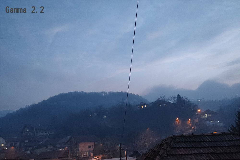
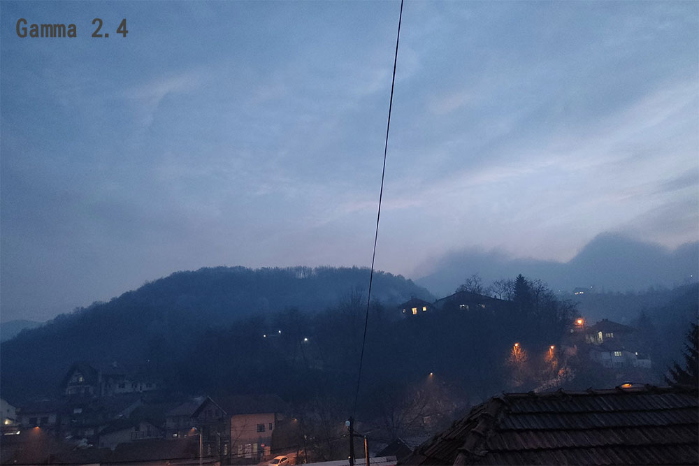
The difference between Gamma 2.0, 2.2 and 2.4 can be seen in the three photos below. If you focus on the brightest and darkest parts of the image, you’ll find that Gamma 2.2 achieves the best balance. Conversely, Gamma 2.0 has more detail in the shadows but makes the rest of the image look bright but washed out, while 2.4 loses some detail in the shadows but gains contrast in the bright parts.
While 2.2 has a good balance, we can also learn from this small example that there is no ideal gamma setting that suits all situations, which is why images are often edited to look better on all monitors. As for games, many of them allow you to adjust the gamma settings to suit your preferences, which is perfect if you just want to fine-tune the display. Subjectivity plays a big role in Gamma, for example, some Cyberpunk 2077 players have increased the in-game Gamma slider to achieve a darker, more brooding atmosphere that better represents Night City’s visuals. Some people have difficulty seeing objects clearly in the dark. In this case, it can be helpful to set Gamma lower than the default value.

What should Gamma be set to?
Generally speaking, standard Gamma 2.2 should be the most balanced ideal overall. Gamma 2.2 is the standard used by professional digital content creators on their high-precision monitors, so content can be better enjoyed at the same gamma setting. This applies to games, movies, images, videos, and even website color schemes. If the game or application allows you to change the Gamma setting, you should use it to set it instead of directly changing the Gamma in the monitor settings all at once. It will only take effect when you play the game or open the application, and it will not affect other uses when you exit.

However, in some cases, other gamma values may look better. If you’re in a dark room and the monitor is bright, Gamma 2.4 will look great. On the contrary, if you use the computer with direct sunlight shining on the monitor most of the time, you may need to adjust the Gamma to 2.0 or even lower to see more clearly. You can try it more.
Gamma is the hardest to understand but most interesting setting on a monitor, and isn’t usually something you have to touch since Gamma 2.2 is the default standard across the industry out of the box, but it’s nice that the option is still there.
Source: KOCPC Chinese